Talk:Main Page/editcopy/Archive 6
heading
I'd like to suggest a change to the heading section (welcome message + images). Instead of using the profession character images, I think we should use profession icons, and I think the welcome message should span 100%. Here's what the variant I'm talking about would look like: [1]. Though we don't yet have the mesmer icon, I think the variant in my sandbox would give the page a more professional + sleeker look, but I guess that's what we're here to discuss.-- Shew 15:53, 2 January 2012 (UTC)
- I disagree with both the icons and the width. The 100% width looks awkward and is a massive field of green; and because the page isn't 100% width on higher resolutions, it looks awkward. The icons are so small that they become insignificant. Profession choice is one of the most important choices in the entire game, and I think the main page should reflect that with big(ger) images. Aqua (T|C) 18:06, 2 January 2012 (UTC)
- I just think the current images look really cluttered on higher resolutions. Profession choice is on the same level with race choice, not gameplay-wise, of course, but as far as character creation goes. If the divs below the header were to, together, stretch 100%, then it wouldn't look so awkward. Look at this revision, for example: [2]. I don't think that looks so awkward. I'm not suggesting the exact layout of divs below the header that I have in that revision, I'm just using that as an example of everything stretching to 100%.-- Shew 18:32, 2 January 2012 (UTC)
- I believe that stretching the header to 100% should be accompanied with the main page spanning the 100% width equally. - Infinite - talk 18:45, 2 January 2012 (UTC)
- I agree on two aspects (partially with people). I agree that 100% for the header makes it look incredibly silly. That green bar is far too thin IMO for a 100% spread. Secondly the current state of the main page (not copy) does appear quite cluttered with those profession release images. I do prefer the currently proposed images I find them cleaner, but because of that you'll need a smaller spread. While it is slightly extreme, I took a screenshot that I will share once I upload it. Currently having some technical difficulties. Venom20
 20:13, 2 January 2012 (UTC)
- I agree on two aspects (partially with people). I agree that 100% for the header makes it look incredibly silly. That green bar is far too thin IMO for a 100% spread. Secondly the current state of the main page (not copy) does appear quite cluttered with those profession release images. I do prefer the currently proposed images I find them cleaner, but because of that you'll need a smaller spread. While it is slightly extreme, I took a screenshot that I will share once I upload it. Currently having some technical difficulties. Venom20
- I believe that stretching the header to 100% should be accompanied with the main page spanning the 100% width equally. - Infinite - talk 18:45, 2 January 2012 (UTC)
- I just think the current images look really cluttered on higher resolutions. Profession choice is on the same level with race choice, not gameplay-wise, of course, but as far as character creation goes. If the divs below the header were to, together, stretch 100%, then it wouldn't look so awkward. Look at this revision, for example: [2]. I don't think that looks so awkward. I'm not suggesting the exact layout of divs below the header that I have in that revision, I'm just using that as an example of everything stretching to 100%.-- Shew 18:32, 2 January 2012 (UTC)
Speaking generally, please bear in mind that the front page must be designed with resolutions of 1920x1080 and beyond in mind, as well as smaller resolutions (at least not-completely-broken at 800x600). Gamers have hi-res displays (hence 1920x1080 and beyond), but aren't necessarily always looking at the wiki on their gaming computer/main display/fullscreen (hence smaller resolutions). When you think "it would look better (on my resolution) like this," please always remember to mentally add "but would that look worse on other resolutions?" Again, these are just general reminders, and not a comment on any specific proposal, which I haven't investigated in detail yet. - Tanetris 22:32, 2 January 2012 (UTC)
- So as to not stall the conversation, I uploaded the image at imageshack Venom20 23:37, 2 January 2012 (UTC)
- Oooh, yeah. Should span less. Definitely. I still prefer the icons as opposed to the current ones or the ones you just uploaded, Aqua; however, I love how you've redesigned the page. Your version really gives off a portal aesthetic, and not just a main page look. Though, the point where the four divs intersect looks kinda inconsistent as far as spacing goes. I'm still for the images I've used, but again, I love the area below the header in your version, Aqua. In fact, I just did a show preview w/ my header and your body, and I think they go well together, with some minor adjustments necessary. I.e., maybe instead of having separate pages linked together you could use collapsible tables to expand the sections on the right of the featured article.-- Shew 00:23, 3 January 2012 (UTC)
- eh i prefer the images we have now over what you are suggesting i would perfer that they get reordered to either match the flash image on the official site or alternate profession type. another idea i had was adding the images to the upper header (talking about the suggested images). -
 Zesbeer 00:41, 3 January 2012 (UTC)
- What about the profession page images (similar to the backgrounds)? An example of this is here. Aqua (T|C) 02:42, 3 January 2012 (UTC)
- Aqua, your new main page 2 suggestion is too similar to gww. People were not wanting gww, please do not forget this and it's why the current layout was chosen... Ariyen
 05:56, 3 January 2012 (UTC)
- Aqua, your new main page 2 suggestion is too similar to gww. People were not wanting gww, please do not forget this and it's why the current layout was chosen... Ariyen
- What about the profession page images (similar to the backgrounds)? An example of this is here. Aqua (T|C) 02:42, 3 January 2012 (UTC)
- eh i prefer the images we have now over what you are suggesting i would perfer that they get reordered to either match the flash image on the official site or alternate profession type. another idea i had was adding the images to the upper header (talking about the suggested images). -
- Oooh, yeah. Should span less. Definitely. I still prefer the icons as opposed to the current ones or the ones you just uploaded, Aqua; however, I love how you've redesigned the page. Your version really gives off a portal aesthetic, and not just a main page look. Though, the point where the four divs intersect looks kinda inconsistent as far as spacing goes. I'm still for the images I've used, but again, I love the area below the header in your version, Aqua. In fact, I just did a show preview w/ my header and your body, and I think they go well together, with some minor adjustments necessary. I.e., maybe instead of having separate pages linked together you could use collapsible tables to expand the sections on the right of the featured article.-- Shew 00:23, 3 January 2012 (UTC)
@Ariyen Really? it already looks alot like gww imho so mission failed. also look at the icons near the logo under the welcome header that's what we are talking about here not the other stuff. @aqua i actually like that alot.-![]() Zesbeer 06:37, 3 January 2012 (UTC)
Zesbeer 06:37, 3 January 2012 (UTC)
- For what it is worth; [[User:Infinite/Sandbox/Main Page|'''this''']] design works on a browser that has a width of around 850px onwards, and may help spark some ideas. It also deals with whitespace on bigger resolutions, unless they get way bigger than the usual max resolutions. However, with browsers viewed at smaller widths, the navigation of that design overlaps the bottom part of the wiki, and this is obviously not ideal. Still, it's a longer-term proposal I was planning on. - Infinite - talk 12:06, 3 January 2012 (UTC)
- I like this header and icons used within it. I dunno y the need for color change, it was decided upon with a huge amount of discussion... Same with the design really (the base design). Only things that weren't a "big deal" was the icons used or header. Ariyen 21:29, 3 January 2012 (UTC)
- On the subject of the header, the header I proposed above works on all resolutions above something around 800; it even works on my phone. Aqua (T|C) 23:55, 3 January 2012 (UTC)
- For the records, I really like Aqua's design; the idea of using the images from the top of the professions pages is brilliant, IMO. Erasculio 23:58, 3 January 2012 (UTC)
- That would look like... This link... (If we use those profession icons and the icons of the towns for races (I do like those) ). 72.148.31.114 06:32, 4 January 2012 (UTC)
- Based on recent history, I think that Aqua's made history with a suggestion that appeals to everyone with the newly proposed images. I too enjoy them. Venom20 00:07, 5 January 2012 (UTC)
- Based on recent history, I think that Aqua's made history with a suggestion that appeals to everyone with the newly proposed images. I too enjoy them. Venom20
- That would look like... This link... (If we use those profession icons and the icons of the towns for races (I do like those) ). 72.148.31.114 06:32, 4 January 2012 (UTC)
- For the records, I really like Aqua's design; the idea of using the images from the top of the professions pages is brilliant, IMO. Erasculio 23:58, 3 January 2012 (UTC)
- On the subject of the header, the header I proposed above works on all resolutions above something around 800; it even works on my phone. Aqua (T|C) 23:55, 3 January 2012 (UTC)
- I like this header and icons used within it. I dunno y the need for color change, it was decided upon with a huge amount of discussion... Same with the design really (the base design). Only things that weren't a "big deal" was the icons used or header. Ariyen
(Reset indent) The one concern that has been raised about my suggestion is that they're too small and not focused enough. I've recently upload a [[:File:User Aquadrizzt MP profession thumbs.png|file]] of what the cropped versions would look like (they're all in the linked file); would people prefer those or the uncropped ones? (I personally prefer the uncropped ones because I think the colors of the auras are too cool to crop out...) Aqua (T|C) 02:06, 5 January 2012 (UTC)
- I agree. The colors of the auras are too cool and I like the other uncropped better. I don't think they're too small in all honest. However to me, if they're too small on bigger screens - then they'd be too big on smaller screens. It's a catch 22. :-S 72.148.31.114 19:52, 5 January 2012 (UTC) (this tis me) Ariyen 21:38, 5 January 2012 (UTC)
- I prefer the uncropped variant, so long as they stay uniform in height (width, would also be appreciated, but not a huge concern). My biggest problem with the current icons is that they're all different sizes and frankly, I'm irritated by it. Venom20 20:58, 5 January 2012 (UTC)
- I prefer the uncropped variant, so long as they stay uniform in height (width, would also be appreciated, but not a huge concern). My biggest problem with the current icons is that they're all different sizes and frankly, I'm irritated by it. Venom20
(Reset indent) I see you pushed your idea live aqua may i suggest that this is the perfect time to reignite this: discussion http://wiki.guildwars2.com/wiki/Talk:Main_Page#mesmer-![]() Zesbeer 23:33, 5 January 2012 (UTC)
Zesbeer 23:33, 5 January 2012 (UTC)
- IMO, do it in the order I proposed it, for two reasons.
- All of the images are either not directional or "looking away" from the logo.
- It's ordered by color currently, thus demonstrating a full spectrum. (The thief is first instead of last because he is pointed left and the mesmer is more pointed right.)
- Aqua (T|C) 00:06, 6 January 2012 (UTC)
- images can be flipped really easily, i would rather it have a layout that makes scene in regards to Soldier ect. i also think the icons need to be a bit bigger as of right now they seem smaller then the icons used to show off the races.- Zesbeer 00:14, 6 January 2012 (UTC)
- That would result in the following color order: Blue-Yellow-Rust-Light Green-Black-Red-Purple-Dark Green. I'm not a big fan of it. Also the height is wacky. On another note, the reason the pictures are that small is so that they work even on small resolutions. Aqua (T|C) 00:21, 6 January 2012 (UTC)
- ??? How about we do them in the order of which is on the professions page? Instead of trying to "pick" an order... That sound good? It might, imo, be more along the lines of what I was told that Stephane and others might like. Ariyen 11:33, 6 January 2012 (UTC)
- Why would we *not* pick an order? The order on the XML file is hardly "official" and the order of the reveals is also kind of meh.
- "It might, imo, be more along the lines of what I was told that Stephane and others might like." I might be misinterpreting this, but it sounds like you're trying to impose the idea that Stephane approved that; if that is true, I would like an official statement or a source. As a side note, while we play by ArenaNet's rules (no leaked content; no copyright violations; etc.), we are given pretty much free reign to do as we please otherwise.
- In addition, this discussion will need to be had eventually; why not now? Aqua (T|C) 23:00, 6 January 2012 (UTC)
- I like Aqua's color gradient. It makes sense to follow a pattern that feels natural, such as the light spectrum. Erasculio 10:01, 7 January 2012 (UTC)
- Perhaps, it's best Aqua, if you would kindly quit assuming and start paying attention to things - such as comments on gww (look at his contributes, might help or even ask Zesbeer his reasoning (that was one of them I was given - and I noticed it via gww)) from the staff as to what they'd like. Thank you kindly for starting a "war" here (aka negative, hostile, and assumptions w/your comments), I'm only for peace and only wish you'd chill your tone. You've done this two 2 to 3 others lately and I think it'd be best to back down and "chill". :-) 72.148.31.114 04:23, 8 January 2012 (UTC)
- wait there was rage going on and i was oblivious to it DAMN IT... - Zesbeer 08:29, 8 January 2012 (UTC)
- What anyone on GWW proposes regarding GW2W stays on GWW; it has no effect here and should not be treated as such. If anyone from GWW wants to suggest anything for GW2W, they can log in with the same account here and join the discussion here. That said, I personally still like the text-based logo header best, but am perfectly willing to go with either the uncropped or (preferably) the cropped versions of Aqua's choice of images. Too bad it would match quite horrendously with a text-based logo, so;
I propose the current logo or just the dragon logo (without text) combined with Aqua's images.
In other words; the current revision of the editcopy, order of the images excluded. - Infinite - talk 13:22, 8 January 2012 (UTC)
- What anyone on GWW proposes regarding GW2W stays on GWW; it has no effect here and should not be treated as such. If anyone from GWW wants to suggest anything for GW2W, they can log in with the same account here and join the discussion here. That said, I personally still like the text-based logo header best, but am perfectly willing to go with either the uncropped or (preferably) the cropped versions of Aqua's choice of images. Too bad it would match quite horrendously with a text-based logo, so;
- wait there was rage going on and i was oblivious to it DAMN IT... -
- ??? How about we do them in the order of which is on the professions page? Instead of trying to "pick" an order... That sound good? It might, imo, be more along the lines of what I was told that Stephane and others might like. Ariyen
- That would result in the following color order: Blue-Yellow-Rust-Light Green-Black-Red-Purple-Dark Green. I'm not a big fan of it. Also the height is wacky. On another note, the reason the pictures are that small is so that they work even on small resolutions. Aqua (T|C) 00:21, 6 January 2012 (UTC)
- images can be flipped really easily, i would rather it have a layout that makes scene in regards to Soldier ect. i also think the icons need to be a bit bigger as of right now they seem smaller then the icons used to show off the races.-
headers color
with the new logo, the main pages header color dost match and it bothers the shit out of me, so any one have suggestions to make it match the reddish orange that our newish logo has?-![]() Zesbeer 00:36, 3 January 2012 (UTC)
Zesbeer 00:36, 3 January 2012 (UTC)
- Maybe brownish grays like the current background for the GuildWars2.com main page?-- Shew 00:44, 3 January 2012 (UTC)
- Were you thinking something like this perhaps? Aqua (T|C) 02:39, 3 January 2012 (UTC)
- Omg. the headers and logo (with icons) span way too far wide. Should be in line with the body. Not like 20 feet wide, makes it look horrible. Please fix this. Ariyen 05:54, 3 January 2012 (UTC)
- no that looks to mcdonald's try maybe with white text? - Zesbeer 06:47, 3 January 2012 (UTC)
- What about something along the lines of this?-- Shew 17:08, 3 January 2012 (UTC)
- My proposal [3] --Till034 17:43, 3 January 2012 (UTC)
- For what it is worth, I enjoy the green and I do not think that it clashes with the currently implemented logo. But I will muck around with colours to see what I can come up with. Venom20 18:24, 3 January 2012 (UTC)
- I like the one Shew linked to. I agree with Till that a red could be nice, but while it shouldn't be too strong, I'm not fond of the one Till linked to as I think it is too far in the other direction.
 A F K When Needed 18:36, 3 January 2012 (UTC)
 - Perhaps it's too severe, but I'd love something like this. A F K When Needed 18:46, 3 January 2012 (UTC)
- I like Shew's i dont care for the pinkish red border but i like it.- Zesbeer 21:06, 3 January 2012 (UTC)
I like [[User:Infinite/Sandbox/Main_Page|this header]] and icon better than having to have a lot of professions icons on there as there's no sense in that now, really. I'd suggest to use the town icons in place of the races images, like rata, etc.. 72.148.31.114 21:14, 3 January 2012 (UTC)(as that was my edit via ip) See above about color discussion. :-) Ariyen 21:30, 3 January 2012 (UTC)
- I like Shew's i dont care for the pinkish red border but i like it.-
- I like the one Shew linked to. I agree with Till that a red could be nice, but while it shouldn't be too strong, I'm not fond of the one Till linked to as I think it is too far in the other direction.
- For what it is worth, I enjoy the green and I do not think that it clashes with the currently implemented logo. But I will muck around with colours to see what I can come up with. Venom20
- My proposal [3] --Till034 17:43, 3 January 2012 (UTC)
- What about something along the lines of this?-- Shew 17:08, 3 January 2012 (UTC)
- Omg. the headers and logo (with icons) span way too far wide. Should be in line with the body. Not like 20 feet wide, makes it look horrible. Please fix this. Ariyen
- Were you thinking something like this perhaps? Aqua (T|C) 02:39, 3 January 2012 (UTC)
(Reset indent) To be completely honest, even with my proposed color choices, I still prefer the complementary green. It looks nice while still being not too bright/saturated and not too pale, and it doesn't clash. Aqua (T|C) 00:35, 4 January 2012 (UTC)
- i see what you are saying but it just reminds me of x-mass... O.o- Zesbeer 00:45, 4 January 2012 (UTC)
- Any colour can remind someone of any colour or season. Doesn't mean we shouldn't use them. If that were the case, we'd be stuck with shades which are just drab and boring. Venom20 00:47, 4 January 2012 (UTC)
- yes but wintersday will probably be a event in gw2 and we limit our options when making themes if they already match that season.- Zesbeer 00:53, 4 January 2012 (UTC)
- The greens used for Wintersday will inevitably be more saturated than the green currently in use; please don't make up non-issues. Aqua (T|C) 01:09, 4 January 2012 (UTC)
- this isnt a non issue and i am not making it up i would love to use the green we already have in a wintersday theme. - Zesbeer 02:35, 4 January 2012 (UTC)
- Show me a design where that colour looks better on a Wintersday theme and I'll accept that this is actually going to be an issue. Until then (almost a full year in time), no one should pre-emptively be reserving colours for holiday themes and propose any colour they believe is viable and complementary. - Infinite - talk 03:29, 4 January 2012 (UTC)
- If for Wintersday we changed from using the current theme to the colour over at GWW to celebrate the festivities, I wouldn't notice the difference. I'd be left assuming that GW2W forgot or simply didn't bother, and I think that's kind of sad. A F K When Needed 04:11, 4 January 2012 (UTC)
- @infinite i am not going to make a theme for a game that isnt even out. @afk i didnt put any effort into getting a theme set up this year because the game isnt even out.- Zesbeer 20:31, 4 January 2012 (UTC)
- Elaboration on prior post: "reserving" colors for holidays unnecessarily limits the color selection process. It is entirely possible to make holiday pages that use the same "class" of color as the default color; if you extended this argument, by the same logic we would be hard pressed to make Halloween pages if we used orange or Wintersday pages if we used red.
- On another note, GWW has used virtually every color in their holiday pages and managed to pull it off most of the time. Aqua (T|C) 23:46, 4 January 2012 (UTC)
- @Zesbeer - I fear I wasn't clear. To elaborate, I don't think there's any reason why we should make the effort before the game is launched. However, if we keep with the current GW2W theme, and use the same Wintersday colour as GWW avail of, then I would never - ever - notice the difference. That, I feel, is a problem. So the tl;dr of it is that I agree with you.
- @Aqua - I think there's a slight issue with communication here. I can't speak for Zesbeer, but I'm not asking we make an entire colour off-limits. That is pushing the boat out a little. But, I think in this specific situation, the two shades are close enough to effectively be indistinguishable. You can look at them side-to-side and be aware they're not the same, but the difference is too slight to - again, in my opinion - be something we expect the average reader to pick up on. A F K When Needed 17:21, 5 January 2012 (UTC)
- @infinite i am not going to make a theme for a game that isnt even out. @afk i didnt put any effort into getting a theme set up this year because the game isnt even out.-
- If for Wintersday we changed from using the current theme to the colour over at GWW to celebrate the festivities, I wouldn't notice the difference. I'd be left assuming that GW2W forgot or simply didn't bother, and I think that's kind of sad.
- Show me a design where that colour looks better on a Wintersday theme and I'll accept that this is actually going to be an issue. Until then (almost a full year in time), no one should pre-emptively be reserving colours for holiday themes and propose any colour they believe is viable and complementary. - Infinite - talk 03:29, 4 January 2012 (UTC)
- this isnt a non issue and i am not making it up i would love to use the green we already have in a wintersday theme. -
- The greens used for Wintersday will inevitably be more saturated than the green currently in use; please don't make up non-issues. Aqua (T|C) 01:09, 4 January 2012 (UTC)
- yes but wintersday will probably be a event in gw2 and we limit our options when making themes if they already match that season.-
(Reset indent) I cannot believe that colour reservation is a reason for prompting another colour discussion. Why does wintersday need to be green? How about winterry greys and blues? But of course wintersday is a topic for next year. Dear I say it, /closetopic? It appears that a majority of conversationalists here would rather not change the colours. That being said Zee, why don't you copy the code from the edit page into your sandbox and play with colours. Perhaps show us what you are thinking about. Venom20 ![]() 21:02, 5 January 2012 (UTC)
21:02, 5 January 2012 (UTC)
- If you are planning to suggest color changes, Zesbeer. Please, consult with what Venom said here and try out different colors in your sandbox. The previous discussion on colors, etc. is here and might be something to look into. It's not worth to have another full archive of it. Ariyen 21:38, 5 January 2012 (UTC)
- I will look over that wall of text when i have time... @ the colour reservation i never said that they needed to be "reserved" i just said i would like to use them and have options open for when making themes comes around.- Zesbeer 23:31, 5 January 2012 (UTC)
- I will look over that wall of text when i have time... @ the colour reservation i never said that they needed to be "reserved" i just said i would like to use them and have options open for when making themes comes around.-
| 49B0B0 (with 187373 border) |
|---|
| 93BF96 (with 879C9D border) |
|---|
- May I suggest something like this? But seriously, I'm going to duck out of this conversation before things meant to be jokes become too serious. Venom20 05:26, 6 January 2012 (UTC)
- I still think we should do something that mirrors the official site; i.e., grays/brownish grays.-- Shew 19:10, 6 January 2012 (UTC)
- Like these?
- I still think we should do something that mirrors the official site; i.e., grays/brownish grays.-- Shew 19:10, 6 January 2012 (UTC)
- May I suggest something like this? But seriously, I'm going to duck out of this conversation before things meant to be jokes become too serious. Venom20
| 93BF96 (with 877f68 border) |
|---|
| 757b7b (with 5e6263 border) |
|---|
| bebbaf (with 8c8675 border) |
|---|
(Reset indent) I dislike the "official page" colors; they're all horrendously bland. :/ Even if we incorporate backgrounds, which I don't think would fly (especially because of cross-browser compatibility issues) it would still be bland headers with cool sections... Aqua (T|C) 23:25, 6 January 2012 (UTC)
- Not much of an article myself, but would it be possible/reasonable to use non-sharp borders to match the GW style? Similar to some of the more creative character templates users made in the past. Konig/talk 18:29, 7 January 2012 (UTC)
- woooo that would look epic awesome and i agree that we should do the non-sharp borders it would match the new art direction gw2 is trying at. but alas my wiki code know how falls short. i am sure you could do it with HTML and images though.- Zesbeer 08:34, 8 January 2012 (UTC)
- I would actually like to suggest a red color matching the new Guild Wars 2 Dragon logo:
- woooo that would look epic awesome and i agree that we should do the non-sharp borders it would match the new art direction gw2 is trying at. but alas my wiki code know how falls short. i am sure you could do it with HTML and images though.-
| #8A0808 (with 3B0B0B border) |
|---|
- it's just an idea, flame away. --
 The Holy Dragons 12:03, 8 January 2012 (UTC)
- Hmmm...
- it's just an idea, flame away. --
| #E7C6A5 (with CDAF95 border) |
|---|
| #FFDAB9 (with CDAF95 border) |
|---|
| #D1A094 (with A3938F border) |
|---|
| #D6C4C2 (with D9948C border) |
|---|
| #BDDBD2 (with 7AB8A5 border) |
|---|
| #B8E0C0 (with 85AD8D border) |
|---|
- Any luck? - Infinite - talk 13:59, 8 January 2012 (UTC)
- I'd love it if there was a way for the painterly borders of GW2 to make it into the Wiki as well, but until then...my preference tilts towards the last two above and maybe the grey as a 'safe' (but detached) choice. The paler shades of pink/mauve/etc seem too incongruous for me (incongruous with what, that's a little harder to say). Redshift 15:02, 8 January 2012 (UTC)
- Redshift: were you thinking something like this? Aqua (T|C) 16:33, 8 January 2012 (UTC)
- As per its talk page, it will need a fixed minimum width. On the bright side; we can make the borders as big or small as we like (and in whatever colours we'd like). I would offer my services, but I am not available to do so for the next two weeks. - Infinite - talk 16:48, 8 January 2012 (UTC)
- Hi, Aqua-apologies, I used the wrong term. I was more referring to the red/orange/grey 'paint stroke' backing types that are used in game, rather than the borders. (Yes, pipe dreams.) My mistake! Appreciate the visual reference, and you should certainly feel free to continue using them, but seeing the actual borders in effect in a non-image framing capacity is a bit too graphically messy for my tastes at the moment. Redshift 17:07, 8 January 2012 (UTC)
- I like #D1A094 (with A3938F border) still havent read that wall of text or had the time to come up with my own. but @aqua thats kind of the idea i had but it would be around the headers and would be flexible enough to scale with differed rezs.- Zesbeer 23:10, 9 January 2012 (UTC)
- I like #D1A094 (with A3938F border) still havent read that wall of text or had the time to come up with my own. but @aqua thats kind of the idea i had but it would be around the headers and would be flexible enough to scale with differed rezs.-
- Hi, Aqua-apologies, I used the wrong term. I was more referring to the red/orange/grey 'paint stroke' backing types that are used in game, rather than the borders. (Yes, pipe dreams.) My mistake! Appreciate the visual reference, and you should certainly feel free to continue using them, but seeing the actual borders in effect in a non-image framing capacity is a bit too graphically messy for my tastes at the moment. Redshift 17:07, 8 January 2012 (UTC)
- As per its talk page, it will need a fixed minimum width. On the bright side; we can make the borders as big or small as we like (and in whatever colours we'd like). I would offer my services, but I am not available to do so for the next two weeks. - Infinite - talk 16:48, 8 January 2012 (UTC)
- Redshift: were you thinking something like this? Aqua (T|C) 16:33, 8 January 2012 (UTC)
- I'd love it if there was a way for the painterly borders of GW2 to make it into the Wiki as well, but until then...my preference tilts towards the last two above and maybe the grey as a 'safe' (but detached) choice. The paler shades of pink/mauve/etc seem too incongruous for me (incongruous with what, that's a little harder to say). Redshift 15:02, 8 January 2012 (UTC)
- Any luck? - Infinite - talk 13:59, 8 January 2012 (UTC)
(Reset indent) Back to the discussion at hand: currently on the editcopy is a #E7A5A5 with a #963636. I've also changed the color within the content zones to be a pale red/pink (#FFF8F8). Any thoughts? Aqua (T|C) 18:11, 16 January 2012 (UTC)
- Too pink. Way too pink. In fact, I'm not a fan of any shade of red as the dominating color. There needs to be some contrast with the logo.-- Shew 18:29, 16 January 2012 (UTC)
- You've changed my mind. Well, not about the pink, but this is pretty awesome, Aqua. I'd prefer the header spanned the width of the divs (together) below it, though.-- Shew 02:57, 17 January 2012 (UTC)
- yea my vote is for your redesign.- Zesbeer 22:32, 17 January 2012 (UTC)
- yea my vote is for your redesign.-
Profession icons
I've compiled a collection of profession placements for viewing here Venom20 ![]() 18:18, 7 January 2012 (UTC)
18:18, 7 January 2012 (UTC)
- Can I add my "Thief first then EM spectrum" suggestion to that? Aqua (T|C) 18:26, 7 January 2012 (UTC)
- I'd suggest the order of <all scholars> <1 soldier> <GW2 icon> <other soldier> <all adventurers> (scholars/adventurers can be switched). It groups them together in an actual grouping way while looking a bit better than the final suggestion on the list (which has 2 adventurers on one side, and the third on the other). Konig/talk 18:32, 7 January 2012 (UTC)
- Thief is first from UV to IF, and last from IF to UV. But we can add variants since grey/black isn't on the spectrum. I'll get some scholar --> soldier variants when I get home. Venom20 18:35, 7 January 2012 (UTC)
- Updated. Konig, while that seems a strange idea at first, I like it the best. It's nice and symmetrical. I prefer an idea of scholars/soldiers/adventurers. It sort of also follows colour-wise accidentally that way. (see #11 on my page) Venom20 01:23, 8 January 2012 (UTC)
- I like the last one. Very good suggestion, Konig! And good proposition Venom. I think the last would work well. Ariyen 04:29, 8 January 2012 (UTC)
- I like the last one. Very good suggestion, Konig! And good proposition Venom. I think the last would work well. Ariyen
- Updated. Konig, while that seems a strange idea at first, I like it the best. It's nice and symmetrical. I prefer an idea of scholars/soldiers/adventurers. It sort of also follows colour-wise accidentally that way. (see #11 on my page) Venom20
- Thief is first from UV to IF, and last from IF to UV. But we can add variants since grey/black isn't on the spectrum. I'll get some scholar --> soldier variants when I get home. Venom20
- I'd suggest the order of <all scholars> <1 soldier> <GW2 icon> <other soldier> <all adventurers> (scholars/adventurers can be switched). It groups them together in an actual grouping way while looking a bit better than the final suggestion on the list (which has 2 adventurers on one side, and the third on the other). Konig/talk 18:32, 7 January 2012 (UTC)
(Reset indent) Added 11.2, with the animated dragon-only logo. Opinions? It's a mere alternative suggestion, I just as much (if not more) support proposal 11. - Infinite - talk 14:18, 8 January 2012 (UTC)
- I've refrained from commenting simply because I like most of the arrangements. I seem to keep coming back to 7 and 10, particularly, but I think 11 works for me once I'm not comparing it to 10. (If one is curious, I think it's because I particularly like the combination of the warrior and ele colors, whereas in 11 the warrior and engineer are a little drab next to each other and the more intense colors weight it too strongly to the left for my tastes.) I do like the animated logo, but I do miss the Guild Wars text, and would wonder if also the uneven spacing in the center could be corrected somehow. Thanks, Venom and co, for these. Redshift 15:02, 8 January 2012 (UTC)
- I love the animation, but I really miss the Guild Wars overlay. :/ Aqua (T|C) 15:18, 8 January 2012 (UTC)
- I like #11 best. In addition to the sorting method the postures draw the eye to the center, whether left of it or right. Gorani 15:59, 8 January 2012 (UTC)
- Still partial to #10 though. I like 11, but I wish the guild wars name could be added to the front of that. Ariyen 01:22, 9 January 2012 (UTC)
- My vote's for 11; the ordering is nice and the colors mesh well on either side.-- Shew 01:42, 9 January 2012 (UTC)
- One thing: for consistency with the race images, what about using the more blurry variants of those profession images?-- Shew 04:29, 9 January 2012 (UTC)
- Err. Maybe it's the race images that have the more detailed variants. I forget.-- Shew 05:02, 9 January 2012 (UTC)
- I agree with Shew. The race images are somewhat blurrier than the profession images. Since they have the same artstyle (which is part of the appeal of this setup), I think it would look a bit better if all those images were equally blurry. I like the blurred look more than the sharpened look, so I would like the profession images to be slightly blurrier (blurry blurry blurry!). Erasculio 09:12, 9 January 2012 (UTC)
- I think the race icons should be replaced with the "icon" themselves that is used to define each race (I use them on my mainpage area). Having things look more blurry, imo, would draw away people into thinking this was run by kids. Just a consideration. My suggestion wouldn't be "overly" gaudy or "professional", but more likely to have an "appeal" to it than blurry images. They are the "best" images, imo, to come from ArenaNet to be able to use. Ariyen 19:06, 9 January 2012 (UTC)
- I think the race icons should be replaced with the "icon" themselves that is used to define each race (I use them on my mainpage area). Having things look more blurry, imo, would draw away people into thinking this was run by kids. Just a consideration. My suggestion wouldn't be "overly" gaudy or "professional", but more likely to have an "appeal" to it than blurry images. They are the "best" images, imo, to come from ArenaNet to be able to use. Ariyen
- I agree with Shew. The race images are somewhat blurrier than the profession images. Since they have the same artstyle (which is part of the appeal of this setup), I think it would look a bit better if all those images were equally blurry. I like the blurred look more than the sharpened look, so I would like the profession images to be slightly blurrier (blurry blurry blurry!). Erasculio 09:12, 9 January 2012 (UTC)
- Still partial to #10 though. I like 11, but I wish the guild wars name could be added to the front of that. Ariyen
- I like #11 best. In addition to the sorting method the postures draw the eye to the center, whether left of it or right. Gorani 15:59, 8 January 2012 (UTC)
- I love the animation, but I really miss the Guild Wars overlay. :/ Aqua (T|C) 15:18, 8 January 2012 (UTC)
(Reset indent) "The race images are somewhat blurrier than the profession images" Just out of curiosity, I know it's more difficult, but is it possible to sharpen the races? Venom20 ![]() 19:16, 9 January 2012 (UTC)
19:16, 9 January 2012 (UTC)
- Oddly enough, I like 7 for it's symmetrical look more than the fact that it's in profession reveal order. 11/11.2 is also good. --JonTheMon 19:40, 9 January 2012 (UTC)
- Luckily, there are already sharp race images available (example).-- Shew 21:29, 9 January 2012 (UTC)
- Are there blurred profession images available somewhere? Erasculio 21:44, 9 January 2012 (UTC)
- Haven't seen any.-- Shew 22:41, 9 January 2012 (UTC)
- Why would we need blurred if there are sharp versions we can scale down? i would much rather have Sharp clear images then blurred any day.- Zesbeer 23:14, 9 January 2012 (UTC)
- I like the blurred race images over the detailed ones. They're not blurry, i.e., hard to make out. They're just less fine/detailed. If there were "blurry" counterparts for the professions, then I think they would look nice. Plus the large, detailed images scaled down look a little too grainy on my screen.-- Shew 23:36, 9 January 2012 (UTC)
- I agree with Shew again. The scaled down images look grainy on my screen as well. The blurred images are not hard to see, they are just slightly softened to be less grainy. I would like to see something for the profession images. Erasculio 09:22, 10 January 2012 (UTC)
- I like the blurred race images over the detailed ones. They're not blurry, i.e., hard to make out. They're just less fine/detailed. If there were "blurry" counterparts for the professions, then I think they would look nice. Plus the large, detailed images scaled down look a little too grainy on my screen.-- Shew 23:36, 9 January 2012 (UTC)
- Why would we need blurred if there are sharp versions we can scale down? i would much rather have Sharp clear images then blurred any day.-
- Haven't seen any.-- Shew 22:41, 9 January 2012 (UTC)
- Are there blurred profession images available somewhere? Erasculio 21:44, 9 January 2012 (UTC)
- Luckily, there are already sharp race images available (example).-- Shew 21:29, 9 January 2012 (UTC)
(Reset indent) This is actually what I'm suggesting and it's located here. It's, imo, much better than any "blurry" image that would have most other readers deter from the site. We wouldn't want that and so I'd like to suggest to go with the best out of each type. Using the best out of the professions and the best out of the races. "Cartoony" and "blurry" might have players second guessing about the "game" from the wiki. It's best, imo, to portray the site more towards the game with some of their site in mind. Also, they don't host blurry images or use them. Do they? In fact, looking at the site I see that the "sharper" images of the races are used. So, I am questioning why the "blurry". If it gets bad pixeled at a certain size or angle, etc. Maybe resaving the picture and saving it under png would help solve that issue? Jpg usually gives images a lesser quality than png does, but not at a "significant" degree. 72.148.31.114 05:06, 11 January 2012 (UTC)
- But the main page isn't using the sharper race images. For example, the main page clearly uses this asura image, which happens to be softer than the asura image used in the asura article (this image). I think you're overstating how "cartoony" the blurrier images look. I wouldn't think for a second that someone would come to the wiki, see the blurry race images (which are currently on the main page) and think the game lacks credibility. You're ranking the two variants, the sharper and softer images, but I don't think you should be. The Guild Wars 2 website even features relatively "blurry" backgrounds. However, I do love the idea and your implementation of using the racial capital icons. I think they make the main page look sleeker and more refined.-- Shew 05:43, 11 January 2012 (UTC)
- Ariyen, the idea that blurry images would scare away readers is, bluntly, absurd.
- Also, I'm not entirely sure what you mean by ""[c]artoony" and "blurry" might have players second guessing about the "game" from the wiki." It is quite clear, IMO, that the images are blurrier, but I don't think that that detracts in a significant way from the way people perceive it, and I'm nearly positive that people aren't going to judge the game or the wiki's knowledge of the game based on the blurriness of the concept art on the main page.
- I also agree with Eras and Shew, the profession images look quite grainy; I think a little photo editing (by someone skilled with something of slightly higher caliber than Paint) would work wonders. Aqua (T|C) 21:00, 11 January 2012 (UTC)
- Gimp might work better on the profession images and race images as both tend to look a bit "deteriorated" and I'd prefer the sharper of both sets. Grainy is what I mean by "cartoony" and "blurry". Gimp is free and works very well for many images, even guildwiki and I believe gww have suggested this program way ahead of paint. I haven't used paint in a long time and don't ever intend to, not when Gimp is free. ;-) (try it Aqua *nudge*.) 72.148.31.114 08:19, 12 January 2012 (UTC)
- This is going to sound a bit stodgy, but I don't know what Policy is: is this ok with ArenaNet? What I am wondering about is that it seems that we are looking to basically pass their original image through a filter and then provide it as is under their name. I recognize the spirit of the conversation (and I'm all for the pretty), but that's something I would personally look very closely at--in other terms it would be saying, "Yes, you may alter our content for the purpose of the site." In this case, if this moves forward, might I recommend being clear about such a change in the image name? For example, I don't believe that the two asura files are 'separate' works--01 is the original, and 02 is a processed version. 02, in my mind, should thus be 01 blurred or something along those lines. Sorry to bog it down. Redshift 11:35, 12 January 2012 (UTC)
- I don't think they would have a problem with that; however, I would agree in that they should have "blurred" or "softened", etc. in the name. But what do you guys think of having the racial capital icons instead of the race images like in Ariyen's example?-- Shew 15:20, 12 January 2012 (UTC)
- If we're doing icons, do only icons. If we're doing concept/wallpaper art, do only concept art. I prefer the gorgeous concept art. Mixing the two feels weird to me IMO. Aqua (T|C) 01:16, 14 January 2012 (UTC)
- I think the only reason they don't mix is because the concept art is grainy compared to the icons. Thus, have a look at this revision (with the current profession images + the racial capitals). How does that look to you? I think the current profession images are soft enough to go well with the racial capital icons.-- Shew 03:43, 14 January 2012 (UTC)
- no, that isnt why they just dont mix, the icons on a non super small monitor are not "grainy".- Zesbeer 03:50, 14 January 2012 (UTC)
- That's a confusing message, Zesbeer. Shew was talking about the Concept art that looked "grainy", not icons... So, you've got me confused. Can you "explain" in detail what you're looking for and what you mean by the way of the images, please? Ariyen 05:27, 14 January 2012 (UTC)
- That's a confusing message, Zesbeer. Shew was talking about the Concept art that looked "grainy", not icons... So, you've got me confused. Can you "explain" in detail what you're looking for and what you mean by the way of the images, please? Ariyen
- no, that isnt why they just dont mix, the icons on a non super small monitor are not "grainy".-
- I think the only reason they don't mix is because the concept art is grainy compared to the icons. Thus, have a look at this revision (with the current profession images + the racial capitals). How does that look to you? I think the current profession images are soft enough to go well with the racial capital icons.-- Shew 03:43, 14 January 2012 (UTC)
- If we're doing icons, do only icons. If we're doing concept/wallpaper art, do only concept art. I prefer the gorgeous concept art. Mixing the two feels weird to me IMO. Aqua (T|C) 01:16, 14 January 2012 (UTC)
- I don't think they would have a problem with that; however, I would agree in that they should have "blurred" or "softened", etc. in the name. But what do you guys think of having the racial capital icons instead of the race images like in Ariyen's example?-- Shew 15:20, 12 January 2012 (UTC)
- This is going to sound a bit stodgy, but I don't know what Policy is: is this ok with ArenaNet? What I am wondering about is that it seems that we are looking to basically pass their original image through a filter and then provide it as is under their name. I recognize the spirit of the conversation (and I'm all for the pretty), but that's something I would personally look very closely at--in other terms it would be saying, "Yes, you may alter our content for the purpose of the site." In this case, if this moves forward, might I recommend being clear about such a change in the image name? For example, I don't believe that the two asura files are 'separate' works--01 is the original, and 02 is a processed version. 02, in my mind, should thus be 01 blurred or something along those lines. Sorry to bog it down. Redshift 11:35, 12 January 2012 (UTC)
- Gimp might work better on the profession images and race images as both tend to look a bit "deteriorated" and I'd prefer the sharper of both sets. Grainy is what I mean by "cartoony" and "blurry". Gimp is free and works very well for many images, even guildwiki and I believe gww have suggested this program way ahead of paint. I haven't used paint in a long time and don't ever intend to, not when Gimp is free. ;-) (try it Aqua *nudge*.) 72.148.31.114 08:19, 12 January 2012 (UTC)
(Reset indent) I just checked on virtually every resolution from 1024x800 up to 1900x1200 and I'm not seeing the "grainy-ness" at all. That, and the discussion here and above has pretty much reached a consensus that we're doing the profession concept art, so we should accommodate that. I still prefer the concept art to the icons/prof reveal images. Aqua (T|C) 16:24, 15 January 2012 (UTC)
- Also, this diff shows how the "white background" race icons look (on the left column) compared to transparent race images (on the right). If we used the sharper ones, they'd have to be touched up, such that there isn't a slight difference in background color between the images and the rest of the main page content. Aqua (T|C) 16:30, 15 January 2012 (UTC)
- I have taken a [[:File:User Erasculio grainy.png|screenshot]] showing what I'm seeing - it looks grainy to me, especially when looking at the bottom right of the necromancer image or the top right of the guardian one. The asura image has a similar effect on its top right, and the norn image on its bottom right, but those don't look grainy.
- I like using the concept art for both the professions and the races. I'm not fond of the racial icons; if we were going to use them, I think we should use something equivalent for the profession images, but we don't have anything like that for now. Besides, the concept art has more of a hand-crafted style that fits GW2 better, IMO. Erasculio 16:46, 15 January 2012 (UTC)
- Sorry, sharp is what I'm going at; forget my use of the word "grainy." (Though, I think "too sharp" implies grainy.) They're too sharp for that small of a size imo.-- Shew 17:16, 15 January 2012 (UTC)
- Aha. Well, the screenshot helps to explain. If I'm understanding correctly, the effect in question is about the result of the 'ink spatter' becoming smaller as the art decreases in size. I had previously thought that 'grain' was a result of resolution/file degradation or compacting over-sharpness, but as it is, I would like to voice that this seems more a matter of aesthetics and not a technical issue. As for my own opinion on the matter, I prefer the sharp images, and I'm not keen on blurring the images. If the grain is really too offensive to taste and we're sure that it doesn't go against Official Preference, then maybe a masked blur via some photoediting software (to retain the sharpness in the figures but blur the spatters) would help for a compromise? Redshift 18:20, 15 January 2012 (UTC)
- I honestly see no difference (was looking on my 10.1 tablet this morning and saw no difference.) I think we should just move ahead. this seems like a problem for a minor amount of people.- Zesbeer 23:04, 15 January 2012 (UTC)
- I honestly see no difference (was looking on my 10.1 tablet this morning and saw no difference.) I think we should just move ahead. this seems like a problem for a minor amount of people.-
- Aha. Well, the screenshot helps to explain. If I'm understanding correctly, the effect in question is about the result of the 'ink spatter' becoming smaller as the art decreases in size. I had previously thought that 'grain' was a result of resolution/file degradation or compacting over-sharpness, but as it is, I would like to voice that this seems more a matter of aesthetics and not a technical issue. As for my own opinion on the matter, I prefer the sharp images, and I'm not keen on blurring the images. If the grain is really too offensive to taste and we're sure that it doesn't go against Official Preference, then maybe a masked blur via some photoediting software (to retain the sharpness in the figures but blur the spatters) would help for a compromise? Redshift 18:20, 15 January 2012 (UTC)
- Sorry, sharp is what I'm going at; forget my use of the word "grainy." (Though, I think "too sharp" implies grainy.) They're too sharp for that small of a size imo.-- Shew 17:16, 15 January 2012 (UTC)
(Reset indent) New site on editcopy is not fit for those that would view it at 800x600 (not everyone is fortunate - just a consideration). I'd like for the community to consider the view of that and the view of 1300 and more as well. Thank you. 72.148.31.114 08:02, 18 January 2012 (UTC)
Proposal
So, while we're revamping colors and headers and virtually everything, may I suggest a more "game-oriented" (as opposed to pre-game-knowledge oriented) design for the main page.
On the aesthetic side, I'm hoping that the color swatches as the headers and the use of concept art will make it feel more Guild Wars 2-y than the current main page. The width is small enough to work on almost all resolutions (see below) but big enough that there aren't huge white spaces on either side.
On the logistical side, this proposal works on any resolution including or above 1152 x 864 (meaning it doesn't work on 1024 x 768 or 800 x 600; to be fair, most pages with images don't work on those resolutions either) and is fully compatible with Chrome, Opera and IE; it *should* work on Mozilla and Safari, and if someone is willing to check it out, I would be very grateful.
I would like opinions on primarily the design (colors can be adjusted with about two minutes of work, so we can figure out what we like); opinions on the content are also cool, but, similar to colors, they can be adjusted pretty much at any time.
(As a side note, as I suspect that any main page design proposed so close to the eventual game release would have to be ready enough for post-game-release, I would suggest that when the game is finally released, we can split the "Updates & news" into game updates and, later, when we bring about the featured article project, that box can be split into featured article and game updates. But that is probably for a later time.) Aqua (T|C) 03:09, 17 January 2012 (UTC)
- I think that the welcome banner needs to have the same style. over all i like it and it feels more gw2 then what we have now.- Zesbeer 03:37, 17 January 2012 (UTC)
- I agree with Zesbeer. The header needs to be updated, and I love the divs; though, if you want, this page has column borders that you may want to use instead of the pink borders that you currently have on your version.-- Shew 03:44, 17 January 2012 (UTC)
- Though I like, I prefer we wait until the game comes out to make sure that the main "showcase" content is up to date, etc. Basically have a new look to celebrate the game, when it's out. :-) Instead of having a complete revamp now and have nothing "new" to show for when the game comes out.... Ariyen 04:05, 17 January 2012 (UTC)
- I will say though. I don't much think we need a "gear and inventory" as that's imo part of the game basics and could both be combined. As per what I've been told, "Less is more". You don't need to put too much of same/similar things on the main page that you can find via the main basic pages like links to materials, etc. can be found under crafting, correct? Sure, that'd make your layout uneven, but keeping the same "style" layout as the current one you had suggested with the new improvements, would imo be better. Your new layout is more similar, imo, to Gww than the old and I'd prefer to be more "different" than gww anyway. (Most that edit here, hardly edit on gww, correct?) :-) No offense, but I prefer we have our own style. Ariyen 04:08, 17 January 2012 (UTC)
- Have you looked at there Proposal it looks a far bit off of gww imho(more so then what we have now). also i think gear is a important part of the game maybe i am wrong but it was important to gw1 and its important to other mmo's- Zesbeer 04:23, 17 January 2012 (UTC)
- (Edit conflict) x2
- @Zesbeer: Oh, I forgot to mention that. I acknowledge that I'm absolutely horribly with any kind of image editing software, and that header style is a placeholder until someone with photo editing skills can make a longer version of the headers.
- @Shew: Unfortunately, because the width of content is 900px (as opposed to the 800px on the site), it doesn't have the nice fade-in/fade-out effect that it does on the website...
- @Ariyen: The reason I'm proposing this now instead of when the game comes out is because I know that most of us (or at the very least myself) will have far more important things to be doing than re-designing the main page. Besides, if the discussion happened then, instead of now, we wouldn't be able to kick off because people would inevitably have things they wanted improved before shipping the design.
- Also, "Gear and equipment" is as essential as game basics. One of the larger "top categories" of things in game is gear, so links to all of the assorted types of gear are warranted and I suspect many will find them useful. The reason there are changes in content is because the main page design, which was implemented, I'll remind you, a year and a half ago, was designed to showcase what little knowledge we did have. We now have far more knowledge about the actual game, as opposed to the lore of the universe, most of which were ports from GWW or paraphrases of the books, and therefore we should shift the content focus from story to mechanical.
- On the GWW argument: the only similarity between my design and GWW's is the fact that both are three columns and the coincidental occurence that my "content sections" line up with the same ones on GWW. Three columns is preferable because it allows there to be less vertical scrolling (as opposed to two columns) while still working on smaller resolutions. IMO, this design looks vastly different (color swatches, actual color, background images, style bars, etc.) to GWW while still remaining functional. We do have our own style, it's just that tables with three columns and icons are aesthetically pleasing and functional at the same time. Aqua (T|C) 04:24, 17 January 2012 (UTC)
- Icons aside, I love it. The icons just aren't aesthetically pleasing to me, but that's a matter of personal preference, I suppose.
- I also feel that the right column on the bottom row is awkwardly longer than the rest. This isn't great, but is an example of an alternative. A F K When Needed 17:32, 17 January 2012 (UTC)
- We could go without the top line and have it looking like User:Ariyen/MainPage that. Btw, aqua, having a comment as blunt as , " I know that most of us (or at the very least myself) will have far more important things to be doing than re-designing the main page" is redundant and assumption. People will edit that day. Hence, someone here can change the main page edit and get a sysop that day to change the main page. :-) 72.148.31.114 18:04, 17 January 2012 (UTC)
- Nice work, Aqua! I'm still not very fond of the racial icons, but they somehow fit the rest of the design. The entire thing looks very nice. Erasculio 20:15, 17 January 2012 (UTC)
- @aqua why couldn't we use those dividers? ie these: http://www.guildwars2.com/global/includes/images/footer-border.png http://www.guildwars2.com/global/includes/images/concept-art-bg.png if they need to be resided that's easy in Photoshop (just to lazy to get my laptop that has it installed)- Zesbeer 00:49, 18 January 2012 (UTC)
- @AFK: I've fixed it, it was about half a line too long, so I condensed the lines (moved FAQ up).
- @Ariyen: All I'm saying with that is that I have other things (wiki related) to do on the game of the day's release, such as mining the DAT file or getting high-res screenshots, or maps of NPC locations, or event walk-throughs...
- @Zesbeer: I've added borders from the website in place of the three pixel wide red dividers. I don't think we need to add the horizontal borders, it detracts from the openness and natural flow of the page. Aqua (T|C) 02:03, 18 January 2012 (UTC)
- @aqua looks awesome imho, (i only added the horizontal borders if someone wanted to flip them)- Zesbeer 02:19, 18 January 2012 (UTC)
- That's actually exactly what I did. ^.^ Aqua (T|C) 03:06, 18 January 2012 (UTC)
- Haven't really looked over the discussion, but the editcopy page as it is, I am in 100% support of. Konig/talk 05:05, 18 January 2012 (UTC)
- Enjoying the visual spirit of the revamp, and appreciate all the effort that's been going into it! A few things I'm wondering, if I may:
- Randomly, is there any chance to have the heading category text to be a font like that used in the game? I think this would be a bit of an issue on too many fronts--pretty sure that the font is licensed or whatnot, and there's platform compatibility--but I figured I'd ask.
- Also, would it be possible to move the backing racial silhouettes rightwards? (The wikicode was a bit over my head, but if possible maybe try shifting them to the right?) It might actually look terrible, but it could also give some clarity between the blue image and the blue text.
- ...and lastly, it might be worth it to try giving the dates their own line in the newsbox. The articles as is are going to take up at least two lines anyways, but this might give us back a little bit of visual cleanliness. Redshift 07:57, 18 January 2012 (UTC)
- Enjoying the visual spirit of the revamp, and appreciate all the effort that's been going into it! A few things I'm wondering, if I may:
- Haven't really looked over the discussion, but the editcopy page as it is, I am in 100% support of. Konig/talk 05:05, 18 January 2012 (UTC)
- That's actually exactly what I did. ^.^ Aqua (T|C) 03:06, 18 January 2012 (UTC)
- @aqua looks awesome imho, (i only added the horizontal borders if someone wanted to flip them)-
- @aqua why couldn't we use those dividers? ie these: http://www.guildwars2.com/global/includes/images/footer-border.png http://www.guildwars2.com/global/includes/images/concept-art-bg.png if they need to be resided that's easy in Photoshop (just to lazy to get my laptop that has it installed)-
- Nice work, Aqua! I'm still not very fond of the racial icons, but they somehow fit the rest of the design. The entire thing looks very nice. Erasculio 20:15, 17 January 2012 (UTC)
- We could go without the top line and have it looking like User:Ariyen/MainPage that. Btw, aqua, having a comment as blunt as , " I know that most of us (or at the very least myself) will have far more important things to be doing than re-designing the main page" is redundant and assumption. People will edit that day. Hence, someone here can change the main page edit and get a sysop that day to change the main page. :-) 72.148.31.114 18:04, 17 January 2012 (UTC)
- Have you looked at there Proposal it looks a far bit off of gww imho(more so then what we have now). also i think gear is a important part of the game maybe i am wrong but it was important to gw1 and its important to other mmo's-
- Though I like, I prefer we wait until the game comes out to make sure that the main "showcase" content is up to date, etc. Basically have a new look to celebrate the game, when it's out. :-) Instead of having a complete revamp now and have nothing "new" to show for when the game comes out.... Ariyen
- I agree with Zesbeer. The header needs to be updated, and I love the divs; though, if you want, this page has column borders that you may want to use instead of the pink borders that you currently have on your version.-- Shew 03:44, 17 January 2012 (UTC)
(Reset indent) please look at the above section - this will cause and does cause problems for those who would view it lower than 900x (I can only view 800x on desktop, due to the monitor). 72.148.31.114 08:04, 18 January 2012 (UTC)
- (Edit conflict) x2 Fixed the upper header (with this edit: [4]) don't know how good my coding is so someone who knows how to code that can do it better i added bold to the text to make it show up. i just looked on my 10.1 tablet and it looks epic awesome i am going to post a request for comment and see if we can get some fresh eyes. (other then the red links i think we are good to go and i also think that it looks awesome!)- Zesbeer 08:05, 18 January 2012 (UTC)
New layout part2
I am making a new subject to discuss the new layout please give thoughts and feedback.-![]() Zesbeer 08:08, 18 January 2012 (UTC)
Zesbeer 08:08, 18 January 2012 (UTC)
- It's horrible on desktop, can't stand the vertical and horizontal scrolling and nothing I can do about that. The current one doesn't do that and I'm preferring atm, because of that. If the new can compensate with lower screen views. The better. 72.148.31.114 08:09, 18 January 2012 (UTC)
- like I said to you on chat who knows if gw2 will be able to even support a 800X600 rez? (more the fact that is really a out dated size imho) like wise I don't know why we are trying to bend over backwards for people with that small of a rez. if i can view it on my 10.1 inch tablet just fine i don't see why we need to go smaller then that.- Zesbeer 08:20, 18 January 2012 (UTC)
- As I said to you in reply in chat. People use 800 size monitors or bigger. Some may not be into new monitors yet and have to save up enough just to get the main tower it's self to run. Best thing to do is ask them - if we're going to "debate" about that. However, it's respectable and I'm wondering why you're wanting to disrespect that? It doesn't matter about the game atm anyway. it matters about the players and what they can view at a variety of sizes. Hence the old style/layout had a max width of 700x to accommodate all that. 72.148.31.114 08:25, 18 January 2012 (UTC)
- I am sure someone can put some code optimizations in to make it look better.
you are not the only person who can edit code.- Zesbeer 08:40, 18 January 2012 (UTC)
- Yes, we have the layout picked out. Let's fix the optimization, that's the point of this now, before going "live" as you seem to now want. Just sayin'. :-) 72.148.31.114 08:42, 18 January 2012 (UTC)
- FYI there is also a problem with an iPad screen, its width is 768 px, and it's a rather popular device IMO. Alfa-R
 15:26, 18 January 2012 (UTC)
- It now works on 1024x768 (see my sandbox), but, unfortunately, I feel it pretty much destroys the aesthetic...
- Also, Ariyen, the current main page doesn't work on 800x600 either... Aqua (T|C) 01:11, 19 January 2012 (UTC)
- ██████████████-- Shew 02:13, 19 January 2012 (UTC)
- Shew, the problem isn't that the thinner res destroys it, it's that the main page *needs* to work regardless of resolution. I'm currently trying to figure out a way to make two (or even three) versions of the main page, and have JS display the most appropriate one for a given resolution. Aqua (T|C) 03:10, 19 January 2012 (UTC)
- This one looks great on an iPad screen actually. Can't check a bigger screen version though. Alfa-R 07:07, 19 January 2012 (UTC)
Aqua, do you have too many colspans? two for each column/section? Seems to make a double space (does for me anyway)... was trying to figure out how to get rid of the excess whitespace - that I seem to see, but your coding confused me. I did have a piece here and there looking closer together, but I gave up when it still kept messing up. Just would like to see something like... [text|text|text] A small example of columns imo. I think it'd be better than [text space|text space|text space] (which is what I feel like I see). Just a few considerations. :-)looks fixed actually, but still see in your erm sandbox pages. :-) 72.148.31.114 08:41, 20 January 2012 (UTC)- For the sake of comparison, if someone wants to see how this looks on a larger moniter, happy scrolling. A F K When Needed 19:28, 22 January 2012 (UTC)
- For the sake of comparison, if someone wants to see how this looks on a larger moniter, happy scrolling.
- This one looks great on an iPad screen actually. Can't check a bigger screen version though. Alfa-R
- Shew, the problem isn't that the thinner res destroys it, it's that the main page *needs* to work regardless of resolution. I'm currently trying to figure out a way to make two (or even three) versions of the main page, and have JS display the most appropriate one for a given resolution. Aqua (T|C) 03:10, 19 January 2012 (UTC)
- ██████████████-- Shew 02:13, 19 January 2012 (UTC)
- FYI there is also a problem with an iPad screen, its width is 768 px, and it's a rather popular device IMO. Alfa-R
- Yes, we have the layout picked out. Let's fix the optimization, that's the point of this now, before going "live" as you seem to now want. Just sayin'. :-) 72.148.31.114 08:42, 18 January 2012 (UTC)
- I am sure someone can put some code optimizations in to make it look better.
- As I said to you in reply in chat. People use 800 size monitors or bigger. Some may not be into new monitors yet and have to save up enough just to get the main tower it's self to run. Best thing to do is ask them - if we're going to "debate" about that. However, it's respectable and I'm wondering why you're wanting to disrespect that? It doesn't matter about the game atm anyway. it matters about the players and what they can view at a variety of sizes. Hence the old style/layout had a max width of 700x to accommodate all that. 72.148.31.114 08:25, 18 January 2012 (UTC)
- like I said to you on chat who knows if gw2 will be able to even support a 800X600 rez? (more the fact that is really a out dated size imho) like wise I don't know why we are trying to bend over backwards for people with that small of a rez. if i can view it on my 10.1 inch tablet just fine i don't see why we need to go smaller then that.-
Wrap-up
(Reset indent) Is everyone generally okay with the new width and appearance? It's adjusted to work on all resolutions above 800x600 (not inclusive.) Aqua (T|C) 21:33, 20 January 2012 (UTC)
- looks fine to me, still need to fill in the red-link blanks.- Zesbeer 22:59, 20 January 2012 (UTC)
- It's all fine except for the welcome banner text. The two different sizes look bad that close together.-- Shew 23:08, 20 January 2012 (UTC)
- Pling fixed that, and I fixed the awkward spacing issues. Now we just need to expand pages and stuff. Aqua (T|C) 02:24, 21 January 2012 (UTC)
- Opinions on my revision to the header? I think it looks better with one line of text; of course, the statement sounded fine before, but it still makes sense. Though "the comprehensive Guild Wars 2 reference" adds a certain flare to the statement, "wiki" is self-explanatory, and removing that segment allows the one-line statement.-- Shew 02:32, 21 January 2012 (UTC)
- personally I hate the banner and find it useless, so i guess you see where my point of view is.- Zesbeer 02:40, 21 January 2012 (UTC)
- How's that Shew? It fits, and written and maintained by the players feels awkward without explaining what is being written (even though it is implied). Aqua (T|C) 02:59, 21 January 2012 (UTC)
- @Aqua: That's fine. Also, now that I'm back on my laptop (1366x768), the main page looks kinda too spaced out. I.e., the boxes aren't centered below the header. But I fixed that, at least for my computer. How's that looking on y'all's computers/phones/etc.?
- @Zesbeer: I feel like we need some kind of welcoming message that addresses the fact that this is the official wiki.-- Shew 03:44, 21 January 2012 (UTC)
- see that's where i disagree go to any website that isnt gw1 wiki and there is 0 welcome message. also it looks fine on my screen.- Zesbeer 04:00, 21 January 2012 (UTC)
- Expressing a preference for the center-aligned edit that's currently up--that fixed up my spacing issues as well on my laptop, Shew. Redshift 04:04, 21 January 2012 (UTC)
- UESP, Zelda Wiki-- oh yeah--Wikipedia. They've all got welcome messages. In fact, your user page has a welcome message. Don't you want the wiki itself to feel as inviting as your user page?-- Shew 04:46, 21 January 2012 (UTC)
- nice wiki pages, and nope, i am a person not a wiki. i just dont care for it no need to get your pants in a bunch. and just to show that i am not a hypocrite i removed that from both my wiki user-pages cus its useless. - Zesbeer 05:12, 21 January 2012 (UTC)
- nice wiki pages, and nope, i am a person not a wiki. i just dont care for it no need to get your pants in a bunch. and just to show that i am not a hypocrite i removed that from both my wiki user-pages cus its useless. -
- UESP, Zelda Wiki-- oh yeah--Wikipedia. They've all got welcome messages. In fact, your user page has a welcome message. Don't you want the wiki itself to feel as inviting as your user page?-- Shew 04:46, 21 January 2012 (UTC)
- Expressing a preference for the center-aligned edit that's currently up--that fixed up my spacing issues as well on my laptop, Shew. Redshift 04:04, 21 January 2012 (UTC)
- see that's where i disagree go to any website that isnt gw1 wiki and there is 0 welcome message. also it looks fine on my screen.-
- How's that Shew? It fits, and written and maintained by the players feels awkward without explaining what is being written (even though it is implied). Aqua (T|C) 02:59, 21 January 2012 (UTC)
- personally I hate the banner and find it useless, so i guess you see where my point of view is.-
- Opinions on my revision to the header? I think it looks better with one line of text; of course, the statement sounded fine before, but it still makes sense. Though "the comprehensive Guild Wars 2 reference" adds a certain flare to the statement, "wiki" is self-explanatory, and removing that segment allows the one-line statement.-- Shew 02:32, 21 January 2012 (UTC)
- Pling fixed that, and I fixed the awkward spacing issues. Now we just need to expand pages and stuff. Aqua (T|C) 02:24, 21 January 2012 (UTC)
- It's all fine except for the welcome banner text. The two different sizes look bad that close together.-- Shew 23:08, 20 January 2012 (UTC)
- Layout is broken on Chrome. Fine with other browsers though. Alfa-R 06:42, 21 January 2012 (UTC)
- looks fine to me. it just has some extra space.- Zesbeer 07:04, 21 January 2012 (UTC)
- Huge gaps between divisions. I'm using Chrome 16.
 Glastium | talk 07:08, 21 January 2012 (UTC)
- Layout doesn't seem to be broken on my Chrome. That is, there is a lot of white space but it doesn't 'break' the layout as the columns are evenly distributed and centered--as long as those two are set, I'm fine and considering the spaciousness as a necessary byproduct on the screen. Redshift 12:47, 21 January 2012 (UTC)
- Ok, I meant that situation when the gaps are bigger than columns themselves (on a screen with high resolution) can't be considered normal imo. Speaking of which, why not just make the columns have floating width of 33% each, and center headers? Alfa-R 10:41, 22 January 2012 (UTC)
- Because then it looks like it exploded on higher reses. THe code requires exact dimension or it breaks... Aqua (T|C) 15:02, 22 January 2012 (UTC)
- I believe I've fixed it on Chrome... the 100% width was being annoying. Aqua (T|C) 16:52, 22 January 2012 (UTC)
- (EC X 2, thanks Aqua)
- "Log-in details are shared between this wiki and Guild Wars Wiki, therefore, if you are registered at GWW, you may log in and begin editing straight away. Please note that if something isn't relevant to or doesn't exist in Guild Wars 2, then it likely belongs on the Guild Wars Wiki, not here."
- Can we please stop throwing the above into the last column? One randomly being twice as long looks horrible. Also, while it comes up from time-to-time, normally people are arguing if something is relevant enough in GW2 to be included. They don't normally just start articles on Pre-Searing and the like. The entire thing could probably be shortened to "Log-in details are shared between this wiki and Guild Wars Wiki". Which would look fine. Anywhere. A F K When Needed 16:56, 22 January 2012 (UTC)
- I think it's now written on the login screen itself, so it doesn't need to be on the main page as well. pling
 16:58, 22 January 2012 (UTC)
- I think it's now written on the login screen itself, so it doesn't need to be on the main page as well. pling
- I believe I've fixed it on Chrome... the 100% width was being annoying. Aqua (T|C) 16:52, 22 January 2012 (UTC)
- Because then it looks like it exploded on higher reses. THe code requires exact dimension or it breaks... Aqua (T|C) 15:02, 22 January 2012 (UTC)
- Ok, I meant that situation when the gaps are bigger than columns themselves (on a screen with high resolution) can't be considered normal imo. Speaking of which, why not just make the columns have floating width of 33% each, and center headers? Alfa-R
- Layout doesn't seem to be broken on my Chrome. That is, there is a lot of white space but it doesn't 'break' the layout as the columns are evenly distributed and centered--as long as those two are set, I'm fine and considering the spaciousness as a necessary byproduct on the screen. Redshift 12:47, 21 January 2012 (UTC)
- Huge gaps between divisions. I'm using Chrome 16.
- looks fine to me. it just has some extra space.-
(Reset indent) I fixed it, the Lion's Arch icon is taller than the other icons, so I put all of them in a 60x60 max size, it looks better now. I also cleaned up "Wiki community". Aqua (T|C) 18:52, 22 January 2012 (UTC)
- So I leave for a week and this is what happens eh? Although it isn't to my liking, I'm not really going to go against 1 week of work. I do have 1 issue though: this. That's using IE 8. Well, I noticed it while rendering using IE while operating inside FF. Since it uses my current version of IE, I decided to open inside IE. That's what I get. Any comments? Venom20 21:12, 22 January 2012 (UTC)
- Internet Explorer and transparency... I suppose we should do our best to accommodate users of all major browsers.-- Shew 21:17, 22 January 2012 (UTC)
- It runs perfectly in IE9. I'm working on the IE 8 issue. Aqua (T|C) 21:22, 22 January 2012 (UTC)
- IE9? Oh yeah! I guess I completely forgot to follow that side of the internet.-- Shew 21:27, 22 January 2012 (UTC)
- Is there a way to change the News template so it does not add a scroll bar to the main page? Keeping it with less entries would probably fix it, but I'm curious to know if other people are having this issue as well. Erasculio 21:31, 22 January 2012 (UTC)
- The scroll bar was intentional... Aqua (T|C) 21:31, 22 January 2012 (UTC)
- Ah... Ok then. Erasculio 21:34, 22 January 2012 (UTC)
- I wouldn't be opposed to cutting the news template down to 5-6 entries/removing the scrollbar. It's not like we save them all anyways.-- Shew 21:36, 22 January 2012 (UTC)
- (Edit conflict) Holy mother of a donkey, this is starting to look great! but ok, back to business, I know the scroll bar is intentional (as Aqua stated above) but is it somehow possible to create a new scroll bar from scratch? this one looks kind of misplaced to be honest. --The Holy Dragons 21:38, 22 January 2012 (UTC)
- Haha, oh dear. For testing the news box, I just changed what I think is the source in Aqua's sandbox here. I do think that separating the date and article into separate lines, though taking up more space, makes it so much more readable. At the very least, thanks for taking that suggestion into account :). Redshift 21:44, 22 January 2012 (UTC)
- So apparently you can customize scrollbars with webkit. Question, though: is webkit only interpreted by Safari?-- Shew 21:47, 22 January 2012 (UTC)
- http://en.wikipedia.org/wiki/WebKit#Use makes me believe that you CAN'T use webkit with every browser. (especially the last sentences) --The Holy Dragons 21:51, 22 January 2012 (UTC)
- http://en.wikipedia.org/wiki/WebKit#Use makes me believe that you CAN'T use webkit with every browser. (especially the last sentences) --
- So apparently you can customize scrollbars with webkit. Question, though: is webkit only interpreted by Safari?-- Shew 21:47, 22 January 2012 (UTC)
- Haha, oh dear. For testing the news box, I just changed what I think is the source in Aqua's sandbox here. I do think that separating the date and article into separate lines, though taking up more space, makes it so much more readable. At the very least, thanks for taking that suggestion into account :). Redshift 21:44, 22 January 2012 (UTC)
- (Edit conflict) Holy mother of a donkey, this is starting to look great! but ok, back to business, I know the scroll bar is intentional (as Aqua stated above) but is it somehow possible to create a new scroll bar from scratch? this one looks kind of misplaced to be honest. --
- I wouldn't be opposed to cutting the news template down to 5-6 entries/removing the scrollbar. It's not like we save them all anyways.-- Shew 21:36, 22 January 2012 (UTC)
- Ah... Ok then. Erasculio 21:34, 22 January 2012 (UTC)
- The scroll bar was intentional... Aqua (T|C) 21:31, 22 January 2012 (UTC)
- Is there a way to change the News template so it does not add a scroll bar to the main page? Keeping it with less entries would probably fix it, but I'm curious to know if other people are having this issue as well. Erasculio 21:31, 22 January 2012 (UTC)
- IE9? Oh yeah! I guess I completely forgot to follow that side of the internet.-- Shew 21:27, 22 January 2012 (UTC)
- It runs perfectly in IE9. I'm working on the IE 8 issue. Aqua (T|C) 21:22, 22 January 2012 (UTC)
- Internet Explorer and transparency... I suppose we should do our best to accommodate users of all major browsers.-- Shew 21:17, 22 January 2012 (UTC)
(Reset indent) why are we supporting a old web browser? upgrade to ie9-![]() Zesbeer 00:23, 23 January 2012 (UTC)
Zesbeer 00:23, 23 January 2012 (UTC)
- No. Upgrade to Firefox. Failing that, Chrome. A F K When Needed 00:25, 23 January 2012 (UTC)
- yea that would be the ideal seeing as its internet exploder.- Zesbeer 00:34, 23 January 2012 (UTC)
- Another option would be to remove all internet browsers from your computer.
- Browsing the internet would be... difficult, however it's still a minor improvement. A F K When Needed 00:43, 23 January 2012 (UTC)
- It's all about standards. Back to the topic: for IE8 fix, making those pics transparent before uploading rather than using transparency tag in main page code can do it. Glastium | talk 01:57, 23 January 2012 (UTC)
- Solved a part of IE8 issue. Now the title texts can display. Glastium | talk 02:13, 23 January 2012 (UTC)
- Solved a part of IE8 issue. Now the title texts can display.
- It's all about standards. Back to the topic: for IE8 fix, making those pics transparent before uploading rather than using transparency tag in main page code can do it.
- yea that would be the ideal seeing as its internet exploder.-
(Reset indent) Oh yeah, now that "News" isn't scrolling, any ideas for an image we can put behind it? Something cool and Guild Wars 2-y. Aqua (T|C) 03:50, 23 January 2012 (UTC)
- Perhaps File:Castle-Knights-Watercolor-1.jpg|this (cropped and edited of course)? Aqua (T|C) 03:53, 23 January 2012 (UTC)
- Actually, I'd rater it be left alone so that people are actually able to read the news. The background images do seem to take away the links - make some sort of hard to see. Even if they are as blanded out as they are... It makes the words poor. I prefer no backgound image on any of them. There's none on the site, right? 72.148.31.114 04:02, 23 January 2012 (UTC)
- How do they make it hard, they're barely visible.
- And how is "there's none on the site" even relevant? Why should we give a damn about whether the site uses transparent background images? Just because they do or don't do it doesn't mean it should affect us at all. Aqua (T|C) 04:13, 23 January 2012 (UTC)
- Actually, I'd rater it be left alone so that people are actually able to read the news. The background images do seem to take away the links - make some sort of hard to see. Even if they are as blanded out as they are... It makes the words poor. I prefer no backgound image on any of them. There's none on the site, right? 72.148.31.114 04:02, 23 January 2012 (UTC)
(Edit conflict) I actually didn't notice that the very first time i looked at your moc up and I don't see how stuff is hard to read. I like the image you posted and it would probably work but it also works with no image. so i am indifferent there. as for the news feed indifferent there as well.-![]() Zesbeer 04:23, 23 January 2012 (UTC)
Zesbeer 04:23, 23 January 2012 (UTC)
- How, how, how do you be little someone's opinion so easily? ""Why should we give a damn about the site?"" If you didn't want to, you wouldn't be having the main page resemble parts of it... Other wikis, basically any and all wikis that I ever visit, never use images behind words. It takes away from the words. Do you see images behind words on other sites? On any site, wiki, etc.?? Really? It looks horrible here. And so I ask you nicely to remove them for once and let others decide if they'd want background images or not. Personally, I'm against them because 1. as white as you'd have to make them, you wouldn't hardly get to see the images. If you make them any more clear, you'd have a hard time reading the words. I'd just prefer the words over additional images. They seem to make the site a bit "gaudy" and I prefer more of a "wiki" than I had decoration. 72.148.31.114 04:24, 23 January 2012 (UTC)
News
May I ask, why were we talking about the news here and not on the template talk? If any changes, imo, was to be made to the news - would be made there. As news template is used on both main page and main page/editcopy and probably else where. Any changes about it, to it, etc., imo, would be made on the corresponding talk. The "scrolling" would probably have been edited and fixed there as well as other ideas, etc. on it. 72.148.31.114 05:40, 23 January 2012 (UTC)
- Because nobody looks at discussions on the talk pages of templates.
- The News template exists primarily (if not exclusively) for the main page. The edit copy, and by extension the talk page, exist to discuss changes for the main page. As the News template is, for all intents and purposes, part of the main page, it gets discussed here.
- The scrolling is intentional. A F K When Needed 06:54, 23 January 2012 (UTC)
- Nobody? Actually, some do. Though the news talk would be just as well for the template to fix, but the talk of the template has recently been used. I tried pointing that out. You can look for yourself AFK. There's talk from a couple of players (Just within the day) and as many that pays attention (obviously) to rc. There'd be enough for a discussion and there's other areas to get discussion on template. Far easier to fix that issue there than much of any place else. There might be a couple of other places that use the template, besides those two pages. Well for one, the users designed mainspace pages on userspace, userspace, etc. 72.148.31.114 08:26, 23 January 2012 (UTC)
- The template itself is only being changed by splitting the date and the article into two separate lines. This is something that would reasonably be done just as is, without use of the template talk, which itself was last used in August. Checking up on the usage reveals that indeed, there are a number of usages by User pages (and only User pages, aside from where it was also previously discussed and then archived in this talk), but I agree that this template is for the use of the Main Page and, were it going through changes, I feel it shouldn't be constrained to avoid disrupting user pages. As it is, I don't believe that News is involved: the template is part of the Main Page, and the Main Page, not the template, is being redesigned. Thus, I feel the discussion here is suited for the purpose. (As it is, the version in the editcopy
currently doesn'tdidn't call upon the News Template, to specifically avoid disrupting the current actual Main Page.) Redshift 10:13, 23 January 2012 (UTC)
- The template itself is only being changed by splitting the date and the article into two separate lines. This is something that would reasonably be done just as is, without use of the template talk, which itself was last used in August. Checking up on the usage reveals that indeed, there are a number of usages by User pages (and only User pages, aside from where it was also previously discussed and then archived in this talk), but I agree that this template is for the use of the Main Page and, were it going through changes, I feel it shouldn't be constrained to avoid disrupting user pages. As it is, I don't believe that News is involved: the template is part of the Main Page, and the Main Page, not the template, is being redesigned. Thus, I feel the discussion here is suited for the purpose. (As it is, the version in the editcopy
- Nobody? Actually, some do. Though the news talk would be just as well for the template to fix, but the talk of the template has recently been used. I tried pointing that out. You can look for yourself AFK. There's talk from a couple of players (Just within the day) and as many that pays attention (obviously) to rc. There'd be enough for a discussion and there's other areas to get discussion on template. Far easier to fix that issue there than much of any place else. There might be a couple of other places that use the template, besides those two pages. Well for one, the users designed mainspace pages on userspace, userspace, etc. 72.148.31.114 08:26, 23 January 2012 (UTC)
Wrap-Up v.2
So, what do people think? Also, do people like the background images, or should I remove them? Aqua (T|C) 04:17, 24 January 2012 (UTC)
- you know where i stand.- Zesbeer 04:56, 24 January 2012 (UTC)
- The current look is great. Done cross-navigator compatibility check? Glastium | talk 08:01, 24 January 2012 (UTC)
- Strong support for the images.
- Perfect! A F K When Needed 08:25, 24 January 2012 (UTC)
- I tinkered around with the background order a bit; it is located in my sandbox here. The objective in the alternate was to see if some of the graphical density could be smoothed out with respect to the text/links, and this order is one that I felt might also be viable (though I do miss the icon colors being horizontally cohesive.) I think the first box is always just going to be a tad busy, along with the second to a lesser degree, but all in all I prefer having the background images over without. (I do like the image in the newsbox, actually; consider my opinion above on that changed.) Regardless of the order, I do like the new look very much. (Just remember to match up the actual news template when pushed live.) Support with gratitude. Redshift 11:30, 24 January 2012 (UTC)
- If we are changing the order, I'll suggest putting LA in the last column (Community). The other five races should be equally weighed as the first five columns (information), while the community columns just provides statistics, feedback and other lesser functionality. Glastium | talk 11:49, 24 January 2012 (UTC)
- If we are changing the order, I'll suggest putting LA in the last column (Community). The other five races should be equally weighed as the first five columns (information), while the community columns just provides statistics, feedback and other lesser functionality.
- I tinkered around with the background order a bit; it is located in my sandbox here. The objective in the alternate was to see if some of the graphical density could be smoothed out with respect to the text/links, and this order is one that I felt might also be viable (though I do miss the icon colors being horizontally cohesive.) I think the first box is always just going to be a tad busy, along with the second to a lesser degree, but all in all I prefer having the background images over without. (I do like the image in the newsbox, actually; consider my opinion above on that changed.) Regardless of the order, I do like the new look very much. (Just remember to match up the actual news template when pushed live.) Support with gratitude. Redshift 11:30, 24 January 2012 (UTC)
- The current look is great. Done cross-navigator compatibility check?
(Reset indent) As if I am going to just watch this happen as it stands. ;) [[User:Infinite/Sandbox/Main Page|'''Here''']] is my aesthetically pleasing version of the proposal, with the above comments took in notion and addressed. It allows the borders to fit more, to express my opinion on the matter. - Infinite - talk 12:29, 24 January 2012 (UTC)
- I think I'm going blind, I can't see the the faint images anymore. :P A F K When Needed 12:41, 24 January 2012 (UTC)
- They are still there, just changed the order a bit, to match the city icons. :) - Infinite - talk 13:03, 24 January 2012 (UTC)
- It's not that.
- I'd just like them to be slightly more pronounced. But it may be having stared at the editcopy so many times I'm going blind. Or it may be that I've gone two nights without any sleep at all and my brain is leaking out of my ears. A F K When Needed 13:19, 24 January 2012 (UTC)
- Well, I didn't change their transparency, so it must be your eyes playing tricks on you today. I *did* change the uploaded city map icons, though; Aqua may need to edit their respective sizes to make them more notable, if he (or anyone else) so pleases. - Infinite - talk 13:34, 24 January 2012 (UTC)
- They are still there, just changed the order a bit, to match the city icons. :) - Infinite - talk 13:03, 24 January 2012 (UTC)


- Let me expand on that thought.... more and more people are viewing at larger resolutions. This design does not take that into account in any way at all. Viewing this design at 1920 wide, you are wasting 50% or more of the real estate available. Fixed width looks are great for static websites, but they suck on wikis. This is why using images for headers (like you find on static websites) is not common on wikis. If this wiki follows the form of all the other wikis I'm involved in, the average viewing width is going to be at least 1280px. Please do not make this mistake. -- Wyn
 talk 16:43, 24 January 2012 (UTC)
- Wyn, I have to say - and I'm not trying to be argumentative here - I disagreed with every single thing you said. If that's personal preference, that's fine, but I want both sides heard from in that instance.
- I have no idea why you think it looks good on some websites and not on others. That's... arbitrary. If the entire wiki was going to use that width, I'd have something to say, but it's one page - and it looks cool. So - to me - it's fine. A F K When Needed 17:49, 24 January 2012 (UTC)
- Not sure what you mean by "thinks it looks good on some website but not others" I'm wholly against fixed width. On static websites it's used by designers to glue each element into a fixed position, which leaves the majority of people these days left with a lot of blank, unused space (this can be adjusted for though with most browsers). On a wiki, where you have elements that are going to float out to the edges of your screen no matter what resolution you are using (left nav, top tabs and personal links) having content set at a 800px fixed width is, imo dumb. The look is a total turnoff for me, and I would not even venture further for fear that's what I'd encounter in the rest of the content. Your "cool" box headers can be achieved with a bit of css finesse if anyone bothers to take the time. Your mainpage needs to entice people to delve further into your content, and provide the maximum opportunities for them to do so. I'm not saying the concept or general look isn't good, just the implementation of it at a fixed 800px width. -- Wyn talk 18:00, 24 January 2012 (UTC)
- I agree with the whitespace point (re)raised; white space should be filled as much as possible. May I repropose my background to tie in with my previous proposal? The city icons and their size are still debatable: [[User:Infinite/Sandbox/Main Page|'''See here for my proposal as it stands.''']] - Infinite - talk 19:11, 24 January 2012 (UTC)
- Indeed, the width was irritating me. I still do not have the time to look over the last week's discussion nor add my own opinions on the matter, but trying to squeeze 3 columns into an 800px width just looked off to me. Venom20 19:31, 24 January 2012 (UTC)
- Indeed, the width was irritating me. I still do not have the time to look over the last week's discussion nor add my own opinions on the matter, but trying to squeeze 3 columns into an 800px width just looked off to me. Venom20
- "Fixed width looks are great for static websites" (Link)
- "I'm wholly against fixed width" (Link)
- I honestly don't even have a clue what you're trying to say; you just flatly contradicted yourself. It's like talking with Ariyen all over again. A F K When Needed 19:50, 24 January 2012 (UTC)
- This site isn't a static website. Therefore, with regards to this (non-static) website, Wyn is against fixed width. --JonTheMon 21:46, 24 January 2012 (UTC)
- I agree with the whitespace point (re)raised; white space should be filled as much as possible. May I repropose my background to tie in with my previous proposal? The city icons and their size are still debatable: [[User:Infinite/Sandbox/Main Page|'''See here for my proposal as it stands.''']] - Infinite - talk 19:11, 24 January 2012 (UTC)
- Not sure what you mean by "thinks it looks good on some website but not others" I'm wholly against fixed width. On static websites it's used by designers to glue each element into a fixed position, which leaves the majority of people these days left with a lot of blank, unused space (this can be adjusted for though with most browsers). On a wiki, where you have elements that are going to float out to the edges of your screen no matter what resolution you are using (left nav, top tabs and personal links) having content set at a 800px fixed width is, imo dumb. The look is a total turnoff for me, and I would not even venture further for fear that's what I'd encounter in the rest of the content. Your "cool" box headers can be achieved with a bit of css finesse if anyone bothers to take the time. Your mainpage needs to entice people to delve further into your content, and provide the maximum opportunities for them to do so. I'm not saying the concept or general look isn't good, just the implementation of it at a fixed 800px width. -- Wyn
- Let me expand on that thought.... more and more people are viewing at larger resolutions. This design does not take that into account in any way at all. Viewing this design at 1920 wide, you are wasting 50% or more of the real estate available. Fixed width looks are great for static websites, but they suck on wikis. This is why using images for headers (like you find on static websites) is not common on wikis. If this wiki follows the form of all the other wikis I'm involved in, the average viewing width is going to be at least 1280px. Please do not make this mistake. -- Wyn
(Reset indent) and this is why i said lets not bother with 800x600 /annoyed WHICH IS IT YOU WANT it to fit well for high rez or for small rez i don't think you can have both if you can then you need to change it.-![]() Zesbeer 20:00, 24 January 2012 (UTC)
Zesbeer 20:00, 24 January 2012 (UTC)
- I'm just going to quote myself, since it got archived: Speaking generally, please bear in mind that the front page must be designed with resolutions of 1920x1080 and beyond in mind, as well as smaller resolutions (at least not-completely-broken at 800x600). Gamers have hi-res displays (hence 1920x1080 and beyond), but aren't necessarily always looking at the wiki on their gaming computer/main display/fullscreen (hence smaller resolutions).
- So no, there is no "or". If a design doesn't accomodate both large and small resolutions, it needs to be fixed. - Tanetris 20:15, 24 January 2012 (UTC)
- If the main page needs to look okay at any imaginable resolution, we should entirely eschew non-icon images and do the whole thing in flexible layout.
 22:48, 24 January 2012 (UTC)
- So i've also tried to make a copy of floating-width main page. You can check it out here. I've checked it w/ Chrome (1680px width) and mobile Safari (iPad screen), as those are the only browsers I have installed, and it works fine, but if there are problems with other browsers please let me know. Alfa-R 10:50, 25 January 2012 (UTC)
- Looks good in safari 5.1.2 Alfa, seems to resize nicely. All it needs to be perfect imo is the images in the background. Jnew
 11:44, 25 January 2012 (UTC)
- A couple questions/suggestions. What's the minimum width that it doesn't start scrolling, and is that b/c of the welcome message? Have you considered a background image for the entire page that consists of the faded background images but tiled? Also, I think there needs to be some sort of separation between columns (space, line, something). --JonTheMon 13:38, 25 January 2012 (UTC)
- If you mean horizontal scrolling, then it shouldn't scroll at all. I've checked the page with other browsers and found that it was displaying incorrectly on IE, but i've fixed that. If u were using IE, check the new version pls, else pls send me a screenshot if u don't mind. A background image should be easily added, but personnaly i prefer a cleaner version of main page without those noone-is-able-to-tell-what-is-pictured-there kind of images. I've also added margins between the columns, but lines won't be a problem really (yet again, a matter of taste). Alfa-R 15:38, 25 January 2012 (UTC)
- Also, text with bullets fails to wrap in IE for a reason beyond my understanding, but works fine with all other major browsers (Chrome/Safari/FF/Opera). I've replaced the bullets with squares, but if someone knows how to fix that with bullets, let me know pls, I'm soooo curious Alfa-R 15:42, 25 January 2012 (UTC)
- If you mean horizontal scrolling, then it shouldn't scroll at all. I've checked the page with other browsers and found that it was displaying incorrectly on IE, but i've fixed that. If u were using IE, check the new version pls, else pls send me a screenshot if u don't mind. A background image should be easily added, but personnaly i prefer a cleaner version of main page without those noone-is-able-to-tell-what-is-pictured-there kind of images. I've also added margins between the columns, but lines won't be a problem really (yet again, a matter of taste). Alfa-R
- A couple questions/suggestions. What's the minimum width that it doesn't start scrolling, and is that b/c of the welcome message? Have you considered a background image for the entire page that consists of the faded background images but tiled? Also, I think there needs to be some sort of separation between columns (space, line, something). --JonTheMon 13:38, 25 January 2012 (UTC)
- Looks good in safari 5.1.2 Alfa, seems to resize nicely. All it needs to be perfect imo is the images in the background. Jnew
- So i've also tried to make a copy of floating-width main page. You can check it out here. I've checked it w/ Chrome (1680px width) and mobile Safari (iPad screen), as those are the only browsers I have installed, and it works fine, but if there are problems with other browsers please let me know. Alfa-R
- If the main page needs to look okay at any imaginable resolution, we should entirely eschew non-icon images and do the whole thing in flexible layout.

Resolutions
The new edit-copy is a presentation of the new style, but with one crucial difference: it works on all resolutions. The content boxes have been expanded by ~30% from the original, and the header is changed slightly to accommodate smaller resolutions while still using the profession images that we all love. If the white space on the sides is still too for your liking, there is a functional version with a background image from the website available for examination here; the reason it's not here is because I, personally, feel it clutters the page a bit too much. So, what do people think? Aqua (T|C) 03:20, 26 January 2012 (UTC)
- Well, it works with a 1024 x 600 resolution, which is an achievement. I can't test on my 1920 x 1080 monitor for a few hours, but I'll glance at it and the alternative in your userspace and tell you my preference as soon as I can. A F K When Needed 03:54, 26 January 2012 (UTC)
- I dont like the guild wars writing, and would like to see a version with out the guild wars or logo like Stephane suggested. also how they are layed out right now just takes up way to much space. maybe setting the images to a % instead of px would work better? (that way its always the same size but scales) i also hope we can get a few more colors and styles for the headers like stephane mentioned. as for the side images they are so faint that i can hardly tell there there.- Zesbeer 04:59, 26 January 2012 (UTC)
- This is not how the all-resolutions design was intended to work at all. I couldn't check it from my phone, where they are displayed 2 by 2, but the idea of all-resolution design is that they go alongside eachother as resolution grows wider. No support on this version as of yet from me. - Infinite - talk 14:36, 26 January 2012 (UTC)
- EDIT: This is how the all-resolutions design is intended to work. It's vastly superior to the up-to 3 sections alongside one another design Aqua pushed onto the editcopy, due to the solution for the whitespace caused on his design. Also note that my design is still being further worked on and is not final (except in term of sections lay-out and scaling, that is final; aesthetics are not). - Infinite - talk 15:15, 26 January 2012 (UTC)
- Aqua's design widens correctly, but the header it too big at 3 rows. Infinite's design just seems.... awkward with it widening by 2 columns at a time. --JonTheMon 17:37, 26 January 2012 (UTC)
- My current designs widens 1 at a time save for the last 2 sections, which group together. This avoids the awkward 5:1 display. - Infinite - talk 18:32, 26 January 2012 (UTC)
- Despite not actively participating in this discussion, I'd like to say that I'm in full support of [[User:Infinite/Sandbox/Main Page|Infinite's layout]]. Firstly, it has the advantage of looking good at all resolutions, not just the small ones or just the large ones; the current layout is incredibly vertical and requires frequent scrolling despite taking up a great deal less space than could fit on most screens (being a surprisingly similar issue to the one that can be found in the UI of a certain small unknown game called Skyrim, which has also been highly criticised for it). And secondly, I completely fail to understand what makes the profession image links so special (other than being wonderful concept art, obviously) that they should take up valuable space on the front page, especially now that they are all known, and even less so when the game actually releases. Having immediate overview of playable professions is no more important than having one of playable races, weapons or skill system, so making one of them stand out this much is quite confusing and simply unnecessary. Being the main page of a wiki, its main purpose should be to link to all the major topics regarding the game rather than to every single feature, so let's just leave those specific lists for their respective overview pages, shall we?
 18:45, 26 January 2012 (UTC)
- I have two diffs that I need opinions on; this one; allowing the section headers to breathe more, or: this one; lining up all 6 sections on a 1920px width resolution; a very popular gaming resolution. - Infinite - talk 19:21, 26 January 2012 (UTC)
- I really like the idea of having all six in a row on a wider screen (1920x1080) and I think the sections are separated clearly enough so that it can fit all of them and still be readable. However, there isn't much workable space within each section when they're that small, so if you guys decide on 4:2 being the max, let the boxes expand a bit more for those of us with wider screens. There's a ton of unused white space around the actual page if I maximize the window yet it still takes 2-3 lines for a 10 word sentence. ~Farlo
 Talk 20:12, 26 January 2012 (UTC)
- Either one is fine in my opinion. Personally, I'd probably choose the 4+2 layout, since it looks a bit less cramped, while still having all the navigation sections available without scrolling and even showing the upper half of the other two on x1080 resolutions (when having no professions in the page header). 20:32, 26 January 2012 (UTC)
- The image behind the welcome message looks a bit weird now... It looks a bit too bland when compared with the other headers. Any chance we could get one with a different texture, like the others? Erasculio 22:59, 26 January 2012 (UTC)
- I will be happy to provide it, with permission from the original uploader. - Infinite - talk 23:04, 26 January 2012 (UTC)
- Erm, if that means me, then yes, permission granted. I think the gear and inventory one looks great, btw, and really they all look good. I do think that the bottom two headers are a little bit too bright--might I suggest tweaking it down or adding in a darker shade? Redshift 02:00, 27 January 2012 (UTC)
- I will be happy to provide it, with permission from the original uploader. - Infinite - talk 23:04, 26 January 2012 (UTC)
- The image behind the welcome message looks a bit weird now... It looks a bit too bland when compared with the other headers. Any chance we could get one with a different texture, like the others? Erasculio 22:59, 26 January 2012 (UTC)
- Either one is fine in my opinion. Personally, I'd probably choose the 4+2 layout, since it looks a bit less cramped, while still having all the navigation sections available without scrolling and even showing the upper half of the other two on x1080 resolutions (when having no professions in the page header).
- I really like the idea of having all six in a row on a wider screen (1920x1080) and I think the sections are separated clearly enough so that it can fit all of them and still be readable. However, there isn't much workable space within each section when they're that small, so if you guys decide on 4:2 being the max, let the boxes expand a bit more for those of us with wider screens. There's a ton of unused white space around the actual page if I maximize the window yet it still takes 2-3 lines for a 10 word sentence. ~Farlo
- I have two diffs that I need opinions on; this one; allowing the section headers to breathe more, or: this one; lining up all 6 sections on a 1920px width resolution; a very popular gaming resolution. - Infinite - talk 19:21, 26 January 2012 (UTC)
- Despite not actively participating in this discussion, I'd like to say that I'm in full support of [[User:Infinite/Sandbox/Main Page|Infinite's layout]]. Firstly, it has the advantage of looking good at all resolutions, not just the small ones or just the large ones; the current layout is incredibly vertical and requires frequent scrolling despite taking up a great deal less space than could fit on most screens (being a surprisingly similar issue to the one that can be found in the UI of a certain small unknown game called Skyrim, which has also been highly criticised for it). And secondly, I completely fail to understand what makes the profession image links so special (other than being wonderful concept art, obviously) that they should take up valuable space on the front page, especially now that they are all known, and even less so when the game actually releases. Having immediate overview of playable professions is no more important than having one of playable races, weapons or skill system, so making one of them stand out this much is quite confusing and simply unnecessary. Being the main page of a wiki, its main purpose should be to link to all the major topics regarding the game rather than to every single feature, so let's just leave those specific lists for their respective overview pages, shall we?
- My current designs widens 1 at a time save for the last 2 sections, which group together. This avoids the awkward 5:1 display. - Infinite - talk 18:32, 26 January 2012 (UTC)
- Aqua's design widens correctly, but the header it too big at 3 rows. Infinite's design just seems.... awkward with it widening by 2 columns at a time. --JonTheMon 17:37, 26 January 2012 (UTC)
- I dont like the guild wars writing, and would like to see a version with out the guild wars or logo like Stephane suggested. also how they are layed out right now just takes up way to much space. maybe setting the images to a % instead of px would work better? (that way its always the same size but scales) i also hope we can get a few more colors and styles for the headers like stephane mentioned. as for the side images they are so faint that i can hardly tell there there.-
profession images
It currently looks rather cluttered imo. There's a little too much going on for my personal taste on a 1920 x 1080 resolution.
I do really think it would be better without 'em. :/ ![]() A F K When Needed 23:32, 29 January 2012 (UTC)
A F K When Needed 23:32, 29 January 2012 (UTC)
- tbh - imo - it's better without them both on my 1920 x 1080 and my 1024 x 600. I like them, but I feel when we add File:User Infinite Guild Wars 2 logo text.png, there's not enough space for everything to fit comfortably.
- Thoughts / opinions? A F K When Needed 01:46, 30 January 2012 (UTC)
Header
Since, this wasn't addressed. I prefer the header as it is currently, "Welcome to the official Guild Wars 2 Wiki, written and maintained by and for the players." (Adding here, incase Aqua reverts a Proposal that others won't get to see.) It's short, not too long and to the point. It is for all those that intend to play guild wars 2 are interested, etc. and by us. Comprehensive and reference are imo redundant. It's a wiki and wikis are known for references. Comprehensive, If people can't comprehend this wiki? They shouldn't be here. So, why are those two words in the welcome? I never see them in any other wiki anyway. 72.148.31.114 04:17, 23 January 2012 (UTC)
- No, I won't revert it (because I don't break 1RR); I'm more than willing to discuss. And still, as I said before, saying "written and maintained by the players" sounds awkward after "Welcome to the Official Guild Wars 2 wiki!" I think it's that the "written and maintained by" part modifies something (the first clause), but it doesn't have any sort of transition between the two.
- And no, comprehensive doesn't mean "people can comprehend" it means something more like all-encompassing.
- Oh and, read this banner... Aqua (T|C) 04:24, 23 January 2012 (UTC)
- (Edit conflict) my thoughts on this are listed above, tl:dr i don't care and would preferred it just removed.- Zesbeer 04:26, 23 January 2012 (UTC)
- (Edit conflict) I'm not really inclined on copycatting gww with the exact same greeting. I prefer to show a bit of a difference in that. Also, considering that too. Wikis cover everything anyway. That's the point of a wiki. I don't much care for the "written and maintained", but I'm wondering if "managed" would be better than maintained. 72.148.31.114 04:29, 23 January 2012 (UTC)
- Actually, I'm thinking of this for the header. Thoughts? "Welcome to the official Guild Wars 2 Wiki, maintained by and for the players." 72.148.31.114 08:22, 23 January 2012 (UTC)
- Maintenance does not imply creation by any stretch of the imagination. In fact, in the business world it's more likely that you'd maintain other people's creations than your own. 08:58, 23 January 2012 (UTC)
- Maintenance does not imply creation by any stretch of the imagination. In fact, in the business world it's more likely that you'd maintain other people's creations than your own.
- Actually, I'm thinking of this for the header. Thoughts? "Welcome to the official Guild Wars 2 Wiki, maintained by and for the players." 72.148.31.114 08:22, 23 January 2012 (UTC)
- (Edit conflict) I'm not really inclined on copycatting gww with the exact same greeting. I prefer to show a bit of a difference in that. Also, considering that too. Wikis cover everything anyway. That's the point of a wiki. I don't much care for the "written and maintained", but I'm wondering if "managed" would be better than maintained. 72.148.31.114 04:29, 23 January 2012 (UTC)
(Reset indent) Just wanted to drop some minor knowledge on you, and say that the header text as it appears on Main Page/editcopy is too large for iPhone 4, and presumably other Apple devices as well. Although this might not be a problem currently, it might become more important later on as ArenaNet releases their applications to smartphones, and more and more visit the site on their phones. — astronomy ![]() 10:52, 23 January 2012 (UTC)
10:52, 23 January 2012 (UTC)
- We can create a mobile version if necessary, but since this is a wiki for a PC game it logically follows that the majority of users will access the wiki from their PCs. 19:24, 23 January 2012 (UTC)
- While I do agree with that, Astronomy brings up a good point. It is possible that the app for smartphones may have a wiki-linking feature, especially if it has chatting capabilities. That being said, it sounds more like a future problem. Venom20 19:46, 23 January 2012 (UTC)
- see thats something that i think we should support is a mobile version of the main page. the popularity of phones/ipads/tablets is ever increasing. - Zesbeer 19:55, 23 January 2012 (UTC)
- while a mobi version would be ok to develop perhaps in time, the main main page should not be optimized for such. Venom20 20:01, 23 January 2012 (UTC)
- agreed.- Zesbeer 21:00, 23 January 2012 (UTC)
- So true. We cannot satisfy both PC users and mobile devices users using the same main page as they differ in numerous ways, like input style, screen definition, etc. Glastium | talk 09:46, 24 January 2012 (UTC)
- For the records, I have been accessing the wiki on my iPhone for a couple years now, and it works perfectly. In fact, the main page was also working perfectly up to this edit; after that, the only issue is the "Welcome" banner, which is stretching the screen. Everything else works fine. IMO, it's a bit of a waste trying to make a second main page for mobile devices if the main page could be made to work (again) with a small fix. Erasculio 22:55, 24 January 2012 (UTC)
- So true. We cannot satisfy both PC users and mobile devices users using the same main page as they differ in numerous ways, like input style, screen definition, etc.
- agreed.-
- while a mobi version would be ok to develop perhaps in time, the main main page should not be optimized for such. Venom20
- see thats something that i think we should support is a mobile version of the main page. the popularity of phones/ipads/tablets is ever increasing. -
- While I do agree with that, Astronomy brings up a good point. It is possible that the app for smartphones may have a wiki-linking feature, especially if it has chatting capabilities. That being said, it sounds more like a future problem. Venom20
new layout
LOVE IT!!! when does it actually become the home page? Fabian 17:09, 26 January 2012 (UTC)
- when it is done. See discussions above. Venom20 17:20, 26 January 2012 (UTC)
- It won't. :/ A F K When Needed 18:28, 26 January 2012 (UTC)
- I suggest to put Guild Wars 2 logo on the upper line, like this, or put all professions on one line, like this. Glastium | talk
- Or put Guild Wars 2 logo on the very top, like this. Glastium | talk 08:52, 27 January 2012 (UTC)
- here is my quick mock up of what Stephane suggested here its not everything but it dose take into acount this suggestion "Not sure that you need the GW2 logo between the profession images (the logo is already on all pages on the wiki)" and kind of dose this one "Swap the "Recent news & updates" and "Wiki community" sections (to emphasize the community aspect) " thoughts? - Zesbeer 10:20, 27 January 2012 (UTC)
- Breaks horribly on smartphones, and mine is 800 pixels wide, at that. - Infinite - talk 11:29, 27 January 2012 (UTC)
- that's nice i didn't optimize it to work for smart phones and thats not what i wanted feed back on i wanted feed back on the lay out and the removal of the logo.- Zesbeer 12:45, 27 January 2012 (UTC)
- Ah, well in that case; your welcome text is not centered and personally I am not a fan of the profession images there. However, if we do either the profession images or the text-based logo, one at a time would suffice. Good to see this version in terms of header lay-out. :) - Infinite - talk 13:56, 27 January 2012 (UTC)
- centered it i just copy pasted from someone else's design and didn't care about the non center because i knew it wasn't going to be final.- Zesbeer 23:25, 27 January 2012 (UTC)
- centered it i just copy pasted from someone else's design and didn't care about the non center because i knew it wasn't going to be final.-
- Ah, well in that case; your welcome text is not centered and personally I am not a fan of the profession images there. However, if we do either the profession images or the text-based logo, one at a time would suffice. Good to see this version in terms of header lay-out. :) - Infinite - talk 13:56, 27 January 2012 (UTC)
- that's nice i didn't optimize it to work for smart phones and thats not what i wanted feed back on i wanted feed back on the lay out and the removal of the logo.-
- Breaks horribly on smartphones, and mine is 800 pixels wide, at that. - Infinite - talk 11:29, 27 January 2012 (UTC)
- here is my quick mock up of what Stephane suggested here its not everything but it dose take into acount this suggestion "Not sure that you need the GW2 logo between the profession images (the logo is already on all pages on the wiki)" and kind of dose this one "Swap the "Recent news & updates" and "Wiki community" sections (to emphasize the community aspect) " thoughts? -
- Or put Guild Wars 2 logo on the very top, like this.
- I suggest to put Guild Wars 2 logo on the upper line, like this, or put all professions on one line, like this.
- It won't. :/
Resolution-independent design
As you may have seen via RC and above, I have been working on a resolution-independent design, to cater every resolution out there without it being broken or showing excessive whitespace (not tested, there will always be whitespace in a main page design). You can see the on-going process of such [[User:Infinite/Sandbox/Main Page|'''here''']], but that's not why I created this section.
I'd like consensus on the type of header and spacing of the individual sections, and whether the resolution-independent design is okay with everyone (it should be, because it is the only fully-universal design out there). The remainder of the aesthetics can be discussed afterwards, with relative ease; it's the mechanic aspect of the design and how the community would like me to continue developing it.
A couple of diffs to help you all on your way;
- Text-based logo, no profession images, reduced padding to span the full 1920px width (a popular gaming resolution).
- Text-based logo, no profession images, increased padding to allow the artwork to come alive more.
- Profession images, no text-based logo, reduced padding to span the full 1920px width (a popular gaming resolution).
- Profession images, no text-based logo, increased padding to allow the artwork to come alive more.
Alternatively, please feel free to opt for different header designs and section ideas; the mechanics is the only thing that makes this design ideal, because it will adapt to any resolution. - Infinite - talk 15:22, 27 January 2012 (UTC)
- Gallery of what they look like on 1920px wide resolutions;


I hope that helps making up minds. - Infinite - talk 16:09, 27 January 2012 (UTC)
- Without the anchoring logo that was in the original redesign, I feel that I fall on the side of using the text and letting the profession images, though lovely, do their work on their own pages. As I am not at the resolution needed, options one and two look the same to me; the horizontal layout (1) is rather appealing in the screenshot, though, and I'm fine with the 4-2 split. I did like it when the white space borders were occupied with a graphic wash, but I'm not sure how feasible that might be (and I doubt it would work with layout 1). Either of the first two for me. Redshift 21:55, 27 January 2012 (UTC)
- I oppose the idea that the profession images should be the first thing to greet people on the wiki as they serve no function on the main page, new players and non-players won't recognise the game by them anyway and it all simply feels quite random. So I support both logo-based versions, the 4+2 layout to choose just one. 22:57, 27 January 2012 (UTC)
- I have that high of a rez and I don't like the 4+2 layout and would prefer the 3+3 layout. I dont care if we have the profession images there or not but i wonder if we changed the color of the image logo to be more of a orange and then imbedded it at 75px in the welcome banner what it would look like.- Zesbeer 23:22, 27 January 2012 (UTC)
- While I'm pretty much "whatever" on terms of the logo (having thought about it for a day) and the 4-2 v. 3-3 discussion (both are nice), I do actually care about the somewhat annoying background image, which obscures the concept art backgrounds and is completely unnecessary in the 4-2 split main page. Aqua (T|C) 00:00, 28 January 2012 (UTC)
- 3-3 split is too static, especially when the next step is 6. This is not a static design; 3-3 is only available on lower resolutions. - Infinite - talk 00:26, 28 January 2012 (UTC)
- I can't decide on what it is, but something about the 4-2 split rubs me the wrong way. That said, I won't be encountering it, so I won't waste everyone's time by arguing over it.
- I prefer the GW2 image over the profession images. Both look cool, though.
- Big thanks to both Infinite and Aqua. Love ya both.
 A F K When Needed 03:51, 28 January 2012 (UTC)
- I still don't get why 3-3 split won't fit higher resolution. And why can't we use logo and profession images at the same time? Sorry if it was explained above because I can't find one. Glastium | talk 03:54, 28 January 2012 (UTC)
- We can, but there would be a lot of whitespace at the sides due to the columns not varying in width. Various members of the community have deemed this unacceptable (although I do prefer it to the 4-2 split myself).
- As I understand it, the images are an "either or" case so the main page doesn't appear too cluttered. Personally, I agree with this. A F K When Needed 04:05, 28 January 2012 (UTC)
- I prefer the images to logo as it adds some needed artistic flair. That being said, I don't dislike the logo, just prefer it less ;). I do not like the 3-3 split at all. I was working on a totally different design myself only so that I could propose a non 3-3 display. The 6-0 display looks amazing on the wide-screen gaming monitor, and the 4-2 looks acceptable on the normal monitor. Venom20 05:11, 28 January 2012 (UTC)
- Note: I asked my wife is she prefers logo or images, she likes the logo better. Venom20 05:11, 28 January 2012 (UTC)
- Note: I asked my wife is she prefers logo or images, she likes the logo better. Venom20
- I prefer the images to logo as it adds some needed artistic flair. That being said, I don't dislike the logo, just prefer it less ;). I do not like the 3-3 split at all. I was working on a totally different design myself only so that I could propose a non 3-3 display. The 6-0 display looks amazing on the wide-screen gaming monitor, and the 4-2 looks acceptable on the normal monitor. Venom20
- I still don't get why 3-3 split won't fit higher resolution. And why can't we use logo and profession images at the same time? Sorry if it was explained above because I can't find one.
- 3-3 split is too static, especially when the next step is 6. This is not a static design; 3-3 is only available on lower resolutions. - Infinite - talk 00:26, 28 January 2012 (UTC)
- While I'm pretty much "whatever" on terms of the logo (having thought about it for a day) and the 4-2 v. 3-3 discussion (both are nice), I do actually care about the somewhat annoying background image, which obscures the concept art backgrounds and is completely unnecessary in the 4-2 split main page. Aqua (T|C) 00:00, 28 January 2012 (UTC)
- I have that high of a rez and I don't like the 4+2 layout and would prefer the 3+3 layout. I dont care if we have the profession images there or not but i wonder if we changed the color of the image logo to be more of a orange and then imbedded it at 75px in the welcome banner what it would look like.-
- I oppose the idea that the profession images should be the first thing to greet people on the wiki as they serve no function on the main page, new players and non-players won't recognise the game by them anyway and it all simply feels quite random. So I support both logo-based versions, the 4+2 layout to choose just one.
(Reset indent) In my opinion, the design of main page should fit *all* resolution rather than *higher* resolution. 3-3 is more balanced and aesthetically pleasing in this sense. The 4-2 design may work on 1920*1600, but it works poorly on lower resolution (1024*768) and higher resolution (3840*3200 for example). Unless an approach to dynamically deciding how many columns in a row to best fit a user's resolution, equibrilium is best to be maintained. My suggestion will hold here (just ignore the non-center title thing). ![]() Glastium | talk 05:52, 28 January 2012 (UTC)
Glastium | talk 05:52, 28 January 2012 (UTC)
- I know there is a way to make the boxes wrap down to the next line depending on the width of the page; I'll have to look it up again. The issue is I can do it using divs/css and I don't know if we have that kind of control on the wiki. Cirdan
 06:01, 28 January 2012 (UTC)
- The reason the 3+3 design doesn't fit higher resolutions is that it is fixed: in low resolutions it looks okay, mostly or completely filling the screen space; however, when increasing the resolution, extensive whitespace appears on both sides to the point that the table only takes up about half or third of the available screen width, while still not necessarily completely fitting height-wise, which is a terrible waste of space. On the other hand, the 4+2 and 6 designs adjust to the resolution, so that low resolutions move the sections down a line if necessary, appearing as 3+3, for instance, while large resolutions utilise the available width and show more information (both designs end up in a single line in large enough resolutions). I don't really care if it would be the 6 or the 4+2 layout to be chosen (so that all 4 link sections are next to each other with enough space) as long as the lines aren't fixed like in the 3+3 one. 11:16, 28 January 2012 (UTC)
- @Cirdan: This design does exactly that. :) - Infinite - talk 12:20, 28 January 2012 (UTC)
- something you guys don't seem to get is that having "white space" =/= being a bad thing, we are going to have a feature article box at some point in the main page's design and that's going to take up more space. also if the white space is such a problem then just throw in these on the sides of the main page problem solved. the 3+3 is much more aesthetically pleasing then the 4+2 and I have a 1920x1080 rez (i have my book marks open alot) - Zesbeer 12:45, 28 January 2012 (UTC)
- I'd contest the aesthetically pleasing remark, but it's an opinional point. The background image is already there and my idea was to either leave it opaque like it is now or remove the opacity altogether and edit the race backgrounds to make the images slide into eachother in a painterly fashion (but never shine through one another). Anyone reckon I should try that latter concept out in practise? - Infinite - talk 12:49, 28 January 2012 (UTC)
- Bleh ..... featured articles Venom20 14:36, 28 January 2012 (UTC)
- @Infinite - it sounds incredible (and very Guild Wars 2 ish), but I'll never be comfortable saying "yes minion, more work, more!". Of course it's not as bad if I don't call you minion. Though the point stands I still wouldn't be happy telling you to do it. So... I show my support for the concept :P
- @Zesbeer - featured articles? -1 A F K When Needed 17:50, 28 January 2012 (UTC)
- @AFK, basically there is another box to add to the main page that changes content every X days. The contents of this box is a synopsis of some arbitrary page on the wiki. It's like a visual representation of the random feature; except that it changes content in the box weekly or monthly or some other asinine length of time. Personally I find that feature to be much more clutter than a sequence of 8 icons, but that's just me. Venom20 18:02, 28 January 2012 (UTC)
- I don't remember the GW2W community deciding on any such thing.
- We're neither GWW, nor Wikipedia. I understood what was being discussed, but I consider it idiocy. It's an encyclopedia about the game, not about itself. A F K When Needed 18:38, 28 January 2012 (UTC)
- At the very least, we are not in any state (nor will we be for some time) to start a "featured article" project. We can discuss that when the need arises, and that time is not now. Aqua (T|C) 21:02, 28 January 2012 (UTC)
- I apologize, I misread what you were saying Venom20 22:03, 28 January 2012 (UTC)
- I apologize, I misread what you were saying Venom20
- At the very least, we are not in any state (nor will we be for some time) to start a "featured article" project. We can discuss that when the need arises, and that time is not now. Aqua (T|C) 21:02, 28 January 2012 (UTC)
- @AFK, basically there is another box to add to the main page that changes content every X days. The contents of this box is a synopsis of some arbitrary page on the wiki. It's like a visual representation of the random feature; except that it changes content in the box weekly or monthly or some other asinine length of time. Personally I find that feature to be much more clutter than a sequence of 8 icons, but that's just me. Venom20
- Bleh ..... featured articles Venom20
- I'd contest the aesthetically pleasing remark, but it's an opinional point. The background image is already there and my idea was to either leave it opaque like it is now or remove the opacity altogether and edit the race backgrounds to make the images slide into eachother in a painterly fashion (but never shine through one another). Anyone reckon I should try that latter concept out in practise? - Infinite - talk 12:49, 28 January 2012 (UTC)
- something you guys don't seem to get is that having "white space" =/= being a bad thing, we are going to have a feature article box at some point in the main page's design and that's going to take up more space. also if the white space is such a problem then just throw in these on the sides of the main page problem solved. the 3+3 is much more aesthetically pleasing then the 4+2 and I have a 1920x1080 rez (i have my book marks open alot) -
- @Cirdan: This design does exactly that. :) - Infinite - talk 12:20, 28 January 2012 (UTC)
- The reason the 3+3 design doesn't fit higher resolutions is that it is fixed: in low resolutions it looks okay, mostly or completely filling the screen space; however, when increasing the resolution, extensive whitespace appears on both sides to the point that the table only takes up about half or third of the available screen width, while still not necessarily completely fitting height-wise, which is a terrible waste of space. On the other hand, the 4+2 and 6 designs adjust to the resolution, so that low resolutions move the sections down a line if necessary, appearing as 3+3, for instance, while large resolutions utilise the available width and show more information (both designs end up in a single line in large enough resolutions). I don't really care if it would be the 6 or the 4+2 layout to be chosen (so that all 4 link sections are next to each other with enough space) as long as the lines aren't fixed like in the 3+3 one.
- I know there is a way to make the boxes wrap down to the next line depending on the width of the page; I'll have to look it up again. The issue is I can do it using divs/css and I don't know if we have that kind of control on the wiki. Cirdan
(Reset indent) @the feature project hate: the feature project is there to highlight parts of the game that are hidden or out of the way but are interesting aspects of the game. -![]() Zesbeer 00:20, 29 January 2012 (UTC)
Zesbeer 00:20, 29 January 2012 (UTC)
- That's nice and all, but we will not be in a state to say "these articles are completely 100% accurate and up to date and full of interesting content" for some time long after game release. Aqua (T|C) 18:47, 29 January 2012 (UTC)
Moving to Mainspace
As we (almost) complete this, is now a good time to move all elements used (images, subpages) to mainspace? Also, do we need to protect them in case of vandalism? ![]() Glastium | talk 22:51, 1 February 2012 (UTC)
Glastium | talk 22:51, 1 February 2012 (UTC)
- i think we are still a long way off to getting consensus...- Zesbeer 00:47, 2 February 2012 (UTC)
- really? Venom20 02:01, 2 February 2012 (UTC)
- have you read the discussions on this page?- Zesbeer 03:30, 2 February 2012 (UTC)
- I have. Venom20 04:25, 2 February 2012 (UTC)
- What Glastium and Venom said. A F K When Needed 05:45, 2 February 2012 (UTC)
- Obviously not everyone will agree, in other words we will never reach 100% satisfaction. While there is no percentage that dictates consensus, for the most part we, the community, seem to be in agreement. Venom20 05:55, 2 February 2012 (UTC)
- ^This. We can't delay this indefinitely because one or two have issues with a small section of detailed design. I strongly oppose 4-2 split, but still I hope to push this live (w/e it is like now) since in the most other parts of this, I love it. Glastium | talk 13:24, 2 February 2012 (UTC)
- i still have issue with the main header with the guild wars logo, and with the 4-2, and with the order of the boxes and i don't think we have come to any sort of consensus on any of those topics or even really talked about them. (aside from the 4-2 split)- Zesbeer 13:40, 2 February 2012 (UTC)
- Perhaps you should create a new discussion, one at a time, for each of your grievances. For instance, in the header discussion, something like " i don't care and would preferred it just removed" may not be enough information to help have things adjusted. The 4-2 split only occurs in certain resolutions, same as the 6-0 and 3-3. It is a small price for flexibility. Venom20 13:53, 2 February 2012 (UTC)
- not really seeing as gw1w has a 2-3-3 split.- Zesbeer 22:49, 2 February 2012 (UTC)
- And the Skyrimwiki has a 3-3-3, what's your point? This is not the GW1W, and thus what it is over there has no bearing on what should be here. This is a different wiki, and as such deserves a different flair. Venom20 22:55, 2 February 2012 (UTC)
- my point is there is a way to do it so it dost have to be a 6-0 or 4-2 split CLAM down on the hostility.- Zesbeer 00:25, 3 February 2012 (UTC)
- This design was brought to life to avoid the excessive white space; it wraps depending on resolution. The general consensus was in favour of such, hence it is there. - Infinite - talk 01:37, 3 February 2012 (UTC)
- While I'm not trying to be dismissive, if there's only one user opposed... A F K When Needed 10:23, 3 February 2012 (UTC)
- The reason why I prefer 3-3 other than 4-2 because 3-3 looks MUCH better in my resolution 1366*768. But if more people prefer 4-2, then so be it. Case closed. Glastium | talk 19:58, 3 February 2012 (UTC)
- Honestly, I wish it was possible to allow users to set a design for the main page, like GW2G forums allow you to pick fixed width if you wish. But I don't believe that is possible in the wiki software. Someone with more tech knowledge might be able to answer that, though. It would be the best of all worlds, easily. - Infinite - talk 20:03, 3 February 2012 (UTC)
- The reason why I prefer 3-3 other than 4-2 because 3-3 looks MUCH better in my resolution 1366*768. But if more people prefer 4-2, then so be it. Case closed.
- While I'm not trying to be dismissive, if there's only one user opposed...
- This design was brought to life to avoid the excessive white space; it wraps depending on resolution. The general consensus was in favour of such, hence it is there. - Infinite - talk 01:37, 3 February 2012 (UTC)
- my point is there is a way to do it so it dost have to be a 6-0 or 4-2 split CLAM down on the hostility.-
- And the Skyrimwiki has a 3-3-3, what's your point? This is not the GW1W, and thus what it is over there has no bearing on what should be here. This is a different wiki, and as such deserves a different flair. Venom20
- not really seeing as gw1w has a 2-3-3 split.-
- Perhaps you should create a new discussion, one at a time, for each of your grievances. For instance, in the header discussion, something like " i don't care and would preferred it just removed" may not be enough information to help have things adjusted. The 4-2 split only occurs in certain resolutions, same as the 6-0 and 3-3. It is a small price for flexibility. Venom20
- i still have issue with the main header with the guild wars logo, and with the 4-2, and with the order of the boxes and i don't think we have come to any sort of consensus on any of those topics or even really talked about them. (aside from the 4-2 split)-
- ^This. We can't delay this indefinitely because one or two have issues with a small section of detailed design. I strongly oppose 4-2 split, but still I hope to push this live (w/e it is like now) since in the most other parts of this, I love it.
- Obviously not everyone will agree, in other words we will never reach 100% satisfaction. While there is no percentage that dictates consensus, for the most part we, the community, seem to be in agreement. Venom20
- What Glastium and Venom said.
- I have. Venom20
- have you read the discussions on this page?-
- really? Venom20
(Reset indent) I'll just re-show the comparison on high resolution below:
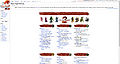
3-3 (Glastium, Zesbeer, A F K)
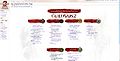
4-2 (Infinite, Venom, Cirdan, Redshift, Noxx, Aqua)
People, just pick. Still I support 3-3 since I purely love the balance in it. But since we all know artistic preferences are subjective, that's why we let the consensus say. ![]() Glastium | talk 20:09, 3 February 2012 (UTC)
Glastium | talk 20:09, 3 February 2012 (UTC)
- The issue I have with yours, Glastium, is the fact that resolutions *under* 800x600 are not supported equally. Reason why this is a point worth noting is the fact that the smartphones will be actively involved in the game. This could be solved by a mobile version of the wiki, and even if not, I'm 100% convinced that your design can be adjusted to support even those resolutions; it's just a matter of adding a little bit more code. No biggie!
- As for Zesbeer's, the issue there is the fact that it *only* supports 3 columns alongside one another; smaller resolutions are completely broken on that design. This too, is a simple alteration of code.
- As for my own design, I can not think of a way to have 3-wide display on certain resolutions that would otherwise display 4:2, without having two instances of the main page. However, I prefer 4:2 over 3:3 because I think it looks more aesthetically pleasing; an opinional issue. - Infinite - talk 21:05, 3 February 2012 (UTC)
- I vote 4-2. 3-3, while it does look decent...I think it looks almost too perfect.Cirdan 21:29, 3 February 2012 (UTC)
- 4-2 is artistically symmetric and not at all blocky like the 3-3 variant. Venom20 21:32, 3 February 2012 (UTC)
- It's not my design, Infi, and I know the issue on devices using lower resolution. What I did is just linking existing screenshot here and show my support to 3-3 design. My intention here is to try to get this issue solved, not trying to argue stuff on design aspect. Glastium | talk 22:04, 3 February 2012 (UTC)
- i.e. Time to debate is over. It's time to decide. Glastium | talk 22:07, 3 February 2012 (UTC)
- Sorry about that, I was under the impression the names in the gallery refered to designs of that type, not the opinions tied to the design. Sorry for the inconvenience. :) - Infinite - talk 22:33, 3 February 2012 (UTC)
- 4-2 (is this straight up 4-2 or straight 6 and adjusting to 4-2 on resolution?) without an incredibly strong preference. I am opting for the one that seems like it fills out the space more and has a little more flexibility in use and iteration. Redshift 23:31, 3 February 2012 (UTC)
- This is fully resolution-independant versus limited to 3:3 --> 6:0 (skipping 4:2 completely). Just to clear that up. :) - Infinite - talk 23:33, 3 February 2012 (UTC)
- @Infinite, I'm too lazy to look at the code so I'm asking if you can refresh my memory. This proposed design moves 1 column at a time to fit you resolution but bonds the last 2 together so it doesn't look strange, correct? For instance, depending on resolutions all of the following are available: 1-1-1-1-1-1, 2-2-2, 3-3, 4-2, and 6-0. Venom20 23:43, 3 February 2012 (UTC)
- That is perfectly correct, yes. And the other proposal skips the 4-2 set-up. That is the only actual difference, I do believe. - Infinite - talk 23:55, 3 February 2012 (UTC)
- Ok, that's what I thought. Venom20 23:56, 3 February 2012 (UTC)
- I like neither of them. They took to much space vertically. In fact, all the information in them can be fitted in one screen on most resolutions, yet both make you scroll in order to reach the bottom. Alfa-R 18:19, 4 February 2012 (UTC)
- Not only do I find the 3+3 too blocky and aesthetically displeasing (subjective opinion), but I also think it makes somewhat less sense, since there are in total 4 sections dedicated to links to various game topics, and it's pointless to separate them if not necessary. As such, I support the 6+0/4+2/... one. 19:13, 4 February 2012 (UTC)
- @Alfa-R; the idea is that both designs will be capable of displaying 6 in one row in the end, as long as resolution allows it. The difference is literally just the skipping of the 4-2 set-up (the 3-3 thumbnail) or not skipping it (the 4-2 thumbnail). They are not limited/fixed to those set-ups; they will both display 6 alongside one another on 1920px width and up. :) - Infinite - talk 19:42, 4 February 2012 (UTC)
- I totally understand that, and still I believe there should be a better way to do a resolution-independent design. Alfa-R 22:06, 4 February 2012 (UTC)
- I totally understand that, and still I believe there should be a better way to do a resolution-independent design. Alfa-R
- @Alfa-R; the idea is that both designs will be capable of displaying 6 in one row in the end, as long as resolution allows it. The difference is literally just the skipping of the 4-2 set-up (the 3-3 thumbnail) or not skipping it (the 4-2 thumbnail). They are not limited/fixed to those set-ups; they will both display 6 alongside one another on 1920px width and up. :) - Infinite - talk 19:42, 4 February 2012 (UTC)
- Not only do I find the 3+3 too blocky and aesthetically displeasing (subjective opinion), but I also think it makes somewhat less sense, since there are in total 4 sections dedicated to links to various game topics, and it's pointless to separate them if not necessary. As such, I support the 6+0/4+2/... one.
- I like neither of them. They took to much space vertically. In fact, all the information in them can be fitted in one screen on most resolutions, yet both make you scroll in order to reach the bottom. Alfa-R
- Ok, that's what I thought. Venom20
- That is perfectly correct, yes. And the other proposal skips the 4-2 set-up. That is the only actual difference, I do believe. - Infinite - talk 23:55, 3 February 2012 (UTC)
- @Infinite, I'm too lazy to look at the code so I'm asking if you can refresh my memory. This proposed design moves 1 column at a time to fit you resolution but bonds the last 2 together so it doesn't look strange, correct? For instance, depending on resolutions all of the following are available: 1-1-1-1-1-1, 2-2-2, 3-3, 4-2, and 6-0. Venom20
- This is fully resolution-independant versus limited to 3:3 --> 6:0 (skipping 4:2 completely). Just to clear that up. :) - Infinite - talk 23:33, 3 February 2012 (UTC)
- 4-2 (is this straight up 4-2 or straight 6 and adjusting to 4-2 on resolution?) without an incredibly strong preference. I am opting for the one that seems like it fills out the space more and has a little more flexibility in use and iteration. Redshift 23:31, 3 February 2012 (UTC)
- Sorry about that, I was under the impression the names in the gallery refered to designs of that type, not the opinions tied to the design. Sorry for the inconvenience. :) - Infinite - talk 22:33, 3 February 2012 (UTC)
- i.e. Time to debate is over. It's time to decide.
- It's not my design, Infi, and I know the issue on devices using lower resolution. What I did is just linking existing screenshot here and show my support to 3-3 design. My intention here is to try to get this issue solved, not trying to argue stuff on design aspect.
- 4-2 is artistically symmetric and not at all blocky like the 3-3 variant. Venom20
- I vote 4-2. 3-3, while it does look decent...I think it looks almost too perfect.Cirdan
(Reset indent) I also support the 4-2 split. <Restates what Infinite said about artistically symmetrical and all that.> Aqua (T|C) 23:49, 4 February 2012 (UTC)
- What Cirdan said. Except I like perfection. 3-3 imo A F K When Needed 00:03, 5 February 2012 (UTC)
- To be honest, i like them both :D Fabian 13:53, 5 February 2012 (UTC)
- I'll suggest we set a deadline on Feb. 12, 23:59 GMT. I'm looking forwards to seeing this settled down thus we can push this live. Glastium | talk 14:30, 5 February 2012 (UTC)
- No no, deadlines don't work. This should be a process, not a task that needs completion. Venom20 14:42, 5 February 2012 (UTC)
- Deadlines usually don't mesh well with the nature of wikis. If we set deadlines, then it effectively states that "no more changes will be accepted after this point" and we might lose a couple of discussions about things that would eventually lead to improvements as a result.
- On the subject of the 4-2/3-3 split: there is really no middle ground, and most people seem to like 4-2 (and those that like 3-3 seem to be somewhat ambivalent about it, with the possible exception of Zesbeer). So, I guess the better question to ask at this point is not "what do people think?". It is "is anyone adamantly opposed to 4-2 split, and why?".
- @Alfa-R: The design has just as much if not less whitespace than the currently designed main page. While it's a poor comparison, it still should be noted that the current one still has 10% on each side. Aqua (T|C) 15:54, 5 February 2012 (UTC)
- No no, deadlines don't work. This should be a process, not a task that needs completion. Venom20
- I'll suggest we set a deadline on Feb. 12, 23:59 GMT. I'm looking forwards to seeing this settled down thus we can push this live.
- To be honest, i like them both :D Fabian 13:53, 5 February 2012 (UTC)
Text font
Would it be feasible to replace the font currently used at the six headers by the font ArenaNet has used in its official videos, such as seen here? I'm not sure how resolution friendly it would be, but maybe that would improve a bit how the headers look. Erasculio 01:10, 6 February 2012 (UTC)
- Without the actual font available to us, I could follow the positioning guidelines as much as possible (but it won't be 100% identical; there will be exceptions in the font, but we lack actual examples of these exceptions). Maybe you've seen them before, but I applied the same standards to my characters' names files. Do you reckon trying it for a single section to preview the concept would suffice? - Infinite - talk 08:57, 6 February 2012 (UTC)
- A man can dream. A F K When Needed 15:46, 6 February 2012 (UTC)
- I have taken the images of the font that Alfa-R created and reversed colours in the images to make them white letters. I have now added them to the current rendition of the edit page. We'll see how that flies. Venom20 20:28, 11 February 2012 (UTC)
- You know, I can update them with alpha-channel white versions if you want to, I did those today. Alfa-R 20:32, 11 February 2012 (UTC)
- You know, I can update them with alpha-channel white versions if you want to, I did those today. Alfa-R
- I have taken the images of the font that Alfa-R created and reversed colours in the images to make them white letters. I have now added them to the current rendition of the edit page. We'll see how that flies. Venom20
- A man can dream.
A different approach

I really don't like 2 things about the current main page proposal: heavy high-contrast red brushstrokes, looking (imo, of course) alien on an otherwise light page; and fixed heights of the navigation blocks, which makes me scroll to the bottom in order to reach the low-most lines. That's why I've embodied my vision here of main page and want to share it with you. It should be more flexible, as the height of the blocks varies depending on the screen resolution. It's a 1st draft, so feel free to comment on it. I'm also planning to change the block headers' font to the official pen-style one. Alfa-R ![]() 18:40, 7 February 2012 (UTC)
18:40, 7 February 2012 (UTC)
- In my opinion, this is brilliant. But people may argue there are too many texts compared to the lack of images. May look like a wall of texts. In general, I think this one is better; the red paintstrokes are kind of fainting for me. Glastium | talk 19:58, 7 February 2012 (UTC)
- I can tell from the icons that you spent a great deal of time on this; I think they're a definite improvement over the current ones. I wonder how they'd look on the current editcopy, perhaps with circular borders.
- I'm interested in your comment on how the brushstrokes are in sharp contrast to the rest of the page; however I feel your version went in the wrong direction, for me personally at least. I like the brushstrokes, and if the rest of the page could somehow feature imagery more prominently I'd like that a lot, however that's made difficult by the attempt at a "one size fits all" approach. I'm looking forward to future drafts! A F K When Needed 20:41, 7 February 2012 (UTC)
- I will leave a better comment in the near future, but I just wanted to point out that I need to scroll on this page. Just pointing it out as this seems to be a counter to your goal. Venom20 21:31, 7 February 2012 (UTC)
- this is a interesting approach, i like the brush strokes but wonder if you could use them in this design but turn them a gray color.- Zesbeer 22:40, 7 February 2012 (UTC)
- I feel like the paintstrokes you dislike so much add much needed structure to the main page; the lack of any strong borders anywhere makes it appear as one big WoT (it looks like a WoT on 1920; it gets far worse on smaller resolutions...). Also, the lack of significant "framing" whitespace also kind of throws me a bit. :/ (@Zesbeer: I'll upload some grey-scale versions of Infi's paintstrokes in a little.) Aqua (T|C) 00:31, 8 February 2012 (UTC)
- this is a interesting approach, i like the brush strokes but wonder if you could use them in this design but turn them a gray color.-
- I will leave a better comment in the near future, but I just wanted to point out that I need to scroll on this page. Just pointing it out as this seems to be a counter to your goal. Venom20


- IMO without the paintstrokes, the page looks drab and dull when viewed using a current gaming resolution (see Fig 2). It looks alright while viewed on an older computer (or lower resolution) because everything is cramped together (see Fig 3), but when it gets spaced out it is as if the entire page is whitespace. Also note in Fig 3 the need for vertical scrolling on both designs. Again, I mean no disrespect, the design is nice, but I like the colour-aspect (the colour too, but that is perhaps a different conversation) of the current design to break up the page. I will say, however, that I do enjoy the new icons. Never seemed right to me to have the current race icons. The icons will not mean anything to anyone (similar reason for removing profession icons). So why not add icons for flair that mean nothing, just pretty pictures that seem to fit with the heading in the art-style of GW2. Venom20 01:08, 8 February 2012 (UTC)
- they actually mean something and are metaphors for blocks they are in (a young sprout for basics, 2 people opposing each other for pvp).
- on scrolling: it will always scroll on smaller resolutions as the amount of text to display is high. when talking about scrolling I meant that starting from a certain resolution (particularly when 4-2 layout kicks in and till 6-0) scrolling can be avoided by utilizing an ability of blocks have variable height and width. Also I've restricted max width of the table, so it won't be so empty-looking on hd displays.
- @all thanks for your comments! Alfa-R 05:40, 8 February 2012 (UTC)
- IMO without the paintstrokes, the page looks drab and dull when viewed using a current gaming resolution (see Fig 2). It looks alright while viewed on an older computer (or lower resolution) because everything is cramped together (see Fig 3), but when it gets spaced out it is as if the entire page is whitespace. Also note in Fig 3 the need for vertical scrolling on both designs. Again, I mean no disrespect, the design is nice, but I like the colour-aspect (the colour too, but that is perhaps a different conversation) of the current design to break up the page. I will say, however, that I do enjoy the new icons. Never seemed right to me to have the current race icons. The icons will not mean anything to anyone (similar reason for removing profession icons). So why not add icons for flair that mean nothing, just pretty pictures that seem to fit with the heading in the art-style of GW2. Venom20

(Reset indent) So i've tried to make a not-so-plain-and-boring variant of my main page, you can see an image of it at the left, here is an initial draft (disregard a golem shoulder on the top). Also, I've updated the 1st one a bit, so feel free to check it out and comment on it. Alfa-R ![]() 17:22, 8 February 2012 (UTC)
17:22, 8 February 2012 (UTC)
- I like what you have there, and I'm torn between the two variants; however, I have suggestions for both. Regarding the first linked variant, I would suggest resizing the background image so that the edges aren't cut off. I'm not liking the sharp edge at the top left. As for the second one, the transition from an artistic background to plain white is fine, but when it goes from white to the background image, it's too sharp of an edge. Maybe if you use the "painterly strokes" provided in that asset kit to implement a less jagged transition, it would look better. The icons/section headers look outstanding.-- Shew
- @Alfa-R your second option seems to busy i would love to see what your first design looks like with the gray scale swatches so let me know when you have those uploaded aqua. - Zesbeer 02:34, 9 February 2012 (UTC)
- I've faded bg image a bit, so it won't look so busy, also note pls that the background can be easily changed - removed even - and shouldn't be a problem, what i'm really interested in is your opinion on a parchment block of a second design. It varies in width so that it takes a whole screen on smaller resolutions, but is limited in max width so that it won't look too empty and broad spread on hd displays.
- On the paintstrokes: There is a major problem with them: they have a fixed width. While it's not a big deal on large resolutions, smaller ones suffer severely from it. Here are two examples of a main page as seen on a 800x600 display (UPD: i've uploaded 1024x768 screens, see discussion below):
- @Alfa-R your second option seems to busy i would love to see what your first design looks like with the gray scale swatches so let me know when you have those uploaded aqua. -


- I've made headers that break into two lines on smaller resolutions, making the whole page fit; unfortunately, this approach won't work with the ufixed width header backgrounds. Alfa-R 07:13, 9 February 2012 (UTC)
- 800x600?! Wow, yeah, there should be a minimum resolution that we care about, and I'm fairly certain that 800x600 is entirely too low. I thought we were setting *x800 as a minimum boundary. Venom20 09:52, 9 February 2012 (UTC)
- I believe we were talking about 800x600 in a New layout part2 section above. A page should work on low resolutions, even if people aren't using low-res displays anymore. The reason is that a browser window has a variable width that can be ajusted by users, so if a user wants to open a wiki in a smaller window it should still display properly. I, for example, almost never use browser in a full-screen mode, keeping it at about 900 px wide (it's much more comfortable to read for me that way) and would really hate to see 1 or 2 columns with a lot of whitespace instead of usefull information. And then again, there are mobile devices, like tablets. Alfa-R 10:44, 9 February 2012 (UTC)
- Well in that case, yes, I think the means in which it collapses is more aesthetically pleasing than the current version's.-- Shew 14:14, 9 February 2012 (UTC)
- I like the variants of this version. It is cleaner and I like the use of the official font. Plus it arranges better on my tablet. :) -- aspectacle
 16:53, 9 February 2012 (UTC)
- I like the variants of this version. It is cleaner and I like the use of the official font. Plus it arranges better on my tablet. :) -- aspectacle
- Well in that case, yes, I think the means in which it collapses is more aesthetically pleasing than the current version's.-- Shew 14:14, 9 February 2012 (UTC)
- I believe we were talking about 800x600 in a New layout part2 section above. A page should work on low resolutions, even if people aren't using low-res displays anymore. The reason is that a browser window has a variable width that can be ajusted by users, so if a user wants to open a wiki in a smaller window it should still display properly. I, for example, almost never use browser in a full-screen mode, keeping it at about 900 px wide (it's much more comfortable to read for me that way) and would really hate to see 1 or 2 columns with a lot of whitespace instead of usefull information. And then again, there are mobile devices, like tablets. Alfa-R
- Beg your pardon, but; with Vector's skin being less wide in terms of wiki navigation, how does it not manage 2 sections alongside one another on the paint stroke design where monobook displays them per 2? Isn't that the current editcopy? That, or something else is different for some browsers or vector, entirely. I just feel like the comparison is being put in a bad daylight here, where the issue should not exist as is portrayed. - Infinite - talk 17:09, 9 February 2012 (UTC)
- I have an old monitor at work and that's how it shown itself there, and that's where a screenshot is from. I've tried to switch to 800x600 at home and indeed, it fits 2 columns perfectly. Don't know the reason. I believe it's because of the browser, maybe it's width was less then 800 there because of a window being opened in a non-maximized mode (you know, when a window is manually stretched to look quite full-screen but have its borderes rendered and probably extra space on its sides)? Anyway, I believe that a web-page layout should work for all reasonable (the one that can be used by its visitors) widths - including non-standard ones; ergo, if a problem persists for like 780px wide window, it should still be approached. Also, excessive whitespace isn't exclusive to the 800x600 resolution and still exists with certain resolutions because of the fixed column width. I've updated examples with 1024x768 variant, you can check it out yourself. Alfa-R 18:24, 9 February 2012 (UTC)
- Also, iPad screens. Alfa-R 18:30, 9 February 2012 (UTC)
- I have an old monitor at work and that's how it shown itself there, and that's where a screenshot is from. I've tried to switch to 800x600 at home and indeed, it fits 2 columns perfectly. Don't know the reason. I believe it's because of the browser, maybe it's width was less then 800 there because of a window being opened in a non-maximized mode (you know, when a window is manually stretched to look quite full-screen but have its borderes rendered and probably extra space on its sides)? Anyway, I believe that a web-page layout should work for all reasonable (the one that can be used by its visitors) widths - including non-standard ones; ergo, if a problem persists for like 780px wide window, it should still be approached. Also, excessive whitespace isn't exclusive to the 800x600 resolution and still exists with certain resolutions because of the fixed column width. I've updated examples with 1024x768 variant, you can check it out yourself. Alfa-R
- 800x600?! Wow, yeah, there should be a minimum resolution that we care about, and I'm fairly certain that 800x600 is entirely too low. I thought we were setting *x800 as a minimum boundary. Venom20
- I've made headers that break into two lines on smaller resolutions, making the whole page fit; unfortunately, this approach won't work with the ufixed width header backgrounds. Alfa-R


- Alpha, which font did you use for your headers? It looks a lot like the font often used by ArenaNet. Erasculio 22:03, 9 February 2012 (UTC)
- I'd probably be interested in Alfa's Main Page design if the variant of it didn't completely blow the original one out of the water. I'm torn between the current edit copy (6x1 = win) and Alfa v2.0.
- (Though I'd give anything for any of the three to replace the current main page, which for some reason, is still there.) A F K When Needed 22:22, 9 February 2012 (UTC)
- Is there any way to have some sort of faint backing for the headers without returning to the resolution/sizing issues? I agree that the current versions are just a little too 'text-y' for my tastes, and just some sort of delineation for the headers would help with that. I do like the icons (and their relations) and the font; the font is especially a big step in the right direction in my view. Thanks for the mock-up! Redshift 02:05, 10 February 2012 (UTC)
- @Erasculio I've used that very same font. I just took screens of the official site and used the letters presented there to manually arrange them into words.
- @Redshift I have an idea on how to do that, but it will take some time. I'll try to implement it on the weekend most probably Alfa-R 07:03, 10 February 2012 (UTC)
- So i've added paintstroke backgrounds to the 1st of my variants of main page. They work both with wide and narrow page layouts, but it turned out worse then I'd expected, and I still think that a clear white page isn't that much a problem. I've also updated a 2nd variant, it now has a scalable background. Alfa-R 10:15, 11 February 2012 (UTC)
- if you added a some with some veration i think it would look even better but it adds that something that it was missing before imho also add it to the welcome banner.- Zesbeer 10:19, 11 February 2012 (UTC)
- if you added a some with some veration i think it would look even better but it adds that something that it was missing before imho also add it to the welcome banner.-
- So i've added paintstroke backgrounds to the 1st of my variants of main page. They work both with wide and narrow page layouts, but it turned out worse then I'd expected, and I still think that a clear white page isn't that much a problem. I've also updated a 2nd variant, it now has a scalable background. Alfa-R
- Is there any way to have some sort of faint backing for the headers without returning to the resolution/sizing issues? I agree that the current versions are just a little too 'text-y' for my tastes, and just some sort of delineation for the headers would help with that. I do like the icons (and their relations) and the font; the font is especially a big step in the right direction in my view. Thanks for the mock-up! Redshift 02:05, 10 February 2012 (UTC)
- Alpha, which font did you use for your headers? It looks a lot like the font often used by ArenaNet. Erasculio 22:03, 9 February 2012 (UTC)
Alfa-R did a great job... I think the first version with [File:User_Alfa-R_MainPage_Logo.png] as background, and some border for the first line will be the best option. also we need to consider how to load titles font for free use in gw2w. -- Itay Alon • Talk 12:42, 11 February 2012 (UTC)
- @Alfa-R main page + cleanup: User:Itay_Alon/Main_Page_2 --The preceding unsigned comment was added by User:Itay Alon (talk).
- Errr... guys, I really like the brushstrokes on the editcopy for a few reasons. The combination of the bright colours livening up the page, the similarity to the official logo, the blood-like edges and overall look is amazing. Did I mention how detailed they are? The current brushstrokes (Itay & Alfa) seem to be there "so we have brushstrokes". Not only do they inherent ~none of what the original brushstrokes brought to the page, but having brushstrokes just for the sake of it is a little pointless.
- I don't like being blunt, but you're capable of amazing work (I've seen this from v2.0, which led me to your talkpage in awe), and I really don't think that the other variant is currently a good investment of your time. Looking absolutely incredible > Having brushstrokes. I'm honestly sorry if this comes across as curt or ungrateful, but to be honest I just don't understand why the new brushstrokes are there.
- I really do hope I'm not discouraging your overall efforts at creating an amazing main page, but I want to step in now and give my $0.02 before you spend even more time on it only to turn around and say "hey let's go with v2.0 instead!" A F K When Needed 16:33, 11 February 2012 (UTC)
Version 2 + cleanup: User:Itay_Alon/Main_Page_2a -- Itay Alon • Talk 17:07, 11 February 2012 (UTC)
- @AFK That's pretty close to what I think actually. While I personally don't like red strokes at all, I agree that they help to structure the page (I also think that icons with text do that pretty well though), and those grey strokes look totally dumb, but unfortunately I can't think of a way to do dark variable width strokes with light text, like in a current editcopy design. So I've just tried to do light strokes/dark font, and it turned out awfull, as I said above. I've reverted - with minor edits - to the original and also made a new copy of a page with strokes in case I'll find out a totally different way to do it.
- @Itay (and probably Zesbeer, who asks for the same thing) Why the hell a border/background for the greeting? While I agree that strokes may play an important role in structuring main page design, welcome message don't need it at all. It's just some text that a person reads when he 1st visits the wiki, and wants to ignore later, why highlighting it, and why in such a manner? Alfa-R 17:46, 11 February 2012 (UTC)
- (Edit conflict) Stupid edit conflict just lost me a wall of text, so I'll try again. The "paint strokes" add a splash of colour and therefore, IMO, are needed. The grey ones are just horrible and don't really do anything. The paint strokes should vary in design. If you use the same stroke for each one it just looks like a bad copy & paste job. It is possible to use the same stroke twice, but they should not be beside each other in that case. I have no idea what is going on in this variant. It looks like someone tried to add a background image, then failed and was too lazy to remove it. It's cut off at the top and bottom. Just horrible, IMO. I like the idea of the tanned background at the top, but why does it not extend to the bottom? It's just left white. If we were to use that idea, a bottom image should be added to the bottom right to add the same effect. This one lacks colour at every turn and just looks like a boring wall of text. While I don't suggest that the current edit copy strokes be added, we should use the idea of colour splash to add some flair to the main page. After all, it is the page that is viewed the most. Venom20 18:00, 11 February 2012 (UTC)
- I will retract my background comment on this one. An IP corrected a div issue and now it looks better. Not my style, but nice now nonetheless. The paint strokes need not be variable. A minimum width should be sufficient. Due to the fact that the columns aren't defined strongly, the tops of the columns do not need to extend to the end of the columns.something like this should be sufficient. It doesn't need to be 290px in width, I was just too lazy to adjust the code when I copied and pasted. Venom20 18:38, 11 February 2012 (UTC)
- I will retract my background comment on this one. An IP corrected a div issue and now it looks better. Not my style, but nice now nonetheless. The paint strokes need not be variable. A minimum width should be sufficient. Due to the fact that the columns aren't defined strongly, the tops of the columns do not need to extend to the end of the columns.something like this should be sufficient. It doesn't need to be 290px in width, I was just too lazy to adjust the code when I copied and pasted. Venom20
- (Edit conflict) Stupid edit conflict just lost me a wall of text, so I'll try again. The "paint strokes" add a splash of colour and therefore, IMO, are needed. The grey ones are just horrible and don't really do anything. The paint strokes should vary in design. If you use the same stroke for each one it just looks like a bad copy & paste job. It is possible to use the same stroke twice, but they should not be beside each other in that case. I have no idea what is going on in this variant. It looks like someone tried to add a background image, then failed and was too lazy to remove it. It's cut off at the top and bottom. Just horrible, IMO. I like the idea of the tanned background at the top, but why does it not extend to the bottom? It's just left white. If we were to use that idea, a bottom image should be added to the bottom right to add the same effect. This one lacks colour at every turn and just looks like a boring wall of text. While I don't suggest that the current edit copy strokes be added, we should use the idea of colour splash to add some flair to the main page. After all, it is the page that is viewed the most. Venom20

- An IP was me actually. I've just made margins show on small resolutions, it always showed on big ones though and it looks like on a picture to the right. On the red strokes: I believe that using them and current icons is never gonna look good, as they are both very vivid and are competing with each other. Alfa-R 18:56, 11 February 2012 (UTC)
- Well if it is an either/or situation, then I will side with the current proposal. While I like the icons that you have used, I enjoy the paint strokes more. Venom20 20:03, 11 February 2012 (UTC)
- Well if it is an either/or situation, then I will side with the current proposal. While I like the icons that you have used, I enjoy the paint strokes more. Venom20
- An IP was me actually. I've just made margins show on small resolutions, it always showed on big ones though and it looks like on a picture to the right. On the red strokes: I believe that using them and current icons is never gonna look good, as they are both very vivid and are competing with each other. Alfa-R
(Reset indent) I would also like to comment on the whole "plain wall of text" thing. First of all, this is wiki, a text-based corpus, and it's absolutely normal when a page on wiki - including it's main page - presents information with a lot of text. Second, I strongly believe that on any site the main page design should be in accord with the rest of its pages, that's why a very minimalistic main page is my choice. Third, wiki should be in harmony with the game site, and it's another reason why I'm against the red strokes. GW2 site is quite black-and-white, actually, sure it has big, splashy pictures and flash-objects - something we can't afford here - and it adds a lot there, but at its core it's just formatted text with black handwritten-esque headers on a white background. And finally, red is an extremely dominant color attracting your eye even when it is not supposed to. Try to look for something on the current editcopy. I, e.g., when examining editcopy once found myself looking not though the links, but shifting my eyes from one header to another. Headers themselves aren't links to some important pages, they are just a way to group main page content, and thus should be (at least a little) more subtle. Alfa-R ![]() 20:26, 11 February 2012 (UTC)
20:26, 11 February 2012 (UTC)

- Firstly, this day in age walls of text are a little stale on the internet. A little artistic demonstration on a main page will not take away from the content. In regards to the "rest of the pages" on the wiki, many pages have the new artistic infoboxes. Sure they are more linear in design, but they are in fact not just boxes of text. You'll also notice that on some pages there is also a table for tiers, which again add colour and break up text. I'm unsure if you have updated your .css to view Aqua's new nav box proposals, but they are also full of colours and are similar to the current infobox designs further diminishing the text on wiki pages. In short, many of the pages of this wiki are incorporating various colours and "objects" to break up a wall of text, that frankly could have been written in the 90's. Of course everyone is entitled to opinions, so please do not take anything that I say personally. I'm sure many people also prefer a minimalistic approach. I speak in terms of generalizations. You have done a fantastic job creating the page. In regards to the wiki relating to gw2.com, please see the thumb on the right. Although we cannot create flash-like objects for the wiki, there is no reason that our main page should not be colourful and flashy in it's own static way. In regards to the red, it does draw the eye to the headers, which IMO isn't a bad thing as it allows you to find the section you are looking for. That being said, I may agree that they are quite vibrant, but this can easily be toned down slightly. As of this entry to the page, I have decided to take a daylong break from participating in this discussion so as to not appear hostile. Cheers. Venom20 20:55, 11 February 2012 (UTC)
To clear: I didn't design nothing, I just clean the code (CSS) of @Alfa-R great job..-- Itay Alon • Talk 22:49, 11 February 2012 (UTC)
(Reset indent) @Alfa-R no one is personally attacking you or ur design so clam down, on the subject of paint strokes if you add some verity to them it would look fine also just the text header with out a paint stroke background looks odd. -![]() Zesbeer 00:58, 12 February 2012 (UTC)
Zesbeer 00:58, 12 February 2012 (UTC)
- I must say: I agree with @Alfa-R: the red brushstrokes in the current Main Page/editcopy are to shout. The eye focus to much time on the titles. I agree we can make @Alfa-R's design much better and update it, but seriously, you cannot say "no" only because title backgrounds! I learn web design, and his (@Alfa-R's) design is really more usability. -- Itay Alon • Talk 12:27, 12 February 2012 (UTC)
- Background images take awful long to load on mobile connections. Of all the suggestions here shown in thumbs I only fancy Alfa-R's first suggestion with emphasis on link lists, though it could use little background color on titles, as current main page has it, but I'm against very strong red strokes. If I want flashy wiki pages and long load times, I head over to Wikia sites. IMO, GWW and GW2W are some of the last few refuges of traditional, plain and not-awkward-design wikis, and I'd hate to see that go away. Mediggo 12:49, 12 February 2012 (UTC)
- While I understand the concerns about load and going overboard, I still think that there's definitely a happy medium that still needs to be established. Though wikis might be about documentation, we are documenting what is essentially interaction with a modern visual medium, and so do and should reflect that. I feel that as what is in a way an extension of the game, visual continuity is also a not-insignificant objective when starting with the design. Lastly, visuals are useful in making the wiki more useful in terms of clarity and navigation--text-heavy approaches are very easily passed through, and a little visual assistance can go a long way. I'd like to be clear that I'm not advocating splashing anything across everything, but those are sort of my guiding principles when I'm voicing my opinion in any of the design discussions.
- For the current versions, I wonder: 1) what if the background/framing parchment were removed and the 'column border'-type image used in the Aqua/Infi version was substituted in? and 2) is there a way to incorporate a red splash like that of the official site without breaking the design? Would the 100x700 welcome image fit in? Redshift 13:20, 12 February 2012 (UTC)
- ...@Itay: Thank you. I actually think this one is rather balanced and clean, and appreciate your putting it together (with my additional thanks to Alfa, of course.) Redshift 14:53, 12 February 2012 (UTC)
- I'm really not a fan of the border around the header. Why not just put this below the header for separation?-- Shew 20:23, 12 February 2012 (UTC)
- wait question can we fit aqua's main page into how alfa-r's suggestion? it seems silly to me that we are having the exact same conversations we already had and a majority of us liked aqua's design.- Zesbeer 20:33, 12 February 2012 (UTC)
- Aqua's suggestion was dropped about two weeks ago. It paved way for mine which in turn led to this section, where it was compared to Alfa's very interesting designs. The mechanics of my suggestion are now incorporated in Itay's rendition of one of Alfa's proposals, which basically combines the best of all worlds so far. - Infinite - talk 20:36, 12 February 2012 (UTC)
- @Shew, do you mean something like this?: [[User:Itay Alon/Main Page 2b. -- Itay Alon • Talk 21:12, 12 February 2012 (UTC)
- @infinite i said DESIGN not functionality meaning the red pant swatches ect. not how its coded. learn to read please.- Zesbeer 21:40, 12 February 2012 (UTC)
- @Itay: Nah, I'm talking about the header with the welcome message. The border is too solid. I would recommend using the image I linked below the welcome message without having a border and without the background. Err...it would need to be a little longer than the image I linked.-- Shew 21:44, 12 February 2012 (UTC)
- @infinite i said DESIGN not functionality meaning the red pant swatches ect. not how its coded. learn to read please.-
- @Shew, do you mean something like this?: [[User:Itay Alon/Main Page 2b. -- Itay Alon • Talk 21:12, 12 February 2012 (UTC)
- Aqua's suggestion was dropped about two weeks ago. It paved way for mine which in turn led to this section, where it was compared to Alfa's very interesting designs. The mechanics of my suggestion are now incorporated in Itay's rendition of one of Alfa's proposals, which basically combines the best of all worlds so far. - Infinite - talk 20:36, 12 February 2012 (UTC)
- wait question can we fit aqua's main page into how alfa-r's suggestion? it seems silly to me that we are having the exact same conversations we already had and a majority of us liked aqua's design.-
- I'm really not a fan of the border around the header. Why not just put this below the header for separation?-- Shew 20:23, 12 February 2012 (UTC)
- Background images take awful long to load on mobile connections. Of all the suggestions here shown in thumbs I only fancy Alfa-R's first suggestion with emphasis on link lists, though it could use little background color on titles, as current main page has it, but I'm against very strong red strokes. If I want flashy wiki pages and long load times, I head over to Wikia sites. IMO, GWW and GW2W are some of the last few refuges of traditional, plain and not-awkward-design wikis, and I'd hate to see that go away. Mediggo 12:49, 12 February 2012 (UTC)
(Reset indent) Thanks again for your comments everyone, and sorry if I sounded agressive last time, I totally didn't mean that. I've made some improvements on my v 1.0, based on Itay's work. it should now be capable of displaying either 3-3 or 6-0 layout, but still using variable widths (although to a much lesser extent). Works fine with resolutions above 1024x768 (including iPad), but breaks a little on 800x600, but I guess it's fixable. Alfa-R ![]() 21:52, 12 February 2012 (UTC)
21:52, 12 February 2012 (UTC)
- @Shew: now? -- Itay Alon • Talk 22:26, 12 February 2012 (UTC)
- @Zesbeer, try to be less hostile please. This should be a pleasant conversation between members of the community. I'm fairly certain that Infinite can read. I have one question, would it be possible to push the current edit copy live while we have this conversation? The current page (while it does not have the consensus on style) does have consensus on content. That should actually be our primary goal, to push the correct content through. Venom20 23:33, 12 February 2012 (UTC)
- @Itay: Stretching the image really does ruin the effect. Here's a longer version from the website: [5]. The spacing between the header and dotted line in Alfa-R's recently posted version is a little better than the spacing in your version. And in no way did I mean for that to sound so condescending.-- Shew 00:21, 13 February 2012 (UTC)
- @Shew: I changed the image (with opacity:0.5). about spacing- it's the last change that we'll make, can take a long time and everyone has is own opinion. -- Itay Alon • Talk 07:01, 13 February 2012 (UTC)
- @Venom20: Not only the content is matter, but also how you presenting him. -- Itay Alon • Talk 10:58, 13 February 2012 (UTC)
- We can't postpone the new content either way so here's a diff I am going to request being pushed live whilst we discuss the new designs some more. - Infinite - talk 11:39, 13 February 2012 (UTC)
- @Infinite I agree with that proposal, but I think it'll be better to move news to the top.
- @everyone I've split my v 1.0 into two: the 1st is a 3-3 or 6-0 capable but has very limited column widths, the 3rd (my 2nd is a parchment-like design with an asura bg) is always a 3-3. I've also made backgroung of v 3.0 brighter for higher resolutions, so check it out. Alfa-R 16:09, 13 February 2012 (UTC)
- We can't postpone the new content either way so here's a diff I am going to request being pushed live whilst we discuss the new designs some more. - Infinite - talk 11:39, 13 February 2012 (UTC)
- @Itay: Stretching the image really does ruin the effect. Here's a longer version from the website: [5]. The spacing between the header and dotted line in Alfa-R's recently posted version is a little better than the spacing in your version. And in no way did I mean for that to sound so condescending.-- Shew 00:21, 13 February 2012 (UTC)
- @Zesbeer, try to be less hostile please. This should be a pleasant conversation between members of the community. I'm fairly certain that Infinite can read. I have one question, would it be possible to push the current edit copy live while we have this conversation? The current page (while it does not have the consensus on style) does have consensus on content. That should actually be our primary goal, to push the correct content through. Venom20

(Reset indent) I would like to draw you attention to v 3.0 once more. I think it takes into account most requests - primarily it's brighter and doesn't spread to much horizontally - while still having its core advantage: it has both width and height variable, making it work well with resolutions both small and big. Alfa-R ![]() 19:46, 13 February 2012 (UTC)
19:46, 13 February 2012 (UTC)
- I really like that design Alfa. -Cirdan 21:31, 13 February 2012 (UTC)
- I second that and I think we should actually push that design live. - Infinite - talk 22:02, 13 February 2012 (UTC)
- I think a main concern of mine is that it lacks style, some may even say it's lacking a certain panache. The paint strokes can be a bit much in the current design, as discussed. I would like to suggest something like this and this. I've only copied and pasted 2 sections of code (borrowing from both Alfa's design and Aqua/Infi's designs). It's simple, no background images and not vibrant as it uses a black splash against the white background. While I agree that the way I placed the icons may look messy, because I was rushed. Thoughts? Venom20 23:12, 13 February 2012 (UTC)
- While they look pretty cool, I think your paint strokes deviate too much from the GW2 aesthetic. I really don't think of GW2 when I see them. The GW2 paint strokes should be carefree/spirited, but the symmetry/contrast in size in yours detracts from that goal. I think the way Alfa-R has the icons next to the headers in his version is a good compromise between too simple and too much. They add much-needed color variance to the page without being too stark.-- Shew 23:25, 13 February 2012 (UTC)
- It should be noted that I took one of the strokes from the GW2 asset kit, duplicated it, flipped it, and paired them end to end. So technically it's 98% GW2 and 2% geometrical translation. Venom20 23:29, 13 February 2012 (UTC)
- I think that affects it a lot. Just sayin'. There are some things you could do to them that wouldn't affect them much, like blurring or flipping. Minor things. But when I see GW2 art, especially the paint strokes/cutscene art, I see that "handcrafted and artisanal" style that the artists went for, and I think that the way you manipulated the paint stroke took away that feeling. At least for me, it did.-- Shew 23:48, 13 February 2012 (UTC)
- Another change on my v 3.0 (which is now main main proposal). It now has artistic brushstroke borders around main block. Alfa-R 16:41, 14 February 2012 (UTC)
- Another change on my v 3.0 (which is now main main proposal). It now has artistic brushstroke borders around main block. Alfa-R
- I think that affects it a lot. Just sayin'. There are some things you could do to them that wouldn't affect them much, like blurring or flipping. Minor things. But when I see GW2 art, especially the paint strokes/cutscene art, I see that "handcrafted and artisanal" style that the artists went for, and I think that the way you manipulated the paint stroke took away that feeling. At least for me, it did.-- Shew 23:48, 13 February 2012 (UTC)
- It should be noted that I took one of the strokes from the GW2 asset kit, duplicated it, flipped it, and paired them end to end. So technically it's 98% GW2 and 2% geometrical translation. Venom20
- While they look pretty cool, I think your paint strokes deviate too much from the GW2 aesthetic. I really don't think of GW2 when I see them. The GW2 paint strokes should be carefree/spirited, but the symmetry/contrast in size in yours detracts from that goal. I think the way Alfa-R has the icons next to the headers in his version is a good compromise between too simple and too much. They add much-needed color variance to the page without being too stark.-- Shew 23:25, 13 February 2012 (UTC)
- I think a main concern of mine is that it lacks style, some may even say it's lacking a certain panache. The paint strokes can be a bit much in the current design, as discussed. I would like to suggest something like this and this. I've only copied and pasted 2 sections of code (borrowing from both Alfa's design and Aqua/Infi's designs). It's simple, no background images and not vibrant as it uses a black splash against the white background. While I agree that the way I placed the icons may look messy, because I was rushed. Thoughts? Venom20
- I second that and I think we should actually push that design live. - Infinite - talk 22:02, 13 February 2012 (UTC)
(Reset indent) I've made a v 4.0 Alfa-R ![]() 19:44, 14 February 2012 (UTC)
19:44, 14 February 2012 (UTC)
- This version looks very nice, but the version 2 has something I'm missing in the later versions. a) the background picture shows something not only left and right but also at top and bottom and b) there is also some colored background behind the content table. For me this is better than the white background in your later approaches. But the paintings are actally nicer in this version :) Balwin 17:23, 15 February 2012 (UTC)
(Reset indent) An update to v 3.0. Now with paint strokes! I will update icons with transparent borders later, but I hope you'll get the idea as it is now. Alfa-R ![]() 16:33, 21 February 2012 (UTC)
16:33, 21 February 2012 (UTC)
Perhaps another interesting concept
...Which is nowhere near functional at this time, but I'd like to share a preview of it of what I envision it to be. The actual design can be found in my [[User:Infinite/Sandbox/Main Page2|'''sandbox''']].
Eventually, it should look like this, with adjusted sections (and a clean code) to display it without any problems on smaller resolutions. Is it worth it to work out this concept into functional code and if so, anyone able to offer some help with that? - Infinite - talk 15:23, 13 February 2012 (UTC)
- The text is too small. Also I think we need to choose something or it will take forever... -- Itay Alon • Talk 18:27, 13 February 2012 (UTC)
- The welcome message is too big/spaced out. The focus should be on the sections, but I feel like it's on the welcome message. The section text's being too small contributes to this as well. Other than the that, I love the overall layout. It looks very much like the official website, but I also like Alfa-R's use of the icons next to each section title (they add some color to the page), and if you were to add those and adjust the welcome message, that would be the main page I'd prefer. EDIT: Also, I don't think the backgrounds for individual sections are necessary.-- Shew 18:41, 13 February 2012 (UTC)
- It's funny, but I think that dropping section bgs and adding icons will almost turn it into what i originally proposed (3-3 blocks w/ icons on a white bg, all in grey/blue/white).
- Now on topic. In my opinion, the major issues with this layout at the moment are as follow. Welcome message is to ragged (it's 'cause letters all have different baselines) and big, while main content is way too small. Also sections vary in width and height, making headers jump. Plus it needs a fix for a lower resolutions, 'cause now bg images to the left and right are to bright and also blocks tend to clump on each other. Alfa-R 19:22, 13 February 2012 (UTC)
- The welcome message is too big/spaced out. The focus should be on the sections, but I feel like it's on the welcome message. The section text's being too small contributes to this as well. Other than the that, I love the overall layout. It looks very much like the official website, but I also like Alfa-R's use of the icons next to each section title (they add some color to the page), and if you were to add those and adjust the welcome message, that would be the main page I'd prefer. EDIT: Also, I don't think the backgrounds for individual sections are necessary.-- Shew 18:41, 13 February 2012 (UTC)
@Infinite your concept is nice (if we must have it i like the welcome banner on urs).-![]() Zesbeer 01:09, 14 February 2012 (UTC)
Zesbeer 01:09, 14 February 2012 (UTC)
for the love of the 6 can we finish this?
honestly i am at the point of not caring any more this discussion has gone on for 2 months now and at one point we were ok with a design. so can someone make a gallery and then let us decide (I would my self but i have no idea which versions alfa-r wants) any how lets decide and push live a final product i am tired of what we have now.-![]() Zesbeer 01:02, 14 February 2012 (UTC)
Zesbeer 01:02, 14 February 2012 (UTC)
- Two months is nothing... Infinite and I have been talking, and we suggested that we push the current editcopy live and then figure it out from there, with all designs. The current main page is abysmal; let's make a change now and then a better one when we figure all of our collective stuff. Aqua (T|C) 01:06, 14 February 2012 (UTC)
Current editcopy, resolution-independant
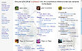
Alfa-r's v 1.0
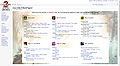
Alfa-r's v 2.0
Alfa-r's v 3.0
Infinite's concept design

here is a current list of them i will update the gallery if anyone else has designs.-![]() Zesbeer 01:16, 14 February 2012 (UTC)
Zesbeer 01:16, 14 February 2012 (UTC)
- I'm unsure if screenshots will actually work since not all the designs look the same in various resolutions. Venom20 01:19, 14 February 2012 (UTC)
- any of the designs can be fixed to work at any res so please stop bringing that up. I think we just need to decide on the design we like the most and go from there. other wise we will be discussing this long after the game has come out, and I would rather focus on other articles when the game has come out.- Zesbeer 01:21, 14 February 2012 (UTC)
- I'm with Zesbeer. I disagree with that suggestion, Aqua. The current page has been there for months, so it's not going to hurt to leave it there a little longer. Porting the current editcopy over to the main page may cause the current discussion to calm down for awhile. Now, that's not a bad thing in itself, but if we want this discussion to end, then we shouldn't end it settling for a design based predominately on timeliness and not aesthetics, not to mention a design with several opponents. While the discussion is hot, let's settle on a design with openness to minor tweaks.-- Shew 01:25, 14 February 2012 (UTC)
- Here's what I think we should do:
- - Give wiki users a specified amount of time to post their entries for the main page.
- - Narrow this closed list down to a few entries based predominately on compatibility.
- - Post a survey on a few GW2 forums and have the community vote on which design they prefer.
- We want to decide on the best, longest-lasting main page possible soon, and we shouldn't settle for any less. We can have this done by the end of February. But we need to come to a good consensus. We all have the designs we prefer and will defend to the death, so if we put the aesthetics portion up to a community vote once we resolve the compatibility part, then we will have both a main page that's cross-browser/system compatible and aesthetically pleasing. Of course, being cross-browser compatible does involve aesthetics to some extent, but not to the extent that the poll will cover.-- Shew 01:46, 14 February 2012 (UTC)
- Putting a time limit on it is the worst thing we can do. A time limit says "no entires will be accepted after this point," but then what happens if someone has a moment of aesthetic brilliance? Are designs posted before the deadline more open to consideration than ones that are posted after the deadline? They shouldn't be, but I suspect that's how it will play out if we do put a time limit on it.
- And voting is the worst possible way to go about this; wikis are built on consensus, not majorities. Voting means that you need just half-plus-one and the people who don't agree be damned.
- No matter how long the consensus takes, the end result will be significantly better than any time-restricted attempt that only half of the contributors support. Aqua (T|C) 02:25, 14 February 2012 (UTC)
- The voting portion is for the community. With that large of a scale, it's impracticable not to have a vote. It would reflect what the community finds best. We're only a fraction of the GW2 community, and for something as big as the main page of the official wiki, I think the community should have some input. There will be consensus, though, when we narrow down the entries. And yes, I support a deadline for entries. I understand that there might be some pleasing designs afterwords, but we'll have less of a need to change the main page.
- We will have decided on something beyond just satisfactory. We will have a consensus-driven, aesthetically pleasing and compatible main page. We have several options, and I'm sure, given a few days, others will come up with designs. Again, we are changing the main page out of this collective desire to change the main page. It's almost become a need.
- You're willing to settle for the current editcopy, continuing discussion behind the scenes, but I say we come to consensus soon. We have to consider time. Come March and afterwards, we'll have more and more to worry about that will bear greater priority than changing the main page. We have to prioritize. Right now we have all the time we want to worry about the main page, but that won't be the case in a few months.-- Shew 02:41, 14 February 2012 (UTC)
- (Will write more later). The current editcopy at the very least can function as a placeholder as opposed to the currently abysmal main page. I am not "willing to settle" for anything yet, I want to see just what we can do. It was a suggestion, nothing more. Aqua (T|C) 02:48, 14 February 2012 (UTC)
- Ok. I really feel like the desire to port the editcopy over to main is driven by the desire to settle for something, especially since this is just now appearing to be an "issue" after months of the same main page. My point is that we need to find something soon anyways, so there's no reason to go ahead and port the editcopy, but as long as this isn't settling, I see nothing wrong with it other than being just a little pointless.-- Shew 02:57, 14 February 2012 (UTC)
- As this is a wiki, deciding stuff by voting isn't the way to go. If we need to alert the community of a discussion or decision, there's the site notice and the community portal. --JonTheMon 03:25, 14 February 2012 (UTC)
- Again, this isn't purely voting. It's consensus and then voting. Now that you mentioned the site notice, I retract my comment about posting in GW2 forums. I forgot about that; that would be a great way to let the community into this process. However, given the amount of community members who visit the wiki, using consensus entirely is not practical. This decision affects those who visit the wiki, and so the best way to decide on a few equally cross-browser compatible pages with differing aesthetics is a poll. There are always reasons to use polls, and you can't just dismiss them because "we're a wiki." While I agree that in several cases pure consensus is the way to go, this is a situation that should more directly entail the community because the main page is a deciding factor in whether someone's going to use the wiki or not, and given the population size of visitors, a poll would be the way to go at the final stage.-- Shew 03:54, 14 February 2012 (UTC)
- As this is a wiki, deciding stuff by voting isn't the way to go. If we need to alert the community of a discussion or decision, there's the site notice and the community portal. --JonTheMon 03:25, 14 February 2012 (UTC)
- Ok. I really feel like the desire to port the editcopy over to main is driven by the desire to settle for something, especially since this is just now appearing to be an "issue" after months of the same main page. My point is that we need to find something soon anyways, so there's no reason to go ahead and port the editcopy, but as long as this isn't settling, I see nothing wrong with it other than being just a little pointless.-- Shew 02:57, 14 February 2012 (UTC)
- (Will write more later). The current editcopy at the very least can function as a placeholder as opposed to the currently abysmal main page. I am not "willing to settle" for anything yet, I want to see just what we can do. It was a suggestion, nothing more. Aqua (T|C) 02:48, 14 February 2012 (UTC)
- any of the designs can be fixed to work at any res so please stop bringing that up. I think we just need to decide on the design we like the most and go from there. other wise we will be discussing this long after the game has come out, and I would rather focus on other articles when the game has come out.-
(Reset indent) can we just find out which one we like the most design wise and then bicker for months about the details? because right now we have 5 options at some point we need to start narrowing and winding this discussion down.-![]() Zesbeer 05:51, 14 February 2012 (UTC)
Zesbeer 05:51, 14 February 2012 (UTC)
- The current Main Page take too long, and now this. I vote for Alfa-r's v 3.0. I re-coding the CSS after we choose something, it will be more helpful. -- Itay Alon • Talk 07:22, 14 February 2012 (UTC)
- I have been following this discussion and still vote for the one with the red paint strokes. (it has color and looks GW2 Syled.) also agreed that we've just got to choose something and work out the small bits later. --The Holy Dragons 07:36, 14 February 2012 (UTC)
- I favor Infinite's design most, as it is clean and achieves some level of familiarity with the official GW2 site (with similiar font and without violent-looking blood-red strokes). It also seems to me that it could be most flexible/scalable when it comes to different screen resolutions and mobile devices. Mediggo 08:46, 14 February 2012 (UTC)
- Does anyone else see the irony in the section meant to speed up the decision of "which main page design will we choose?" becoming a section about "how will we decide which main page design will we choose?"? Erasculio 09:11, 14 February 2012 (UTC)
- Wikipedia rule: Never a consensus! Except of course a consensus on this rule.. -- Itay Alon • Talk 09:34, 14 February 2012 (UTC)
- My nod goes to Alfa v3. I like Infi's, but it's a bit text heavy without the icons (and with, it's basically alfa v3 on my screen), and I'm not keen on the out of line placement of the community box. Redshift 12:14, 14 February 2012 (UTC)
- @Eras: How else are we going to manage this? After all the discussing we (mostly you guys) have done, people keep introducing new variants. By setting up a process of doing this, we can do it in both a timely and collaborative manner.-- Shew 12:24, 14 February 2012 (UTC)
- While I definitely prefer Infinite's concept design, I'm afraid it will be nearly impossible to make it work on small resolutions. Alfa-R's v2 looks very nice as well, but it may look even nicer if the outer borders of the asura background were not straight edges but used the brush strokes instead. And I'm also not a big fan of the bullets in the beginnings of lines. Other than that, though, this would probably be my choice at the moment. I wouldn't mind Alfa-R's v3 too much either, but I think the side images could be a bit more transparent (I don't really like how the edges of the table are clearly visible on them). 12:45, 14 February 2012 (UTC)
- While I definitely prefer Infinite's concept design, I'm afraid it will be nearly impossible to make it work on small resolutions. Alfa-R's v2 looks very nice as well, but it may look even nicer if the outer borders of the asura background were not straight edges but used the brush strokes instead. And I'm also not a big fan of the bullets in the beginnings of lines. Other than that, though, this would probably be my choice at the moment. I wouldn't mind Alfa-R's v3 too much either, but I think the side images could be a bit more transparent (I don't really like how the edges of the table are clearly visible on them).
- The concept has a featured article in mind, which would appear above the other 4 sections on the left, whilst displaying the two on the right exactly like the official site. Just to clear that up. - Infinite - talk 12:47, 14 February 2012 (UTC)
- @Eras: How else are we going to manage this? After all the discussing we (mostly you guys) have done, people keep introducing new variants. By setting up a process of doing this, we can do it in both a timely and collaborative manner.-- Shew 12:24, 14 February 2012 (UTC)
- My nod goes to Alfa v3. I like Infi's, but it's a bit text heavy without the icons (and with, it's basically alfa v3 on my screen), and I'm not keen on the out of line placement of the community box. Redshift 12:14, 14 February 2012 (UTC)
- Wikipedia rule: Never a consensus! Except of course a consensus on this rule.. -- Itay Alon • Talk 09:34, 14 February 2012 (UTC)
- Does anyone else see the irony in the section meant to speed up the decision of "which main page design will we choose?" becoming a section about "how will we decide which main page design will we choose?"? Erasculio 09:11, 14 February 2012 (UTC)
- I favor Infinite's design most, as it is clean and achieves some level of familiarity with the official GW2 site (with similiar font and without violent-looking blood-red strokes). It also seems to me that it could be most flexible/scalable when it comes to different screen resolutions and mobile devices. Mediggo 08:46, 14 February 2012 (UTC)
- I have been following this discussion and still vote for the one with the red paint strokes. (it has color and looks GW2 Syled.) also agreed that we've just got to choose something and work out the small bits later. --
(Reset indent) I know, I'm late to the party, but now with some suggestions available, i can give my opinion. The proposal of the current editcopy has on its good side, that it catches the painterly feeling with the brush strokes. But I have two complains. a) Too much red. The whole site screams Attention Danger!!! It has to much eye catcher with all the red headlines. b) It has too much white space left and right, especially on my wide screen monitor, but also on my 'normal' one. The approach 1.0 from Alfa-R is better in this way, but it takes it to another extreme. It has no real eye catcher. While it has this beautiful icons, the overall look is too light. So its 'just' a white pane with a lot of text and some little color dots (the background come not really to attention). I like the version 2.0 from Alfa-R best. With the background it takes away the problem with the 'too light plane' and with the white spaces, without the alarm feeling from the proposal from Aqua. (If the version 2.0 could somehow include some pf the brush strokes, but not so prominently (and not so red) that would be perfect :)). The only problem I have here is, it take a little while to load the background, but this is no real problem for me. Ther version 3.0 from Ala-R is not so good as version 2.0 for me. The proposal of Inifinte takes away the problem with th ewhite space left and right, but has no eye catcher at all. This is really just a wall of text on a light pane (again, the background comes not really to attention), and there is nothing to break the mold for the eye. So if we would decided on these suggestions, I would vote for Alfa-R version 2.0. (and would dream of a little brush stroke somewhere). Balwin 18:48, 14 February 2012 (UTC)
- I don't care.
- I absolutely despise the current main page, and currently the stars and moons must have aligned; I honestly love every single option presented. All I want is for the community to pick something now and go with it. I have no problem waiting for Infinite and co. to realize his concept design, but only if the community decides now that it will be implemented when complete. Not discussed, considered, looked at, or any variation of the theme. If it's chosen, great. But I want the agreement made now, and I want that decision to be respected when the time comes. If I absolutely had to pick one, I would probably choose Infinite's concept design. But I'd honestly be thrilled if any of the above become the design. Sorry for the rant that has an 80% chance of being irrelevant.
- (Infinite's concept + Vector is terrifyingly incredible.) A F K When Needed 19:36, 14 February 2012 (UTC)
- i think i like Infinite's concept the best.- Zesbeer 23:03, 15 February 2012 (UTC)
- i think i like Infinite's concept the best.-
where we stand
- Balwin
- Cirdan
- Alfa-r
- Glastium
- Itay Alon
- Redshift
- Infinite
- Shew
- Mediggo
- Noxx
- Kio
- Kokuou
- Aqua
- The Holy Dragons
- Lhimez
- Venom20
- JonTheMon
- Mattsa?
- Konig?
- Eerie
[[User:Infinite/Sandbox/Main_Page2|Infinite's concept design]]
- Infinite
- Zesbeer
I am assuming the authors like there versions best so +1 to there designs for them which leaves us with infinite's being the top pick now (when i wrote that) I say we way the pros and cons of a design and move forward with making that the best design, other wise this is going to go on for ever with no end in sight of a main page that is "consensus driven" because everyone is going to endlessly come up with new layouts and designs and concepts.-![]() Zesbeer 02:52, 17 February 2012 (UTC)
Zesbeer 02:52, 17 February 2012 (UTC)
- Actually I don't like v 2.0 myself as it is (but it is there in case I can think of a way to improve it) and my voice goes for v 3.0. Also, Shew likes my v 3.0 (he said that in a section above), and Cirdan and Infinite were also for my v 3.0, if u look up the previous section (a different approach) after the second to last indent reset, and Noxx too (he had 1 suggestion but it was implemented since then). Also, the way I understand the decision making here, we should not be voting like that but rather choosing a version that has no crucial objections and everyone is more or less satisfied with. Alfa-R 06:43, 17 February 2012 (UTC)
- that a was before Infinite made his concepts, also Noxx said that he prefers infinities design but dost think it will work with all rez but thats not true because Infinite him self said that it was just a design and would recode it to work on all rez that's why i have him listed there. also Cirdan added him self to 2.0- Zesbeer 07:20, 17 February 2012 (UTC)
- Infinites proposal: 15:23, 13 February 2012 (UTC)
- Then under v 3.0
- I really like that design Alfa. -Cirdan 21:31, 13 February 2012 (UTC)
- I second that and I think we should actually push that design live. -Infinite 22:02, 13 February 2012 (UTC)
- How is that after? And who said a person should have 1 voice? Most people are supporting several versions, after all. Alfa-R 07:27, 17 February 2012 (UTC)
- I am just trying to find were the majority of people are. my list Isn't set in stone so clam the **** down, honestly if they want there name next to a design they can add it them self's.- Zesbeer 07:37, 17 February 2012 (UTC)
- I'm totally calm, why? Also, my opinion on the whole thing. I've been implementing what people wanted to see, when it's doable, and as of now I only see 1 person who has objections against my v 3.0 - Venom20, who says it lacks style, while others are either for it, or don't have objections at least, but I may forget someone. It has also 1 feature the other designs are lacking: a variable width, it scales without making whitespaces like Aqua's, or having a really small font to fit lower resolutions (while imo looking extremely small on a high-end ones) like Infinite's. I know that it sounds like an advertising, and a biased point of view, but i'd just push my v 3.0 live and continue discussion if needed. Alfa-R 07:53, 17 February 2012 (UTC)
- Look at the discussion above, also you page is too plain for me. Also we can use ur coding on whatever main page design we decide to go with. I know this is a hard concept for people to understand, seeing as I keep having to say it but we can fix the main page to have whatever coding we want, But we need to pick a Design FIRST. I also stated that ur design needs something more like gray paint (varying) swatches but u said it was horrid so whatever. - Zesbeer 08:06, 17 February 2012 (UTC)
- I'm sorry, but is it so plain that you are choosing an even plainer design? And not everything can be redone in a different layout, wiki has some limitations, for example making a variable length horizontal/vertical line based on an image would be quite difficult, if not impossible, and would have a lot of extra coding, which isn't a good decision for 1 pixel line. Alfa-R 08:20, 17 February 2012 (UTC)
- With=100% problem solved.- Zesbeer 08:25, 17 February 2012 (UTC)
- no it isn't. U will have to add a surrounding block with overflow=hidden, and even then it will not work as intended sometimes. I've tried that. The vertical bar is even worse. And all for a single line. Also, you haven't answered my question. Alfa-R 08:33, 17 February 2012 (UTC)
- and i wont answer that question (yet). we need to pick a over all design and answering that question will just side track us more then it already has.- Zesbeer 08:36, 17 February 2012 (UTC)
- you are kidding, right? If, on the one hand, a page being plain is our only complaint, and, on another, a plainness isn't that an issue, then we are 1 step closer to consensus - that is, we agree that a page can be plain - aren't we? Alfa-R 08:50, 17 February 2012 (UTC)
- no i am not joking and it seems you have a problem reading because i listed 2 problems with ur page. also i am waiting for a few more people to respond- Zesbeer 08:52, 17 February 2012 (UTC)
- 1st of all, stop being so agressive and that attacks, please. I probably can't read, but I see the same thought put in two different phrases: 'plain', and 'needs more'. Alfa-R 09:02, 17 February 2012 (UTC)
- 1st of all, stop being so agressive and that attacks, please. I probably can't read, but I see the same thought put in two different phrases: 'plain', and 'needs more'. Alfa-R
- no i am not joking and it seems you have a problem reading because i listed 2 problems with ur page. also i am waiting for a few more people to respond-
- you are kidding, right? If, on the one hand, a page being plain is our only complaint, and, on another, a plainness isn't that an issue, then we are 1 step closer to consensus - that is, we agree that a page can be plain - aren't we? Alfa-R
- and i wont answer that question (yet). we need to pick a over all design and answering that question will just side track us more then it already has.-
- no it isn't. U will have to add a surrounding block with overflow=hidden, and even then it will not work as intended sometimes. I've tried that. The vertical bar is even worse. And all for a single line. Also, you haven't answered my question. Alfa-R
- With=100% problem solved.-
- I'm sorry, but is it so plain that you are choosing an even plainer design? And not everything can be redone in a different layout, wiki has some limitations, for example making a variable length horizontal/vertical line based on an image would be quite difficult, if not impossible, and would have a lot of extra coding, which isn't a good decision for 1 pixel line. Alfa-R
- Look at the discussion above, also you page is too plain for me. Also we can use ur coding on whatever main page design we decide to go with. I know this is a hard concept for people to understand, seeing as I keep having to say it but we can fix the main page to have whatever coding we want, But we need to pick a Design FIRST. I also stated that ur design needs something more like gray paint (varying) swatches but u said it was horrid so whatever. -
- I'm totally calm, why? Also, my opinion on the whole thing. I've been implementing what people wanted to see, when it's doable, and as of now I only see 1 person who has objections against my v 3.0 - Venom20, who says it lacks style, while others are either for it, or don't have objections at least, but I may forget someone. It has also 1 feature the other designs are lacking: a variable width, it scales without making whitespaces like Aqua's, or having a really small font to fit lower resolutions (while imo looking extremely small on a high-end ones) like Infinite's. I know that it sounds like an advertising, and a biased point of view, but i'd just push my v 3.0 live and continue discussion if needed. Alfa-R
- I am just trying to find were the majority of people are. my list Isn't set in stone so clam the **** down, honestly if they want there name next to a design they can add it them self's.-
- that a was before Infinite made his concepts, also Noxx said that he prefers infinities design but dost think it will work with all rez but thats not true because Infinite him self said that it was just a design and would recode it to work on all rez that's why i have him listed there. also Cirdan added him self to 2.0-
We should probably drop Aqua's and Alfa-R's v. 2.0 from the picture as they seem to have received least praise, and help reach consensus between the remaining two fine designs. These things can take time and I don't think we're in a hurry since the game isn't even close to release (still!). Mediggo 10:30, 17 February 2012 (UTC)
- Alfa-R v. 2.0's highly graphical design doesn't really fit the wiki pages in my opinion, the white borders everywhere give it a makeshift look (also it's supposed to be informative, not some art gallery). The Aqua design is a bit too aggressive with it's bloody red headers splattered all across the page. The infinite design is pretty good with it's subtle graphic but the headers sink a bit into the background because they're contrasted by the blue links (which are a bit too small in my opinion). I think the Alfa-R's v. 3.0 is the best, having the guild wars appearance with very clearly laid out sections, headers and sub-headers. 88.113.167.239 13:15, 17 February 2012 (UTC)
- When I look at Alfa-R's v3 I have a slight feeling something is out of place, it just doesn't feel right to me; at the same time, though, I can't really say what is wrong with it. Part of it is probably that large enough resolutions do indeed create whitespace between the images and the table. This, along with the fact that the images themselves are very contrasting, dark, sharp, rectangular, separates the screen into 3 individual sections that don't really appear to belong to each other. Moreover, although the table has brush stroke borders, the right image has a vertical line splitting it into a lighter and a darker part, which looks like a border of the table.
- That's perhaps the reason why I prefer v2, v4 and Infinite's concept: the images and text are close by so that they can blend one into another and create a single complex design. However, each has their own flaws, unfortunately. The v2 is too rectangular and the table doesn't fit well into the background; the v4 solves this problem, but low resolutions show no image whatsoever; and Infinite's concept is very difficult, if not impossible, to describe by HTML and CSS alone, especially when it comes to the low resolutions of tablets and phones — the divs (and the dividing lines) would have to either all change their widths accordingly, or shift from beside each other to below each other as required — I hope I'm wrong about this though. 13:35, 17 February 2012 (UTC)
- "Part of it is probably that large enough resolutions do indeed create whitespace between the images and the table."
- To be fair, that's a requested change which Alfa has not yet had time to comment on. Link. A F K When Needed 18:09, 17 February 2012 (UTC)
- To be fair, looking at the timestamps, I'm not surprised by that. 19:52, 17 February 2012 (UTC)
- I'm looking into that and would really appreciate if u could help me with ideas for bg images. Those are just backgrounds from an official races page, and were more of placeholders. The same goes for the icons actually, I don't like a current metaphor for PvE, but can't find a better one. Alfa-R 19:58, 17 February 2012 (UTC)
- I've made a quick change to v 3.0. Is it looking any better? Alfa-R 20:49, 17 February 2012 (UTC)
- I'm a fan of Aqua's presently( or the current MPE copy, whatever it is labelled). Although I'm wondering why Infinite's name is appearing twice on the list. Also if the answer is somewhere in the above wall of text for this section, tldr. Venom20 21:07, 17 February 2012 (UTC)
- That's because Infinite has supported two versions in the sections above, and we haven't heard his opinion here yet. Also, I believe you can mark several versions here, no one said you can like only one of them. Alfa-R 21:13, 17 February 2012 (UTC)
- @Alfa: Regarding your change to v3, it's now a little hard to read the links over the images. I'm sure if you faded them, it might be better. (Still a fan of the previous version.)-- Shew 21:52, 17 February 2012 (UTC)
- "Is it looking any better?" Definitely, in my opinion. 22:26, 17 February 2012 (UTC)
- I've made a variant of my 3rd with the mothership bgs. They are less rectangular, can u tell me how it look like on a 1920 display, or provide a screenshot, pls? Mine is 1680 at max, so it's hard to tell whether it fixes a problem or not. Alfa-R 12:20, 18 February 2012 (UTC)
- Sure, [[:File:User Noxx Alfa-R Main Page 3b.png|here it is]]. Space between the images and the table is fine, but they are too high and are cut off at the bottom. Here is the [[:File:User Noxx Alfa-R Main Page 3.png|first version]] for comparison. 15:18, 18 February 2012 (UTC)
- Thanks! They are cut off for a reason: on smaller resolutions height of a page becomes larger, so it's either using smaller images and creating vertical whitespaces (like a previous version), or cropping images on the top/bottom on higher resolutions. I tried to soften cropping edges, so it should look better now. I've also swapped them (3 and 3b), as I like those bgs better, and would like them to the prime version. Alfa-R 16:12, 18 February 2012 (UTC)
- Yeah, that's what I thought. Anyway, it's [[:File:User Noxx Alfa-R Main Page 3b.png|much better]] now, I can finally say I quite like it. 20:54, 18 February 2012 (UTC)
- would you mind adding your name to the list above then? Alfa-R 11:06, 19 February 2012 (UTC)
- would you mind adding your name to the list above then? Alfa-R
- Yeah, that's what I thought. Anyway, it's [[:File:User Noxx Alfa-R Main Page 3b.png|much better]] now, I can finally say I quite like it.
- Thanks! They are cut off for a reason: on smaller resolutions height of a page becomes larger, so it's either using smaller images and creating vertical whitespaces (like a previous version), or cropping images on the top/bottom on higher resolutions. I tried to soften cropping edges, so it should look better now. I've also swapped them (3 and 3b), as I like those bgs better, and would like them to the prime version. Alfa-R
- Sure, [[:File:User Noxx Alfa-R Main Page 3b.png|here it is]]. Space between the images and the table is fine, but they are too high and are cut off at the bottom. Here is the [[:File:User Noxx Alfa-R Main Page 3.png|first version]] for comparison.
- I've made a variant of my 3rd with the mothership bgs. They are less rectangular, can u tell me how it look like on a 1920 display, or provide a screenshot, pls? Mine is 1680 at max, so it's hard to tell whether it fixes a problem or not. Alfa-R
- "Is it looking any better?" Definitely, in my opinion.
- @Alfa: Regarding your change to v3, it's now a little hard to read the links over the images. I'm sure if you faded them, it might be better. (Still a fan of the previous version.)-- Shew 21:52, 17 February 2012 (UTC)
- That's because Infinite has supported two versions in the sections above, and we haven't heard his opinion here yet. Also, I believe you can mark several versions here, no one said you can like only one of them. Alfa-R
- I'm a fan of Aqua's presently( or the current MPE copy, whatever it is labelled). Although I'm wondering why Infinite's name is appearing twice on the list. Also if the answer is somewhere in the above wall of text for this section, tldr. Venom20
- I've made a quick change to v 3.0. Is it looking any better? Alfa-R
- I'm looking into that and would really appreciate if u could help me with ideas for bg images. Those are just backgrounds from an official races page, and were more of placeholders. The same goes for the icons actually, I don't like a current metaphor for PvE, but can't find a better one. Alfa-R
- To be fair, looking at the timestamps, I'm not surprised by that.
(Reset indent) So, though I doubt this is what anyone wants to hear, I've made a new version; it can be seen User:Aquadrizzt/Sandbox/Main Page 4. The headers require special css (which can be obtained from my personal css) to view properly; as the background image only works in CSS, not in the div styles. It's my attempt at fixing all the problems people had with my design while simultaneously incorporating aspects of Alfa-R's. Aqua (T|C) 02:43, 19 February 2012 (UTC)
- can you post a screen shot cus when i added it to my css it didnt work.- Zesbeer 03:09, 19 February 2012 (UTC)
- (You forgot to add the sub div for the text). The screenshot is now up; also, I'm displaying it on 1900x1200; it works on 800x600 as well. Aqua (T|C) 03:15, 19 February 2012 (UTC)
- You know that I'm not a fan of the previous version, but this is a step back imo. I really don't like the color of headers, it looks messy/dirty and alien on this page - the previous one was crisper and was at least supported by the logo (though I didn't like that one, it had its fans, while this, I guess, is a lose-lose solution). Also, an overall look of this page to me is like everything was just tossed and jumbled together from different sources: visual elements in headers (strokes and icons) are competing with each other, as they are both meant to draw focus; dotted lines are of different sizes; strokes are cropped on the left for no reason I can see. If I were you Aqua, I'd focus on the forté of your page, not go away from it. I'd like to suggest trying more freeform strokes, like someone just swept a paintbrush over (smth like that is seen in a flash object under a profession name on the mothership professions page), and of a different color probably, may be a sort of blue to support the background image? Also, I believe that strokes don't need icons, neither mine nor racial capitals' ones, the reason is, as I said, that they are serving the same purpose and having both makes them vie for it. I'd also try to keep a 6-0 layout (again, I'm not a fan of that one as it creates whitespaces on certain sizes, but that's one of the things that people like about your design and I think you could probably find a way to fix it). Hope that helps and thanks for your contributions to this discussion! Alfa-R 10:19, 19 February 2012 (UTC)
- Yes, the previous version looked better. I liked the color of the headers and the design overall. It feels appropriate to the game. Lhimez 11:21, 19 February 2012 (UTC)
- @Alfa-R: I've taken into account some of your suggestions (blue strokes, fixed borders, etc.); I like the blue strokes when they're coupled with the background. I've given up on the 6-0, because in order to do that, I would have to sacrifice compatibility on small resolutions. The icons are now, IMO, the focus of the headers, which the strokes flowing naturally out of them. The thumbnail of my previous failure has been replaced with the new one that I like significantly more. (I also stole your overlay and borders, I think they add significantly to the aesthetic.) Any thoughts? --The preceding unsigned comment was added by User:Aquadrizzt (talk).
- OMG AQUA! That's actually frightening.
- Count me in favour of Aqua's current Main Page 4 style. I first saw it listening to the start of the Conquest of Paradise Soundtrack, and had a bit of a moment. I'm in awe.
- I want to say something. I'm proud of GW2W. I didn't GWW, the way it did things, or the community. GW2W, and everything about it, feels much better. I love it and all of you.
- (I'm normally an asshole, take the sentiment while it's on offer. :P) A F K When Needed 21:02, 19 February 2012 (UTC)
- i honestly don't care for this new version aqua, as of right any one mind if i archive the page up to "were we stand" (the page is to large (we can even labe it main page discussion.- Zesbeer 00:56, 20 February 2012 (UTC)
- I am pretty sure a lot of people will mind. Or should mind; we're not rushing this decision until time is absolutely running out and I don't care even if another 100 designs roll in, they all have their right to exist and be discussed. This will also give every designer the opportunity to perfect what they've been working on, as well as become inspired by each other. Archiving now is simply too soon, also. - Infinite - talk 01:04, 20 February 2012 (UTC)
- nothing is stoping people from talking about the designs still its just the other discussions have not seen activity for a wile.- Zesbeer 01:10, 20 February 2012 (UTC)
- Waiting until the last minute is a good way to cause a lot of chaos for such a collaborative process. Information is going to start rolling in tomorrow, and that'll be the case in a month too. Now, I understand that some people are still working on their designs, but I don't think we should give that too much time.-- Shew 01:16, 20 February 2012 (UTC)
- i am about ready to give up, this is never going to happen if we keep coming up with designs.- Zesbeer 01:25, 20 February 2012 (UTC)
- Then give up and wait until things start to wrap up, by which time you can/might/should state your opinion anew, with more recent insights at that time. I am doing the same; I don't care what users are still planning to design/change, but I do know that I will speak up when I find something unwise or plain lacking. Other than that (like many above) I have taken a back seat in this whole discussion. But equally, who can tell what future new designs bring. There may even be a perfect new main page out there soon. By cutting off the process due to some beta and new information, we might never get to see this design. I agree that it would be nice to have the new main page ready soon, but I'm not too fussed about the beta in conjunction with "needing" a new main page. I much rather this process continues at a slower pace, to allow the designs to breathe more and thus be of higher quality (or not, some are just not good enough in opinions). - Infinite - talk 01:34, 20 February 2012 (UTC)
- no this discussion is not going to ever end because "there might be something better out there" you can say that for anything. there needs to come a point were we stop.- Zesbeer 01:43, 20 February 2012 (UTC)
- no this discussion is not going to ever end because "there might be something better out there" you can say that for anything. there needs to come a point were we stop.-
- Then give up and wait until things start to wrap up, by which time you can/might/should state your opinion anew, with more recent insights at that time. I am doing the same; I don't care what users are still planning to design/change, but I do know that I will speak up when I find something unwise or plain lacking. Other than that (like many above) I have taken a back seat in this whole discussion. But equally, who can tell what future new designs bring. There may even be a perfect new main page out there soon. By cutting off the process due to some beta and new information, we might never get to see this design. I agree that it would be nice to have the new main page ready soon, but I'm not too fussed about the beta in conjunction with "needing" a new main page. I much rather this process continues at a slower pace, to allow the designs to breathe more and thus be of higher quality (or not, some are just not good enough in opinions). - Infinite - talk 01:34, 20 February 2012 (UTC)
- i am about ready to give up, this is never going to happen if we keep coming up with designs.-
- Waiting until the last minute is a good way to cause a lot of chaos for such a collaborative process. Information is going to start rolling in tomorrow, and that'll be the case in a month too. Now, I understand that some people are still working on their designs, but I don't think we should give that too much time.-- Shew 01:16, 20 February 2012 (UTC)
- nothing is stoping people from talking about the designs still its just the other discussions have not seen activity for a wile.-
- I am pretty sure a lot of people will mind. Or should mind; we're not rushing this decision until time is absolutely running out and I don't care even if another 100 designs roll in, they all have their right to exist and be discussed. This will also give every designer the opportunity to perfect what they've been working on, as well as become inspired by each other. Archiving now is simply too soon, also. - Infinite - talk 01:04, 20 February 2012 (UTC)
- i honestly don't care for this new version aqua, as of right any one mind if i archive the page up to "were we stand" (the page is to large (we can even labe it main page discussion.-
- This looks better, but there are still things to improve. First of all, the strokes. I still think that something with this form:
 will look better. Current are still more blots then strokes. Next, the color. This one is IMO muddy again (like when you mix too many paints on a palette), just less then previous, and the color of the "Guild Wars" bit of text on the heades is looking very bad with this one. Then, header text alignment: can you verically center it? Finally, borders: I feel that this design has to much of them, while it can probably look better without any at all. Alfa-R 06:24, 20 February 2012 (UTC)
- @Alfa-R: I've taken into account some of your suggestions (blue strokes, fixed borders, etc.); I like the blue strokes when they're coupled with the background. I've given up on the 6-0, because in order to do that, I would have to sacrifice compatibility on small resolutions. The icons are now, IMO, the focus of the headers, which the strokes flowing naturally out of them. The thumbnail of my previous failure has been replaced with the new one that I like significantly more. (I also stole your overlay and borders, I think they add significantly to the aesthetic.) Any thoughts? --The preceding unsigned comment was added by User:Aquadrizzt (talk).
- Yes, the previous version looked better. I liked the color of the headers and the design overall. It feels appropriate to the game. Lhimez 11:21, 19 February 2012 (UTC)
- You know that I'm not a fan of the previous version, but this is a step back imo. I really don't like the color of headers, it looks messy/dirty and alien on this page - the previous one was crisper and was at least supported by the logo (though I didn't like that one, it had its fans, while this, I guess, is a lose-lose solution). Also, an overall look of this page to me is like everything was just tossed and jumbled together from different sources: visual elements in headers (strokes and icons) are competing with each other, as they are both meant to draw focus; dotted lines are of different sizes; strokes are cropped on the left for no reason I can see. If I were you Aqua, I'd focus on the forté of your page, not go away from it. I'd like to suggest trying more freeform strokes, like someone just swept a paintbrush over (smth like that is seen in a flash object under a profession name on the mothership professions page), and of a different color probably, may be a sort of blue to support the background image? Also, I believe that strokes don't need icons, neither mine nor racial capitals' ones, the reason is, as I said, that they are serving the same purpose and having both makes them vie for it. I'd also try to keep a 6-0 layout (again, I'm not a fan of that one as it creates whitespaces on certain sizes, but that's one of the things that people like about your design and I think you could probably find a way to fix it). Hope that helps and thanks for your contributions to this discussion! Alfa-R
- (You forgot to add the sub div for the text). The screenshot is now up; also, I'm displaying it on 1900x1200; it works on 800x600 as well. Aqua (T|C) 03:15, 19 February 2012 (UTC)


(Reset indent) Firstly, I'll just say that I haven't paid attention to the whole discussion. From there, I'd like to state a few things:
- Rushing is bad, while waiting til the last minute will, as Shew said, make things chaotic, rushing will more importantly make us miss some important things and lead to an even sooner redesign of the main page - and worse, rushing at the last minute will be a combination of the two.
- Previously we designed the main page with the idea of adding new sections - such as featured articles - as a possibility. Of the "Where we stand" list, this seems impossible with both of Alfa-R's suggestions, and hard with Aqua's (what's currently the edit copy) due to the lack of additional city icons. I personally dislike Infinite's as the text is way too bloody small and making it bigger will throw the design off, along with this the Game basics spot is hard to read due to color of the text and the background. Similarly, the merged idea just looks way to cluttered. As it stands, I like the current editcopy the most, but I suggest different icons when possible so that we can add new sections should it ever be deemed worthy.
- One final thing I want to ask: Do we even need to change the main page? From what I understood in the discussions, this whole thing started because someone thought up a new aesthetic, and it seems that everyone got on the bandwagon of changing things without ever questioning whether it needs changing. As such, what I suggest is waiting until the press beta is over, and we get our luscious details, and being armed with new knowledge we can more accurately assess on how to change the main page - if we change things now, we'll just change things again with every new major release of information, up until things die down (documentation wise) post GW2 release.
TL;DR: I think it's best to just settle on a temporary main page, which is what the current main page (not edit copy) is, and figure out a new main page either closer to release, or post release. Konig/talk 01:50, 20 February 2012 (UTC)
- I genuinely dislike the current main page design. I dislike the headers. I dislike the colour of them. I don't think the profession images belong; they were cool during the profession reveal, but they've out-stayed their welcome imo. There's no reason to have the same logo as in the top left corner of every page. I do like the images in the boxes, but I feel as a community, we can do better than the current main page. Yes, I jumped on the bandwagon. No, I'm not doing it in context of liking what's there already.
- As for adding sections, it would be nice to have a design that can easily accommodate them, but I do wonder what those sections would be. I'd argue that with Special:Random, we don't need a Featured Article section. The wiki should document the game, not document itself.
- I don't want to stick with the current design for the foreseeable future. To be honest, I think after so many people have spent time voicing their opinions - and more to the point - after people have spent so much time and effort on lovingly designing candidates, turning around and saying "nah, maybe later" is rather insulting. I'm not offended, and I don't have a single shred of resentment toward you Konig, but I do think that sentiment is unfair.
- I'd argue that the community should decide that on the last day of February, the main page will become whichever design that consensus is backing at the time. People can continue to create new designs; and I'd encourage them to, but the main page won't change for at least a month. Likely more. This means that we can pick one and move on. There'll be some certainty, without stabbing in the back everyone who has taken so much interest in trying to give the main page a more current and aesthetically pleasing design. If something better truly comes along, then it won't be held back and oppressed. There'll still be an editcopy. There'll still be a talk page.
- Just my opinion. A F K When Needed 02:21, 20 February 2012 (UTC)
- I was mainly meaning that I'm getting a sense of urgency and, quite franky, redundency. This is, what, the fourth time we've discussed altering the main page since late '09 (or was it '10 that GW2 info began flowing in... was it really that long ago?). I'm more concern on revamping the main page the fewest amount of times rather than fixing the outdated profession icons (which aren't that bad there) or making better banners (which I agree are bad).
- I'd rather have a longer discussion focused on long term availability of the designs, than try to force things to change right here right now because if we do force things to change asap, then we'll just be changing it again later on (and honestly, I have dealt with constant redesigns with GuildMag and that's more than I can handle in that department of constant change!).
- I never once meant "toss out all your discussions and thoughts because we shouldn't change things" but rather "discuss longer, stop trying to rush *stares at Zesbeer*"
- On the topic of featured article - I view that as less of documenting itself it makes documenting certain aspects of the game more prevailant (we just focus on the better articles because they're prettier for the main page). Whether that's a future spot or not, I'd just like for there to be room for additional boxes should something we don't foresee be something worth adding to the main page - at the same time, I'd like for there to be a lack of white space while likewise not being too cluttered (yes, I'm demanding a lot, but if we're going to discuss changing the main page seriously, then we should demand a lot, and fit in as much as we can - time restraints be damned! Though Zesbeer does have a point that we can't go about this endlessly, but it's not as urgent as he's making it to be). Konig/talk 02:57, 20 February 2012 (UTC)
- i am actually not trying to rush anything i just want to Make sure that there is a end point because if there isn't then this will never end as it seems to be right now. there are a lot of good options right now. all of which are better replacements for the main page then what we currently have. and if we cant agree to saying hey by xyz date we will make up our minds then this will never end like i already said. and it feels like we are at a point of this will never end. someone will make something else that one person likes better. ALSO this "This page is 184 kilobytes long; some browsers may have problems editing pages approaching or longer than 32kb." - Zesbeer 03:25, 20 February 2012 (UTC)
- The thumbnail on the right is me proving a point that the design I've developed can be altered to fit a featured article or other stuff box. That being said, I don't think it is wise to anticipate things that might be on the main page at this time. Clearly whatever we have will need to undergo revision eventually. Aqua (T|C) 04:20, 20 February 2012 (UTC)
- I was less of saying to anticipate what will be on the main page, but rather anticipate the fact that new things will want to be added - that is so we can have an actual revision, rather than yet another overhaul (difference being, well, everything). That said, not opposed to that layout, though I'm not really firm on the icons. Konig/talk 04:30, 20 February 2012 (UTC)
- I havn't checked here for just a few days, now I'm completely lost here. I don't like to rush, either, but we need to become efficient somehow. Glastium | talk 05:13, 20 February 2012 (UTC)
- the same can be done with all of the designs. Making an icon and a handwritten header is a matter of minutes, and the layout of different versions is all the same basically. Alfa-R 05:47, 20 February 2012 (UTC)
- While I do not advocate the use of .css for the main page as it may deter contributions in the future, I do like aqua's new version. It looks nice in both my small resolution and large resolution. It has some artistic flair but not too much as to be overpowering. Also, if I may suggest we add a template to change to background image periodically. This would give an illusion that the wiki is semi-dynamic (see example template). Aside from this one, I"m still in favour of the current red splash version. Venom20 09:56, 23 February 2012 (UTC)
- That's a great idea imo! Also, please check out my v 3.0 as it now has paintstroke headers too. Alfa-R 10:44, 23 February 2012 (UTC)
- My thoughts are in line with Venom's. Konig/talk 17:42, 23 February 2012 (UTC)
- I like Aqua's new design. Looks good, doesn't get in the way of the info, and looks to be adaptable to any future additions to the main page. I also like Venom's idea of incorporating a dynamic background. Mattsta 18:17, 23 February 2012 (UTC)
- My thoughts are in line with Venom's. Konig/talk 17:42, 23 February 2012 (UTC)
- That's a great idea imo! Also, please check out my v 3.0 as it now has paintstroke headers too. Alfa-R
- While I do not advocate the use of .css for the main page as it may deter contributions in the future, I do like aqua's new version. It looks nice in both my small resolution and large resolution. It has some artistic flair but not too much as to be overpowering. Also, if I may suggest we add a template to change to background image periodically. This would give an illusion that the wiki is semi-dynamic (see example template). Aside from this one, I"m still in favour of the current red splash version. Venom20
- I havn't checked here for just a few days, now I'm completely lost here. I don't like to rush, either, but we need to become efficient somehow.
- I was less of saying to anticipate what will be on the main page, but rather anticipate the fact that new things will want to be added - that is so we can have an actual revision, rather than yet another overhaul (difference being, well, everything). That said, not opposed to that layout, though I'm not really firm on the icons. Konig/talk 04:30, 20 February 2012 (UTC)
- The thumbnail on the right is me proving a point that the design I've developed can be altered to fit a featured article or other stuff box. That being said, I don't think it is wise to anticipate things that might be on the main page at this time. Clearly whatever we have will need to undergo revision eventually. Aqua (T|C) 04:20, 20 February 2012 (UTC)
- i am actually not trying to rush anything i just want to Make sure that there is a end point because if there isn't then this will never end as it seems to be right now. there are a lot of good options right now. all of which are better replacements for the main page then what we currently have. and if we cant agree to saying hey by xyz date we will make up our minds then this will never end like i already said. and it feels like we are at a point of this will never end. someone will make something else that one person likes better. ALSO this "This page is 184 kilobytes long; some browsers may have problems editing pages approaching or longer than 32kb." -

.jpg)
.png)
.jpg)
(Reset indent) I'm sort of new here but maybe I can provide a fresh perspective. A basic grid is good if you want it to work on any resolution, but it's also pretty limiting. I would say design for a reasonable minimum so we can design the page according to what we think is most important. I really like Aqua's latest design. Ironically, even though the Featured Article and News & Updates sections are larger than the rest, it actually leads me into the other boxes and ends up placing emphasis on Game basics and Gear & Inventory. In contrast, with 6 boxes of equal size, there's no emphasis on anything and I can't really tell what I'm looking at. I really think we need something a bit more .. fluid? Something like that. Eerie Moss 23:11, 23 February 2012 (UTC)
too late for my input?
I don't know if it's too late, but I think the current edit copy of the main page is perfect. The design and the red banner is excellent, and when I access the wiki on my iPhone, it fits perfectly. Of course I haven't really taken the time to read the conversation above me, but why is this such a huge project? Fabian 20:34, 22 February 2012 (UTC)
- No it isn't. Your feedback is welcome and appreciated.
- Two reasons. The first being I might not be willing to even sniff your favourite food, let alone eat it, because people like different things. The second being that we want the main page to be future proof, so we don't have the same long discussions three months down the line. A F K When Needed 20:55, 22 February 2012 (UTC)
- nope, i was trying to get us to some sort of discussion but some people want to block having this conversation ever coming to a end. and thus the wall o text.- Zesbeer 00:16, 23 February 2012 (UTC)
- Working out kinks in the design is different than preventing an outcome Zesbeer. Aqua (T|C) 00:25, 23 February 2012 (UTC)
- except we are not at that stage were at the everyone submit designs forever stage. tried to get us past that and got shot down so.- Zesbeer 00:33, 23 February 2012 (UTC)
- @
ZeezZesbeer, instead of steering a discussion in the way that you want it to go, try contributing and you may have a better experience. Venom20 00:45, 23 February 2012 (UTC)
- first off don't call me zeez because there is another user with the name zeez, secondly i want to give feedback on a design we all agree on other wise like i already said this will go on forever because we will just be bringing up the same things.- Zesbeer 00:47, 23 February 2012 (UTC)
- HOW ABOUT we leave ourselves out of it entirely, put up polls on the fansites and see how the community feels, narrowing down favorites, then use our talents to make the wiki a good place, and make a consensus on our own using influences and concepts from what the community wants and likes? ~~
 Kiomadoushi 17:56, 23 February 2012 (UTC) edit: at the very least, we may find it's NOT just half, and maybe like 80% or 90% of all people are happy with one particular design? if it comes out 50% or something, then we know that a majority of people like it, and so we narrow it down or merge it with another design. 17:58, 23 February 2012 (UTC)
- /faceplam thats exactly what i have been trying to do.- Zesbeer 21:51, 23 February 2012 (UTC)
- To be fair, it looks and feels like we're exiting the exploratory phase, which would then be followed by refine/combine, and finally decision making. So, it's taken a while, but sometimes things can't be rushed. And it'll probably end sooner than you're dreading. --JonTheMon 21:58, 23 February 2012 (UTC)
- /faceplam thats exactly what i have been trying to do.-
- HOW ABOUT we leave ourselves out of it entirely, put up polls on the fansites and see how the community feels, narrowing down favorites, then use our talents to make the wiki a good place, and make a consensus on our own using influences and concepts from what the community wants and likes? ~~
- first off don't call me zeez because there is another user with the name zeez, secondly i want to give feedback on a design we all agree on other wise like i already said this will go on forever because we will just be bringing up the same things.-
- @
- except we are not at that stage were at the everyone submit designs forever stage. tried to get us past that and got shot down so.-
- Working out kinks in the design is different than preventing an outcome Zesbeer. Aqua (T|C) 00:25, 23 February 2012 (UTC)
- nope, i was trying to get us to some sort of discussion but some people want to block having this conversation ever coming to a end. and thus the wall o text.-
(Reset indent) @Kiomadoushi: Absolutely not. We're the official wiki, while we might share small amounts of a userbase, we should generally stay unassociated with fansites. Similar to how wikipedia doesn't do ads, we should be objective, having assorted fansites might make it less objective. Aqua (T|C) 23:57, 23 February 2012 (UTC)
- We're not the only ones who use the wiki, and its not like just everybody is checking out this site to be able to vote, considering the game isn't out and people aren't always checking for info... the official GWW, and sites like GuildWarsGuru and GuildWars2Guru, maybe Wartower.de ... stuff like that, not just EVERY unofficial site. And its not like we could say "GW2W is pending a layout change - let your voice be heard" and link to the GW2W, cos that'd be advertising for another site, which you know other sites wouldn't approve. If we leave it to just here, only US that are here often and don't check it once a month waiting for updates and word of beta or release would be able to vote. To be fair, we should make it open to all the people who will be using the wiki on game's release. ~~ Kiomadoushi 01:35, 24 February 2012 (UTC)
- By all means, everyone is entitled to come here and voice opinions. There isn't a need to get comments from other sites, they should come here. Anyone who played GW knows a wiki exists, that is just a lazy excuse. But as Jon has pointed out, all the designs are starting to merge together. We are presently almost out of the exploratory phase. We pretty much know what we want. Venom20 02:00, 24 February 2012 (UTC)
- By all means, everyone is entitled to come here and voice opinions. There isn't a need to get comments from other sites, they should come here. Anyone who played GW knows a wiki exists, that is just a lazy excuse. But as Jon has pointed out, all the designs are starting to merge together. We are presently almost out of the exploratory phase. We pretty much know what we want. Venom20