Guild Wars 2 Wiki talk:Projects/Armor skins
Since I'm creating this page, I thought I'd post a few thoughts.
PvP armor names are somewhat sketchy, some pieces seem to have different names from the rest of the set, usually it's just one odd piece out but one is 3:3, and the "Rivited" set has a different name on every piece (Rivited is the chestpiece name). If two sets had identical names I put a number next to each of them. Unfortunately some skins share identical names in PvE as well. Unsure of what set names have an 's and what ones do not, the wiki, TP, and GW2DB do not always agree on the subject.
There seem to be two different Masquerade skins, one appears only in PvE and one only in the PvP locker. Not sure if someone accidentally put the wrong skin in or what. Also the PvP locker is missing the Rawhide shoulders and mask.
Not including special skins like the Hall of Monuments items and unique starting gear in the list for the moment, they can be added in later. I managed to identify most of the sets on my own, through checking NPCs, the Trading Post, and fansites, but there are still some holes to fill in.
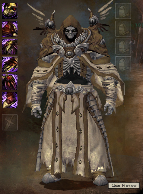
Regarding images: I am willing to do the work to get all of the images up (though it would take some work >.<). However first I would like to see if 1) someone has already done / started on this project to save some time, and 2) achieve a consensus on how to render the screenshots. Should they use the default dyes, or different colors to highlight the dyeable areas? Should they be cropped to the size of the character, or take up the entire equipment preview screen so the images are all the same size? Should there be screenshots just for the front, or back/sides as well? Crop out the inventory icons on the left or leave them in? PNG or JPG? I'd like some input on this now so I can do them right the first time. Here's a sample of how I'd like to do it: Scutilla 03:52, 20 September 2012 (UTC)
- My quick thoughts:
- I don't know if we want to do both "standard" colors (there's a "dye remover" option) and dyeable areas or what, but we definitely need to show the dyeable areas by using contrasting dyes. Preferably using a standard selection of dyes for all armors instead of random colors on each one.
- For the armor gallery the images should be cropped to the character. Preferably this would be not in the preview window, since larger characters will be clipped behind the slot boxes, but I know that won't be possible for a while since some armors are very expensive.
- We should probably make complete galleries from the start, doing front/back/side for everything.
- High-quality JPG format, probably 90% would work. While PNG is nearly-lossless, the file size is usually much bigger than even a 95% JPG.
- That's all for now, going to bed. —Dr Ishmael
 04:52, 20 September 2012 (UTC)
- Thanks for starting this up. As I mentioned on the Project talk page, I'm definitely enthusiastic about seeing this come together. Sadly, I'm a slow gamer, so I probably won't have much opportunity to provide screenshots.
- For showing the dyable areas, what about choosing three common-rarity colors with a high degree of contrast, say a red, yellow, and blue from the vibrant set? We could standardize that they are applied in a specific order.
- Is there (going to be) individual pages for individual armor pieces? If so, then I would leave out the icons from the screenshots. If not, then there may be a value to them. - LordEhzed 16:46, 20 September 2012 (UTC)
- Adding my 2 cents... for the "main" front picture of the armor (the pictures in this page, assuming we have a similar goal http://wiki.guildwars.com/wiki/Mesmer_armor ), a standard set of dyes (that people start with) should be chosen to make the armor look nice rather than for high contrast. I think high contrast dyes would make the gallery page look like unprofessional.
- We could have a secondary gallery of images on each armor's page for dyeable areas either by using ideas above (single picture with contrasting dyes), or by having 4 images for each set of armor where we move a single high contrast color through each dye channel while keeping the other three channels the same color.
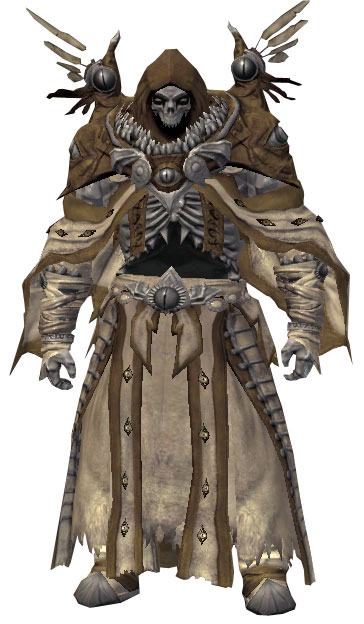
- Also, I think the ultimate goal should be a picture of just the model alone ( http://wiki.guildwars.com/images/1/13/Mesmer_Enchanter_armor_m.jpg ). I haven't tried in any other program, but cutting out the model from screenshots is doable enough in photoshop so I assumed paint.net would work. Until then, just a picture cropped to the character would be fine.
I have to ask, what is the armor in the example, and how is it obtainable? ````` mk
- It's light Corrupted_armor -- Chrono (talk)
 17:07, 12 October 2012 (UTC)
I'd love to help this project, but have a few things to say. Some armor pieces automatically hide others (example: Tier 2 Sylvari cultural light armor chest hides shoulders, I know there are others), we might have to take note of this. Also, pictures of whole armor sets I find don't really show what the individual pieces look like, as some details may be hidden by others. As a person that likes to mix and match I think it might be important to show what the individual pieces look like. I was thinking of starting a project where every armor category (headgear, shoulders, chest, etc) would have its own gallery page, where we could put images of what each piece looks like, and note which different sets have the same skin. It would however be awesome if we could do something like that on here directly, since a lot of work has been put to this page already. Not Honeydew 21:17, 15 October 2012 (UTC)
Whle I would have liked to use the default dyes as the selections chosen for the galleries, I have come to the conclusion that that would simply not be helpful. Some of the armor sets do have different colors, such as the example posted above, but many of them end up one uniform color at default. I agree that colors should be chosen from the starter dyes, and would nominate Matte, Autumn, Limette, and Stream, consistently in that order throughout all previews. Obviously most armor sets do not require all four colors, but some do. timRAR 21:02, 5 November 2012 (UTC)
Tactical Armor for the light armor set is the Karma set available in Malchor's Leap. I'm not sure of the names of all the pieces, but the chest piece is Pagga's Garb. 07:22, 25 November 2012 (UTC)
- PvP Wizard's seems to be the same skin as exotic Invader's (light armor). I only checked the shoes. Okuza 14:04, 30 November 2012 (UTC)
Combining Resources[edit]
Maybe not combining, but we could comb through this site: http://www.gw2armor.com/human/female/k2/heavy/display_looks.php To get some more work done. ![]() Fresh Berry Smoothie 21:33, 27 January 2013 (UTC)
Fresh Berry Smoothie 21:33, 27 January 2013 (UTC)
Gallery pages[edit]
- ← moved to Talk:Armor#Gallery pages
Plan of Attack on Documenting the Wardrobe[edit]
I apologize if this is in the wrong place -- I've only recently gotten into helping out with formatting and documentation on the wiki and I'm (almost) completely lost. What's our plan for documenting the Wardrobe? Particularly adding support for the new chat codes and documenting which items unlock which skins.
--Anonymouse (talk) 17:49, 20 April 2014 (UTC)
- Ask User:Psycho Robot, he's got a plan (or so he says). I'll go enable the chat links quick. —Dr Ishmael
 18:32, 20 April 2014 (UTC)
Cultural Armor sets[edit]
With the current skin-and-transmute-changes (wardrobe), and the removal of both Glory and the Glory vendors, we can probably remove the Cultural comparison charts, since you can now only really get the PvE version, and not to mention that both apply to the same skin in the Wardrobe anyway.
Matter of fact, it might just be easier to completely redo this page, seeing as you can now just preview all of the armour sets, clean the picture up, and upload that picture with minimal effort. I truly think it's easier to refer to armour looks by their skin names from the Wardrobe than their in-game names, but keep linking to where to get them and how to get them, etc.
Garruul (talk) 15:39, 4 June 2014 (UTC)
- Three years down the road, I think it's worth holding on to that information if only for historical purposes. The early PvP sets were seriously unstandardized, and most didn't get naming conventions until a massive change rolled through after the implementation of the wardrobe. SarielV
 16:58, 7 April 2017 (UTC)

